Settings
The free caption slider is an image slider where a caption is on the left side and the arrows are on the right. The slider uses the boxed layout, so you can put it everywhere on your site, it will fill up the width of the container where you put it.
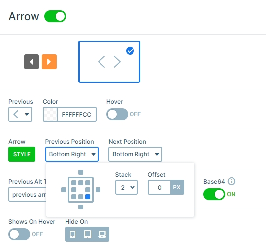
The arrows are in the bottom right corner, but you can place it on another place, also you can customize the colors or the type of the arrow at the Controls tab of the Slider settings.
Layers
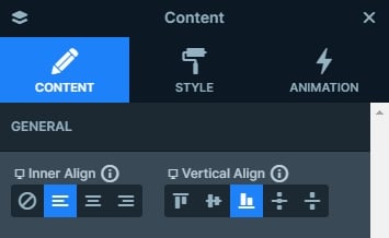
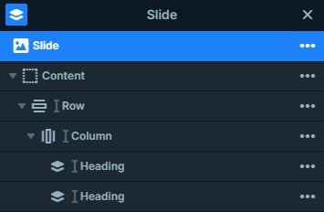
You can find 2 heading layers in each slide which are in a row. The row has a pink background color, and it is on the bottom left corner because the Content layer is positioned vertically to the bottom and horizontally to the left side. The full width option is disabled at the settings of the row, because of that it doesn’t fill up the whole width of the slide, it is as big as the content it’s in.
Animations
An attractive slider animation immediately catches the user’s eyes. Impressive 2D and spectacular 3D animation will look nice and professional when carefully chosen. However, sometimes, you don’t need these fancy transitions. Sometimes, you just want your slides to have a clear and simple slider animation. These are the times when you should consider using main animation, instead of background animation.
What’s the difference between main animation and background animation? Let’s point out the similarities first: they both have effect on your background images, they both look good and professional. While there are tons of background animations to choose from, but they allow more customization. Main animation also work on layers that don’t have layer animation on them, so if you set the main animation to fade and you set a Background animation, too, then the layers without layer animation will be faded in with the main animation, while the selected Background animation occurs on the images only.
Layout
The 2 heading layers are in a 1 row – 1 column structure, and this row is positioned to the bottom-left. The arrows are in the other side, which gives a frame to the slider.
Responsive
By default the arrows are hidden on mobile, but at this slider we have enabled them. In this case the visitors can notice there are more slides available, and they can switch slides by clicking on the arrows or with a simple drag.
Related Post: Create a Unique Layer Slider with Smart Slider 3
Related Post: How to Create Beautiful Responsive Image Slider?
