Settings
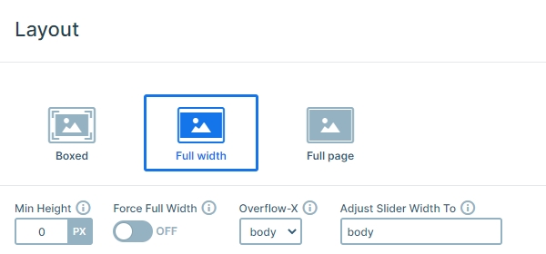
The Fullwidth Post slider has 3 slides, and each slide has the same structure. The slider is a full width slider, so fills the available horizontal width of your screen. If the container isn’t full width, you may need to enable the force full width option.
This slider can be used as a post slider, and you can make it dynamic. Just import the slider, open the slide, and copy it. Then create a dynamic slide, set the generator, and paste the copied layout. Then you can add variables to the layers, and they will dynamically change.
Layers
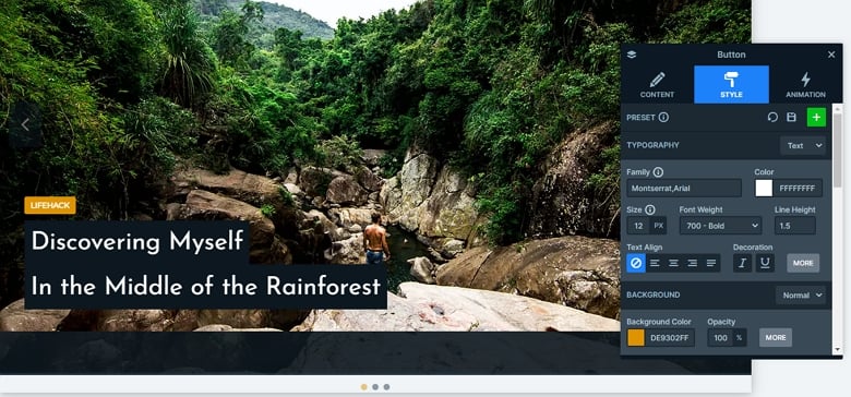
The slides don’t have too many layers. There is a button layer, and after that 2 heading layers are. Below these layers you can see an image which is in absolute position, and this image is the same as the slide background image, but doesn’t fill the width and height, and doesn’t have an overlay on it. The CTA on the top has an eye-catching color, which can display the category of the post, also you can put a link on it.
Animations
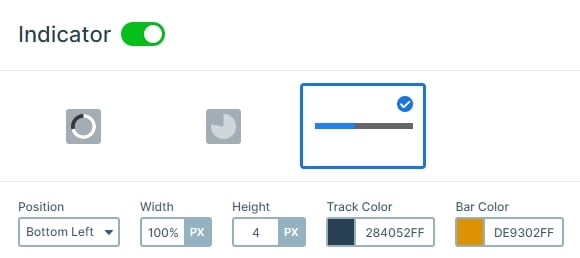
If you check the slider you can notice it autoplays in every 8 seconds. The slider autoplay indicator on the bottom displays the time and when the next slide will come. This gives a nice movement to the slider, also the visitors will know there are other slides in the slider. Also, you can stop the autoplay if you click on the slide, so you will have enough time to read the content.
Layout
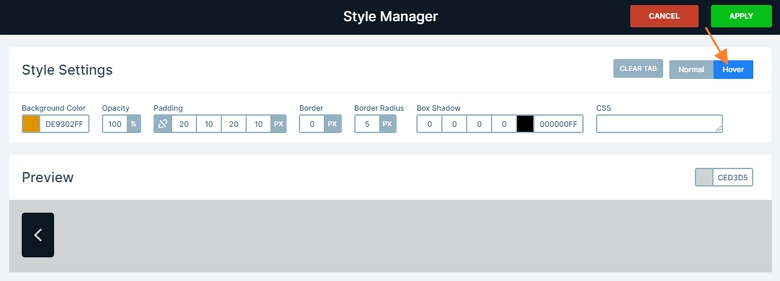
Each slide has the same layout: there is a background image, over that is an image layer, and over the image are 3 layers. The autoplay indicator is on the bottom, and the arrows are in the left and right sides. These arrows have an orange hover color. You can change them in the Controls tab of the Slider settings if you click on the green Style button. Then the Style manager will open, and you can customize your arrow.
Responsive
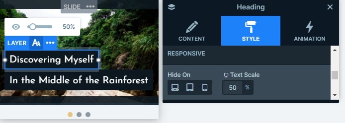
The slider is fully responsive. The texts are smaller on tablet and mobile thanks to the text scale option. You can use it to make the text lower or bigger on different screens.
Related Post: Enrich your Blog with a Post Slider
Related Post: 11 Beautiful Full Width Slider Examples

