Slider Settings
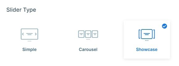
The Watch showcase template’s got this awesome Showcase slider type that you might have spotted on other cool websites. What’s neat about it is that you can show off multiple slides all at once. One slide grabs the spotlight right in the middle, while the others kind of hover on the sides, ready for you to switch between them easily.
Your visitors can explore this slider in many ways. First up, there are the controls at the bottom which you can customize in any way you prefer. They’ve got this nice hover effect that just makes sliding a piece of cake. Additionally, they show numbers so you always know where you’re at and how many more slides there are.
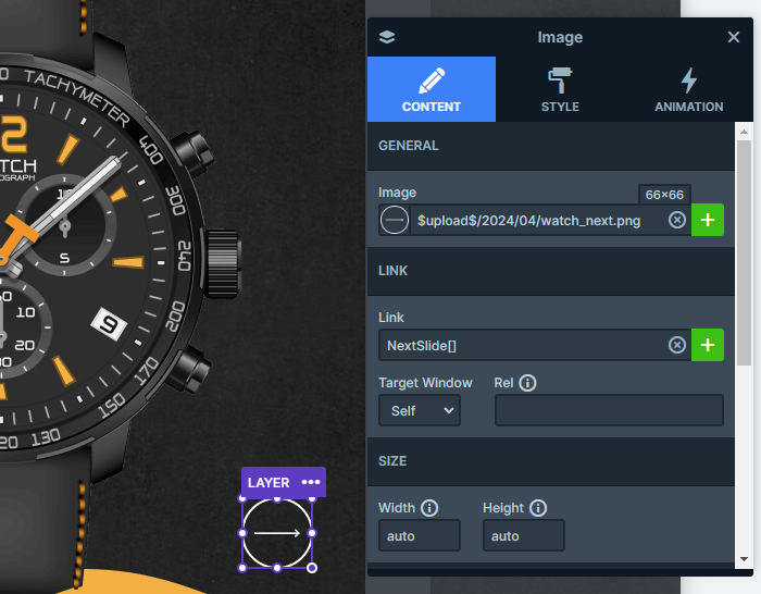
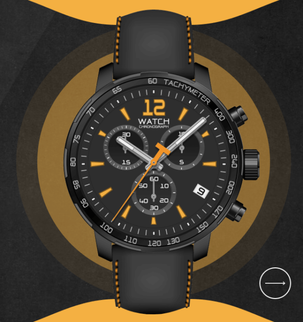
Moreover, you can also click on the arrow button tucked away in the bottom right corner of each slide. Give it a tap, and you’ll smoothly go through the slider, one slide at a time, all thanks to the Link Action settings.
And for all the touch screen users out there, it’s got them covered too. Simply drag your finger across the slider horizontally, and you’ll glide through those slides without any hassle. It’s the perfect way to explore when you’re swiping away on your phone or tablet.
Layers
Let’s talk about what makes this template really cool. It’s got all the basics covered: Headings, Text, and Images to start things off. But here’s where it gets exciting. Smart Slider adds some special layers that really make your slides stand out.
Take the Area layer, for example. You’ll see it on every slide. It lets you add a splash of color to your background, giving your watches a classy touch with those cool pulsing effects.
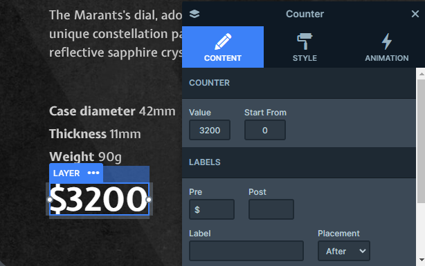
Then there’s the Counter layer. It’s attention-grabbing, letting you count up from a starting point and add extra characters for some additional flair.
And last but not least, the List layer. It’s subtle but super useful, helping you showcase your content in a neat way.
Animations
First off, the showcase slider switches slides horizontally. Just click on the next or previous slides, and you can move between them. Plus, if you’ve got enough slides, they’ll make a continuous circle back around, so you can easily jump back to the first one.
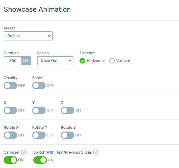
Now, let’s talk about the eye-catching animations. There are some cool incoming layer animations, but the most noticeable animation is definitely the pulsing effect.
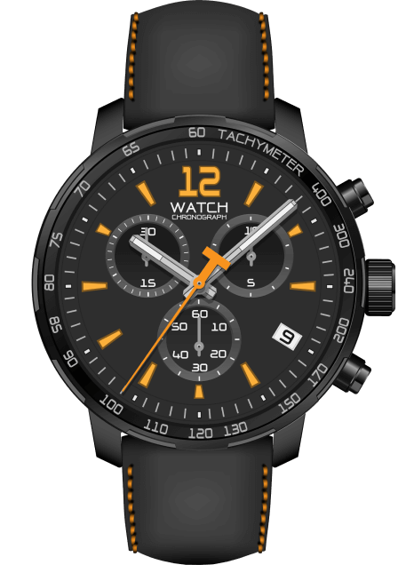
Behind the watch, there’s these Area layers doing their thing. They’ve got a Loop animation, so it’s constantly scaling up. Moreover, it’s all in this vibrant orange color with circular borders, giving it a super clean look.

Each of the three circles pulses in its own time, creating this mesmerizing effect that’s hard to look away from. And just when you thought it couldn’t get any cooler, each circle has its own incoming animation too.
Layout
Let’s break down how each slide is set up. It’s all about two columns: one on the left, and one on the right, each taking up half the slide’s width.
In the left column, you’ll find default layers. These are your main content, sitting in their usual spots.
The right-hand column is where things get interesting. It’s filled with absolute layers. These layers float on the slide, not taking up any real space. That means you can put them anywhere you like, making them perfect for adding decorative touches.
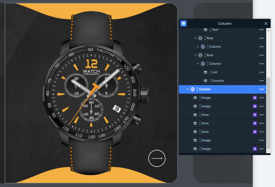
We suggest focusing on building your main content with default layers. Then, if you want to enhance your design with some decorations, then turn to absolute layers.
Responsive
Let’s look at how this slider looks on smaller devices like your phone. You’ll notice that the columns stack on top of each other, making it easier to navigate and read. It’s all about giving your visitors the best experience, no matter what device they’re using.
Smart Slider has a bunch of other mobile-friendly features you can play around with. For example, you can set different font sizes for different devices, so everything looks just right. Plus, you can hide certain layers to make sure your visitors get the best experience on smaller screens. It’s all about making sure your slider looks great, no matter where it’s being viewed.


