Settings
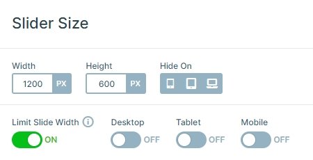
This Subscribe slider looks complicated with all the different things on it, but it’s easier than you would think. This is a block type slider, so it has only one slide without any controls. The slider size is 1200x600px, and it is full width, so it fills the horizontal width of your screen.
Layers
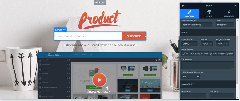
This demo block has only 4 layers: there is an image layer on the top, then an input layer comes, and finally a heading and an image are. The input layer is a subscription form in this case. To make your subscription form work, you should set the form action where the button will send the email address and also you can change the input name according to your subscribe script.
Animations
The image layer on the bottom has a layer parallax effect. The parallax effect by default interacts with your mouse cursor, and you can change that in the Animations tab of the Slider settings. In this case, we have used scrolling parallax, so if you scroll down, the image moves.

Layout
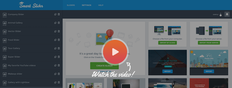
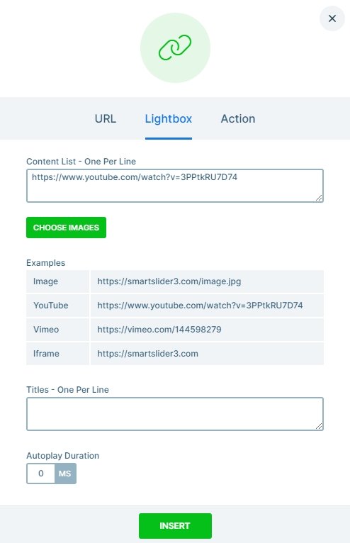
The layout of this block is very simple: the layers are under each other. But if you click on the bottom image, you can see a lightbox will open. In this case this lightbox contains a video, but you can display your image or an iframe content, too.
Responsive
The slider is fully responsive. If you check it on mobile, you can see the heading layer is hidden. With that you can save space, and the visitor can focus on the subscribe form. But if you want to display the heading on mobile, you can enable it in the Style tab of the layer window.
Related Post: Add Lightbox Slider to your WordPress site
Related Post: Everything You Need to Know about the Parallax Effect
