💡 Best features in this slider
Settings
Static slide is that slide, which is over your slider without switching away, while your regular slides can move behind them. So you shouldn’t think of them as slides, because the whole concept is different, it is rather a tool which gives you a powerful option with a user friendly interface. In the following video you can learn how to create a static slider.
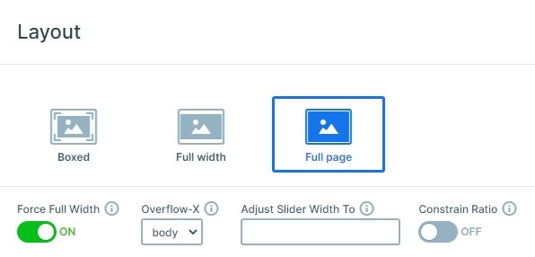
This Static slider is a full page slider, it fills the 100% width and height of your browser. You can use it as a great homepage slider, and can fit in any theme, because you can fully customize it. On the bottom of the slider you can notice a white shape divider which you can customize or disable in the Animations tab of the Slider settings.

The slider stands out from 4 slides: a static slide, where the content is, and 3 other slides with background images which are autoplaying every 8000ms. You can stop the autoplaying with the autoplay control on the top, also you can see when the next slide will come.
Layers
With a static slide you can place layers, for example your logo or watermark over your normal slides. In this case the fully textual content is on the static slide. There are heading and text layers, 2 buttons and 3 transition layers. The transition layer stays from 2 images, and if you hover over it, the image changes to another. You can use these images to link to your social media platforms.

Animations
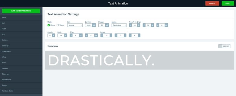
When you load the slider, all layers come in with an incoming layer animation after each other. The main heading uses a special animation which you can use only on headings: text animation. With the text animation you can animate your text by its characters or words. You can customize this kind of animation in the Text animation manager which you can reach from the content tab of the layer window.

Layout
The static slider stays from 3 rows. You can find the headings and another row with the two button layer in the first row. The third row is on the bottom with the 3 transition layers. The first main row fills up the available vertical space because the Stretch option is enabled. The second and third row are close to each other, because the full width option is disabled at their settings.
Responsive
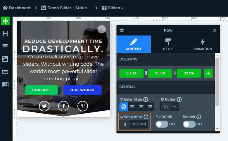
The slider is fully responsive, and fills the full page on every device. The fonts are smaller on the smaller screens, the font sizes are resized with the Text scale option. If you switch to mobile view, you will see that the button layers and transition layers are next to each other in this view as well. By default a row wraps after 1 column, but at this slider the columns won’t wrap.

Related Post: What is a Full Page Slider and How to Use it?
Related Post: Add Beautiful Section for your Website with Shape Dividers


