

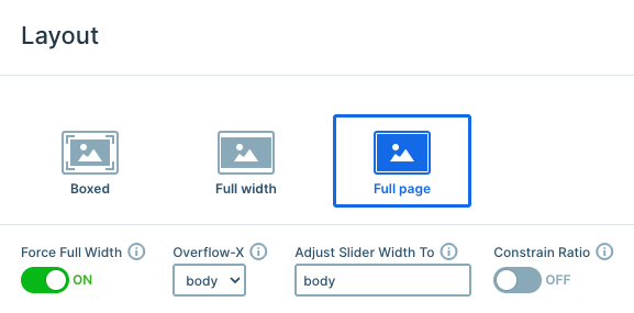
Settings
This slider uses a full-page layout, which means only one slide is visible at a time, and it always fills the entire browser window. With the Force Full Width option enabled, the slider stretches beyond its container and expands edge-to-edge across the screen, while still keeping its original proportions intact.
The navigation settings provide several interaction options, including dragging on both desktop and mobile devices. At the bottom, there are three bullets that indicate the total number of slides and highlight the currently active one. These bullets were set up in the Controls settings, where you can fully customize their appearance and behavior.
The two CTA buttons on each slide were set up to navigate visitors to the next slide using the Link Action setting. To create this behavior, click the + icon next to the Link field, then under Actions choose the appropriate slide navigation action.
In the Animations tab, the Carousel setting allows the slider to loop continuously between the first and last slides for a seamless browsing experience.
Layers
Each slide follows a similar structure and uses many of the same basic layers, but each one was styled differently to give it its own unique feel and avoid repetition. The design mainly relies on layers like rows, columns, text, buttons, and images, combined in different ways across the slides.
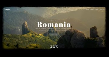
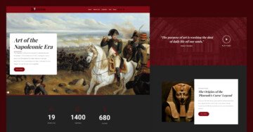
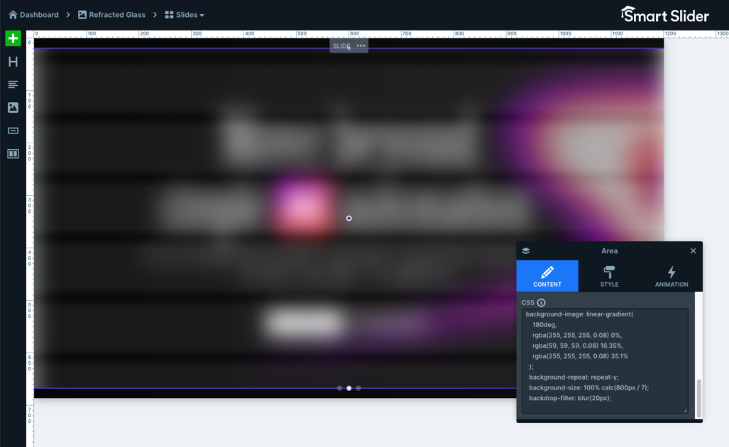
Some more unique layers were also used, including the Area layer featured on each slide. One of the Area layers uses a gradient background, which is a great way to add depth and color to a design. The other one uses custom CSS with a repeating linear gradient to create the reflective glass effect. The remaining slides follow a similar visual style, with adjustments like rotated gradients, different sizing, and unique positioning to keep every slide visually interesting.
Another standout element is the Highlighted Heading layer placed in the center of each slide. This makes it easy to emphasize important words or phrases, while still allowing the highlighted part to be styled separately from the rest of the text.
The buttons were also customized with separate normal and hover states in their style settings, creating a smoother and more interactive user experience.
Animations
This slider uses a Horizontal Main animation when switching between slides, creating a smooth transition from one slide to the next. One of the most eye-catching effects, however, is the subtle movement of the shape images reacting to the mouse cursor.
This effect is created using mouse parallax, which responds to the cursor position and creates the illusion of depth between the different image layers. It adds a more interactive feel to the slider without distracting from the content.
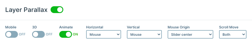
The mouse parallax effect can be enabled in the slider’s Animation settings. After that, you can define the parallax strength for individual layers in the Style tab of the layer you want to animate. In this slider, all of the shape images use the same parallax value of 5, giving the interaction a consistent feel across every slide.
Layout
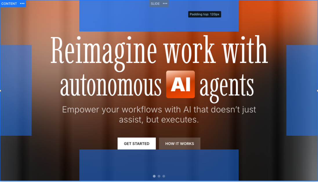
Each slide uses the same overall layout, with the main content centered inside a row. This positioning is created by applying 120px padding on all sides of the content layer, giving the design plenty of space and balance across the screen.
The decorative image and the two Area layers use absolute positioning, which allows them to be placed freely around the slide without affecting the main content layout. Each of these elements is positioned and styled slightly differently on every slide to create a more visually interesting composition.
Absolute positioning works especially well for decorative elements, since it lets them “float” independently while keeping the core layout clean and consistent.
Responsive
Smart Slider includes a wide range of responsive settings to help your sliders adapt smoothly to different screen sizes. In this template, however, only a few small adjustments were needed, since the layout already scales well across devices by default.
One especially useful feature is the Font resizer, which allows text sizes to automatically adapt to the current screen size, helping keep the content readable on smaller devices. This template also reduces the previously mentioned padding values on smaller screens, creating a more balanced and visually pleasing layout.
These small responsive adjustments help ensure the slider stays clean, readable, and aesthetic on all devices.