Settings
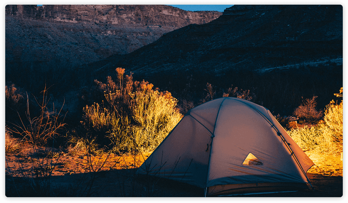
The Blur slider is a special looking simple type slider. A simple type slider means the common look of the slider, which displays one slide at a time. Additionally, it’s a full width slider, which makes the special blurring effect look so stunning.
What makes this slider look so special? It’s the fact that on each slide you see a blurred background image, then in a couple of seconds, the sharp version of the image appears in the middle. It’s like the image isn’t blurred, and more vivid in the middle.
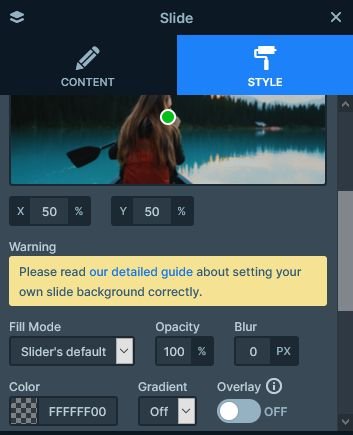
Creating such effect is simple, but you’ll need two images to achieve it. First you need the blurred image, to use it as the background image of the slide. It’s big enough to fit into a full HD screen. You can blur the image with your image editor, and apply the dark overlay. Or, you could use the Blur and Overlay options available in Smart Slider. Then, you’ll need another image, which isn’t blurred or darkened. This image should be a crop from the middle of the large image.
Layers
There aren’t many layers in the Blur slider, but you can find the most essentials. There’s a heading layer, what you can use to create a nice headline. You can put longer, descriptive text into the text layer. Creating a call to action button is super important, as it helps a lot with conversion. We’ve prepared a button layer for you in the Blur slider template. Additionally, there’s an image layer where you can place the cropped image.
Animations
The Blur slider template is rich in animations. The first animation you’ll see when you open the slider is the layer animation. This animates in the layers. The layer animations on the layers have two different behavior. The image layer simply fades in, while the textual layers move in from the right.
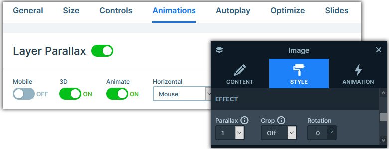
The second animation you’ll notice is the 3D parallax effect on the image layer. As you move the mouse cursor above the image, it reacts to it with a cool movement. To enable this effect on a layer, first you need to turn on the 3D parallax at the Animations tab of your Slider settings. Then you’ll need to set the parallax at the layer where you want to use it. The last animation is the Horizontal Main Animation, which you’ll see during slide switching.
Layout
Although you can quickly import any slider template, you can quickly build a layout like the Blur slider’s. First, you need to set a maximum width to the Content layer, then align it to the right. This will put the content to the right side of the slide. Next, add an image layer in Absolute position, and move it below the Content layer.
Responsive
In Smart Slider, aligning happens from the parent element. So, if you want to move your layers up, look for the Vertical align option on their parent. Similarly, you can align the layers horizontally from the parent as well. Additionally, this Inner align option is device specific, as demonstrated on this template. On desktop the texts are left aligned, whereas on mobile they’re centered.
The other responsive adjustment you can find on the Blur slider template is related to the font sizes. Using the Font resizer you can set a smaller, or a bigger font size for your texts on mobile. This is helpful to create a better looking layout on mobile. Additionally, you can hide any layer on any device. On the Blur slider template, we hid the image layer on mobile.
Related Post: How to Create Beautiful Responsive Image Slider?
Related Post: Everything You Need to Know about the Parallax Effect
