Slider Settings
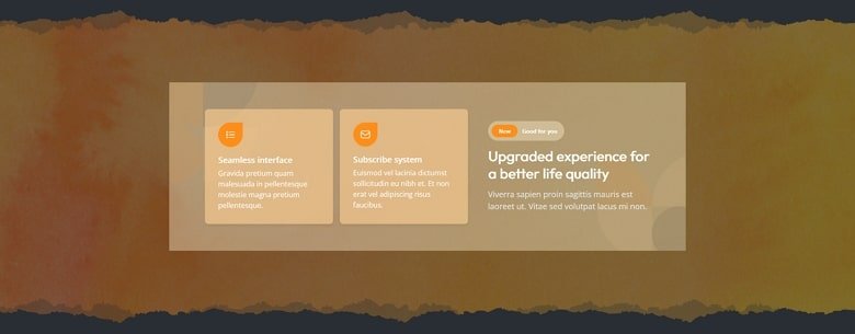
The Nala Dark page is a special kind of template that consists of multiple sliders. You can gather them by placing them into a slider group. But keeping the sliders organized is not the only thing a Slider Group does. In fact, it also allows you to publish your grouped sliders at once.
Layers
The sliders use lots of interesting layers. Of course you can find the most popular layers: heading, text, image and button on most slides. These are the most basic layers to build content. They help adding structured headings, long text, pictures and CTAs to your sliders. Apart from these common layers, you can find a Counter layer on some slides. The Counter layer is a special layer that counts from the star number to the end number you set.
Animations
The Nala Dark page features a couple of amazing effects. The most common is the layer animation that you can find on all slides. Layer animations help introduce your layers in a more interesting way. Apart from making the slides more interesting, they also help bringing some life into the slide.
The other cool effect you can see on one of the sliders is the Shape Divider. Shape dividers are graphic designs that help separate the sliders in a more interesting way.

Layout
The layouts are super simple, but there are some interesting solutions. For example, in the first slider you can see a custom button created using a two column row. The left column has a background color and contains an image. The right column only contains a heading layer. Then their container, the row has a lightbox that opens a video.

Responsive
Smart Slider is a responsive slider and it offers many tools to ensure your content looks great on any screen sizes. The most popular tool that helps you optimize your slider for small screens is the Font Resizer. It lets you reduce (or increase) the font size without affecting any other device view.
Related Documentation: Where to find the Slide Library?
Related Post: Smart Slider 3 – Slide Library


