


Settings
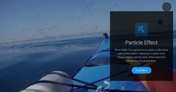
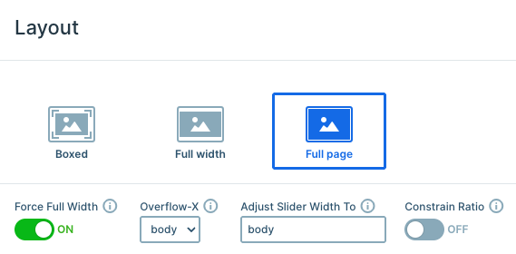
This template uses a full-page layout, meaning only one slide is visible at a time, and it fills the entire screen. The result is a clean, distraction-free experience that keeps visitors focused on your message.
Since Force Full Width is enabled, the slider stretches beyond its container and expands to the full width of the screen, creating a seamless, edge-to-edge hero look while keeping its original proportions.
Navigation is smooth and intuitive. On smaller screens, users can simply swipe through the slides, while on larger screens, they can drag to move between them. Each slide also includes an arrow button that takes visitors to the next slide.
You can easily set this up by using the Link action on the button layer. Just click the + icon next to the Link field under Actions, and choose the appropriate slide navigation option.
Carousel is enabled in the Animations tab, so visitors can easily move from the last slide back to the first and vice versa. This creates a continuous browsing experience that feels natural.
Layers
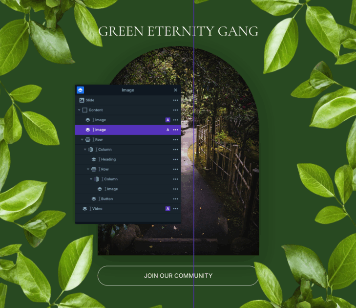
This slider keeps things clean by relying on core layers like rows, columns, images, headings, and buttons. The structure is simple, but a few thoughtful touches make it stand out.
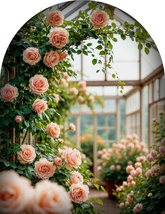
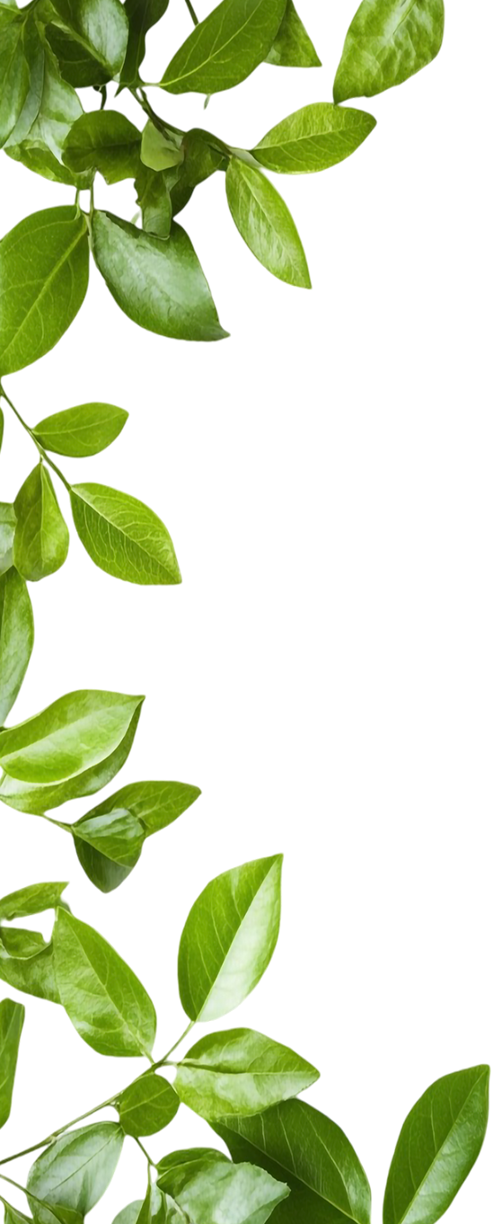
Some images are added with absolute positioning, which makes them perfect for decorative details. For example, the roses on the sides of the first slide are positioned this way, allowing them to float freely without affecting the main layout.
There’s also a subtle background video layer placed using absolute positioning. It plays automatically, loops continuously, and stays muted, adding atmosphere without distracting from the content.
This template uses an MP4 video, which Smart Slider fully supports. You can customize playback, size, and other options directly in the video layer’s Content tab to match your own preferences.
Animations
The Gardening Community slider includes a few subtle but eye-catching animations that bring the design to life. When the slider first loads, the decorative images placed with absolute positioning slide in from each side using incoming animations. It’s a small detail, but it adds a dynamic feel right from the start.
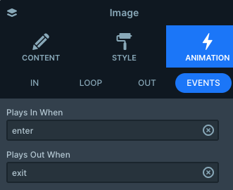
There’s also a nice interactive touch on the button. When you hover over it, the image above slowly zooms in on its shape. This is created using layer events.
The image layer is set to Play in on enter and Play out on exit, while the button triggers the custom event on mouse enter and mouse exit.
Layout
Each slide follows the same clean structure, built with rows and columns to keep everything aligned and easy to manage. The decorative images are positioned absolutely on the sides, while the main content remains centered, creating a focused layout.
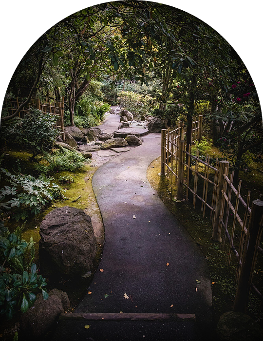
The central image includes a bit of custom styling added through the Developer tab’s CSS section. A simple combination of border-radius and box-shadow gives it a softer look. This custom class is applied directly to the middle column.
To ensure the background video stays subtle, every other layer is set with a higher z-index. This keeps the video visually behind the content while still contributing to the overall look.
Responsive
Smart Slider is fully responsive, so your slider will look great on any screen size. Still, you have plenty of options if you want to fine-tune things even further.
In this template, for example, the decorative side layers are hidden on smaller screens. Absolutely positioned layers can sometimes feel too dominant on mobile, so it’s always worth checking how they behave.
You can control this easily with the Hide on option in each layer’s settings, where you decide exactly which screen sizes should display the layer.
Another useful tool is the Font resizer, which lets you adjust text sizes specifically for smaller screens. So with just a few tweaks, you can make sure everything stays readable across devices.