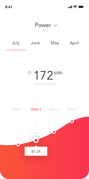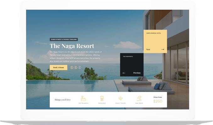
💡 Best features in this slider
- Highlighted heading layer
- CTA button
- Counter layer
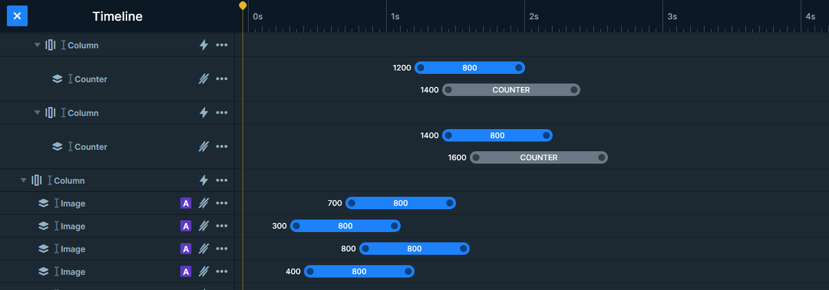
- Image layers in absolute position
- Bullet control
Settings
It’s a popular design choice on modern websites to put a full page hero header or slider to the website. These sliders fill the whole width and height of the browser. On today’s large monitors a full page slider provides enough space for a good first impression.
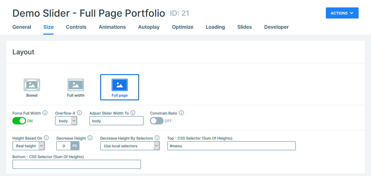
After you got your visitor’s attention, they’ll want to see more of your site, so they start interacting with it. One of the most natural ways to interact with the page is to scroll down. In Smart Slider you can use this scroll action to switch slides. As a result, instead of scrolling to the next section of the page, the visitor sees a new slide. This works great with a vertical animation, because it makes the slides look like they’re new sections of the page.
Layers
The purpose of a portfolio slider is both to showcase your previous works and to get you new jobs. For this reason the first slide contains two call to action buttons. One large button leads the visitor to your Latest Projects, and another leading to a contact page.
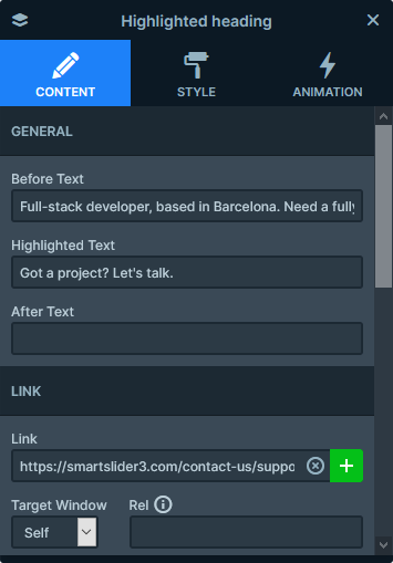
This second button is actually a special layer called Highlighted Heading. With this layer you can highlight the most important part of your text with a cool effect. It’s a great layer to grab attention, so it’s a great choice for a less ostentatious CTA button.
At the bottom of the first slide you can see two super counter layers. Counters are great to display numeric details about your product or services.
Animations
Smart Slider has many cool effects you can choose from to make your slider look more stunning. The layer animation, what you can see on each slide, is one of these effects. It brings motion and life to the slides, which makes it easy to grab the attention of your visitors.
Layout
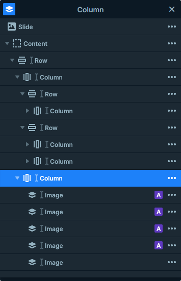
The slides in the Full Page Portfolio slider have a very simple layout: there’s a row with two columns in each slide. The left column contains the text, and the right one has images. By default this layout would place the image below the text on mobile. But in Smart Slider you can change the order of the columns, so it’s possible to show the image first. This gives a much better look on small screens.
Responsive
In Smart Slider your layers can have two different position type: Default or Absolute. Default layers are the perfect choice to create your slide’s content. Working with Default layers ensures your content remains legible on the smallest screens. Additionally, it prevents any content from getting cropped.
Absolute layers, on the other hand, are great for decorative content. On this slider, the colorful shapes are Absolute image layers. What makes them more special is that they’re Nested. Nesting means placing Absolute layers into a column, which helps with the positioning.
Related Documentation: Slide editing in Smart Slider 3
Related Post: Smart Slider 3.4 – Nebula
