Modern web designs have lots of cool effects. There are some old, but gold effects like the typewriter effect. There are effects copied from the video industry like the Ken Burns effect. And there are super cool effects which are game physics and motion graphics inspired. The particle effect might be the best example for this case.
What is the particle effect in web design?
Particle effect or particle system is a technique in web design, that uses a large number of tiny objects. These objects keep moving around on the site, creating a spectacular result. Particles can interact with each other such as connecting with a line when they get close enough.
Particles are usually circle shaped and really small. But it’s not uncommon to use other shapes, such as triangles, squares or other polygons. Particles can interact not only with each other, but also with the user. For instance, they can flee from the cursor, or connect themselves to it by a line.
How does particle effect work?
Particle effect works by creating many particles in a given area. These particles move continuously, usually in a random way, without stopping. It’s also possible to make the particles follow a given direction, for instance, move from top to bottom.
How to use the particle effect on WordPress?
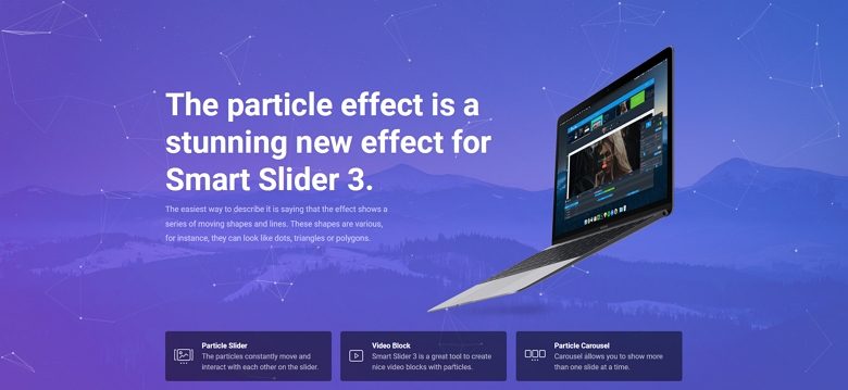
The easiest way to use the particle effect on your WordPress site is using a plugin. For instance, the effect is available in Smart Slider 3 Pro, which is a great tool to create such decoration.
- Download and install Smart Slider 3 Pro to your website
- Create a new slider using Smart Slider 3
- Select the Particle Effect at the Animation settings of the slider you just created
Here’s a quick video to show you where to find the effect:
What kind of particle effects are available in Smart Slider 3?
Smart Slider 3 allows you to choose from 9 different, cool looking particle effects. These effects are premade by us, but they have minor configuration options. For instance, you can change the color or line color, even the speed, but you can’t change the shape. If you need to use custom shapes, you can build your own effect and paste its code to the slider. But you can use this to create a snowing effect.

Why should you use the particle effect on your slider and website?
The particle effect is a modern web design technique. The best part of this effect is, that it’s not as common on websites as, for example, the parallax effect. This means you have a bigger chance to make a great first impression which can lead to more sales. Even if your site doesn’t sell anything, you can profit from such a unique effect. Cool effects like this make the site memorable for the visitor and they are more likely to come back.
Final thoughts
Particle effect is one of the key techniques modern web design has. It’s a simple but elegant effect, which offers many possibilities to use. What I like most in the particle technique is that it fits well with any type of website, unlike many other effects. The best websites out there already use it. Are you using it, too?