Settings
Sliders are great tools to display your images. A gorgeous slideshow can help encourage visitors to spend more time on the website. Smart Slider 3 is not a simple image slider plugin as it lets you add other content as well. For instance, you can add text and buttons to your slides, as you can see on this slider.
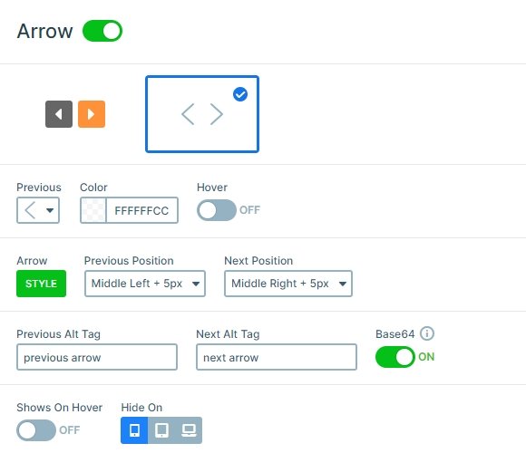
This slider is full width so its width fills the width of your browser. You can navigate to the next and previous slides in 3 ways: with the arrows, bullets and by dragging. You can customize the arrows and the bullets at the Controls tab of the Slider settings.
Layers
The slides of the Free Full Width slider contain 3 layers: two headings and a button. The layers on this slider have simple settings which make the slider look minimalistic. Minimalism is one of the key elements of modern web design trends.
The first heading layer is probably the most unique looking layer of this slider. It displays uppercase letters with an underline below. This underline is actually a bottom border, which is 3px wide, making the line rather thick. The actual content of the layer is “Short story”. But, as you can see, it is displayed with uppercase letters. It’s one of Smart Slider 3’s great features that changes the look of the text.
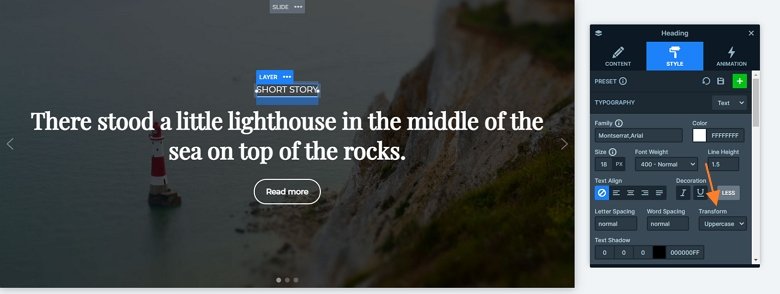
The second heading layer’s most interesting part is the font family. Websites usually use sans serif fonts, so it’s rare to see a serif font in a headline. This is a Google Font, it is called “Playfair Display” and it’s available as one of Smart Slider 3’s predefined fonts.
Modern websites commonly use buttons, which have rounded corners. Designers refer to such buttons as “pill buttons”, as they look like a pill. The best part of these buttons, apart from looking trendy, is that Smart Slider 3 lets you create them with ease.
Animations
If you click one of the controls, you can switch slides. Then another slide will come in with a horizontal main animation. You can speed up or slow down this animation at the Animations tab of the Slider settings, also you can change it to vertical or fade if you want.
Layout
The layout of the slider is simple: there are 3 layers under each other. The bullets control displays on the bottom, and the arrows are positioned to the sides.
Responsive
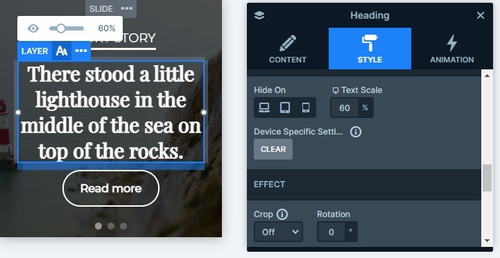
The slider is fully responsive. Each layer is visible on tablet and mobile, but the second heading is smaller. This is because of the Text scale option which allows you to customize the font size in different devices.
Related Post: Do you need a Free Full Width Slider for your Site?
