💡 Best features in this slider
Settings
The Crypto block is a block type slider so it has only 1 slide without any controls. It can be a great hero header on your company or business website. I think you have noticed the white curve on the bottom. This is a shape divider which can be a great separator between the sections. You can customize it in the Animations tab of the Slider settings. Here you can change its type, color, width and height, you can animate it, and you can set it on each device.

Layers
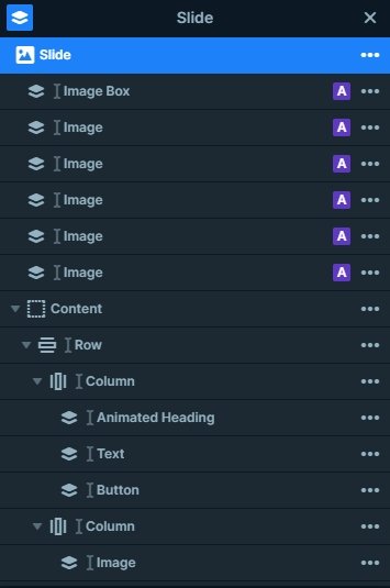
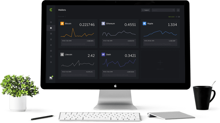
You can see 5 different layer types in this block: there is an animated heading on the top, after a text and button layer comes. You can see an image layer in the right side, and an image box above it. Also you can see 5 different image layers as a decoration.
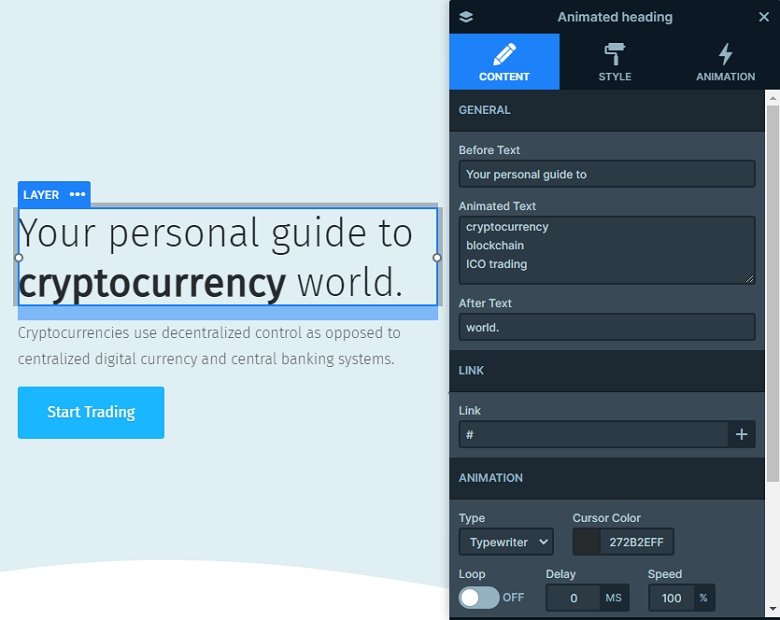
The animated heading cheers up the whole slide because it attracts the eye. You can customize its settings in the layer window, you can change the before, after and the animated texts, also you can change the type of the animation, and change its color.

Animations
Creating beautiful hero blocks with nice text effects has never been easier. The Animated heading layer has all the effects you need, such as the typewriter effect which you can see on the slider above. The most noticeable animation on the slider is the typewriter effect. But there’s also a particle effect in the background. In front of the monitor there’s an image box layer which has a layer animation on it, just like the small icons have.
Layout
What about the slider’s structure? Well, we used default positioning to build the basic structure: a row with two columns. The left column has the Animated heading, text and button layers. The right column only has the monitor image. We used absolute positioning to add the design elements: the five icons and the image box layer.

Responsive
If you check the block on smaller devices like on your phone, you can notice the decoration elements are hidden. The content is the most important part of the slide, and with hiding the absolute layers we can save space, and the content will be legible on these smaller devices.
Related Post: Use Beautiful Layer Animations in Smart Slider 3 Pro
Related Post: What is a Particle Effect and Why Should You Use It?


