💡 Best features in this slider
- Highlighted heading layer
- Heading layer in Absolute position
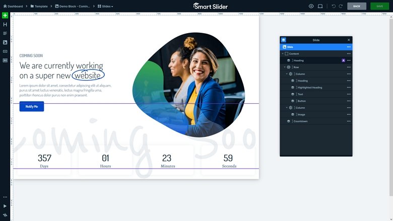
- Countdown layer
Slider Settings
The Coming Soon template is a full width block. Full width elements are popular nowadays, because they cover the browser horizontally. Such sections look stunning on today’s wide monitors, which makes designers and clients love them.
The Block is a special slider type in Smart Slider. A Block is not an actual slider, it can’t slide, because it displays one slide only. What is it good for, then?? A Block allows you to use the power of Smart Slider and create gorgeous and responsive sections for your site.
Layers
The Coming Soon template is full of interesting layers. There are some standard layers, like the heading and text layer. Also, there’s a CTA button that urges visitors to take action. On the left there’s an image layer to give a nice visual.
One of the most special layers on this template is the highlighted heading layer. It lets you create a headline, and highlight some words on it. In this case, there’s one highlighted word, because that’s the most important part of the message. THe highlight is a nice circle shape.
The other special layer is the Countdown layer. It lets you count down to any date you choose and get your visitors excited for your event.
Animations
There are no layer animations on this template. The only movement you can spot is the way the highlight circles the text of the Highlighted heading layer. Also, there’s a movement as countdown counts down to the website’s start.
Layout
The base of the slider is a stretched row. This row contains the textual layers in the middle and the image as well. Stretching the row makes it fill all available space. As a result, it pushes the countdown layer to the bottom of the slider.
The other interesting layout is the Absolute positioned heading behind the countdown layer. Absolute positioned layers are great for decorational purposes. To select this Absolute positioned layer for editing, use the Layer list.

Responsive
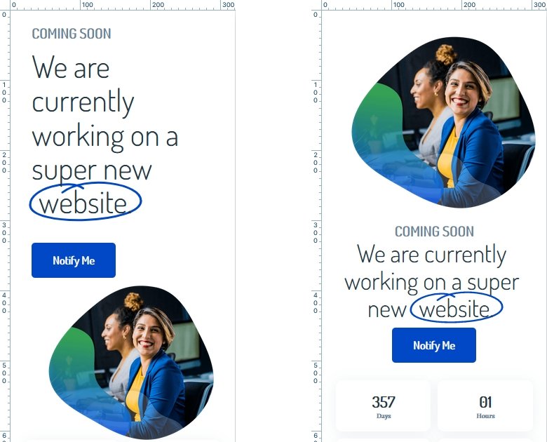
Smart Slider is a responsive slider, and has many cool tools to ensure the best small screen display. On this template we made many responsive adjustments. For example, we changed the column order. By default when the columns of a row wrap into new lines on a small screen, they wrap in a left-to-right order. As a result, the column on the most left will be on top, and the column on the most right will be at the bottom. By changing the column order we could place the image on top instead of bottom.

The other mobile specific changes include reducing the text size using the Font resizer. Also, at the countdown layer we set a custom column count. As a result, the countdown appears in a 2×2 grid as opposed to listing all 4 elements next to each other.
Related Post: Introducing Countdown Layer
Related Video: Responsive Settings

