Black Friday Super Sale! 🔥 Enjoy a jaw-dropping discount of up to 50% OFF on all Smart Slider plans. Hurry, the offer ends on December 2nd!

Buy Now
Design

Why the Research Against Sliders is Wrong (and They Don’t Suck)

Raelene Morey
Raelene Morey
December 12, 2017
Research Against Sliders

I’m tired of all the negative talk around sliders so I’m just going to leave this here…

Hero slider
Squarespace does a great job of showing beautiful sliders

Yes, I know it’s the Squarespace homepage and yes, I’m well aware that this blog is on a site for a WordPress plugin. But you know what? The Squarespace website kicks WordPress.org’s ass.

Why? Well, it’s beautifully designed for one thing. And you know what else is really cool? Its sliders. That’s a big ol’ slider right there in the header.

When I first visited the redesigned version of the site after having not seen it for a while (I love WordPress, why would I visit Squarespace?!), it took me a few moments to realize I was looking at a hero header slider because it looked gorgeous. I mean, look at it. It’s stunning!

If you’ve been listening to the anti-slider brigade bleat on about how bad sliders are, spend a couple of minutes scrolling through the Squarespace homepage and then come back and tell me why sliders are terrible for user experience design, distracting, unattractive, slow and difficult to use… Those are some of the popular arguments against sliders.

Because I just don’t see it. Yes, sliders were pretty damn ugly five years ago, but I’d argue that they’ve come a long way since then and are now an essential web design tool that everybody’s using whether you realize it or not.

So in this post, I’m going to state my case for why sliders are making a comeback, attempt to shoot down the haters, and, hopefully, open your eyes to the possibilities that sliders offer.

Why Sliders Suck

Okay, you got me, sliders do suck – but only when they aren’t used or designed well.

Here are some of the commonly cited arguments used against sliders that have contributed to its bad reputation:

Did you notice the commonality between the articles attached to those arguments? They’re all from 2013 except one (which was published in 2011, even older), which in tech terms is a lifetime ago. Web development and design have changed enormously since then, nullifying many of the assertions made against sliders as we count down the days to 2018.

It’s also important to note that the sliders talked about in those posts haven’t been designed all that well and are mostly hero headers – sliders aren’t exclusively used in headers anymore (though some are) and shouldn’t be.

To prove my point that sliders were ugly back in 2013, I used the Way Back Machine to find an example. Here you go:
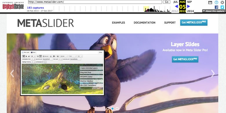
Meta Slider page from 2013

Yes, it’s a slider for a competing plugin. Interestingly, Meta Slider is still the most popular free slider plugin in the WordPress Plugin Directory. Currently, it has 800,000 active installs and the same design it had back in 2013.

No wonder people think sliders suck.

Why Sliders Actually Work: The Research

Let’s take a look at a more recent study that shows – gasp! – sliders are a worthy design tool.

Kyle Peatt from Mobify, a mobile commerce and engagement platform, spent 11 months sampling approximately 7.5 million slider interaction events on several mid-sized to large eCommerce websites that do at least $20 million in sales per year.

Why invest so much time and effort into this research? Well, as a company that develops large-scale eCommerce sites for mobile devices, many of which have at least one slider, Peatt wanted hard evidence on whether the company was doing something wrong, i.e. doing a disservice to its customers by using sliders.

Instead of being reactionary and blindly following the negative noise around sliders, Peatt decided to do his own research.

The sampling he carried out on customer websites uncovered some interesting results, which I’ll compare here with data gathered by Erik Runyon. Runyon’s analysis of sliders for the University of Notre Dame is the most cited research when it comes to sliders sucking.

1. People Do interact with Sliders

Runyon found that only 1.07% of visitors clicked on sliders in the featured banner sliders he examined for the university. For his research, he counted an interaction as a user clicking on a slide.

Peatt’s results, on the other hand, found that users interacted with product image gallery sliders at a high rate: 72% of users swiped through sliders at least once, while 23% directly interacted with sliders by zooming.

2. People Don’t Only Interact with the First Slide

Back to Runyon’s research. Of the 1.07% of people who clicked on the university’s sliders, 89.1% clicked on the first slide. The assumption would be that clicks on the second slide would trend down, right? Instead, Runyon found that clicks fell off the face of the earth – just 3.1% of all clicks.

Looking at Peatt’s results, he found that people directly interacted with the second slide of product image gallery sliders at a rate of 15.7%, and at least 64% of people advanced to the third slide – a roughly linear rate, not a steep drop.

3. Sliders Are Accessible

A lot of people assume that sliders aren’t accessible. I mean, you need to click the navigation arrows to see the next slide, right?

That may have been the case in years gone by, but nowadays sliders – like everything else on a website – are required to meet accessibility guidelines. The Web Content Accessibility Guidelines (WCAG) 2.0 provides rules for how to make sliders accessible for anyone.

Here are the guidelines in the WCAG 2.0 that relate to sliders and modern day sliders meet the requirements:

  • Guideline 1.1 – Text Alternatives: Any text you create for a slider can be read by reader software.
  • Guideline 1.2 – Time-based Media: Like any type of time-based media that is added to a slider, such as audio, video and captions, it’s up to the user to provide alternatives.
  • Guideline 1.3 – Adaptable: Sliders can use both aria and role attributes to identify regions such as navigational arrows. Other semantic elements, like highlighting parts of the text by making it bold or italic, can also be done by sliders.
  • Guideline 1.4 – Distinguishable: Depending on the sliders you’re using, it’s easy to adjust the color of every textual element, shape, arrow or bullet. For example, you could create a greater contrast between background images and layers by setting up a background color and lowering the image’s opacity.
  • Guideline 1.4.2 – Audio Control: Sliders usually provide some way to control the volume or pause it.
  • Guideline 1.4.4 – Resize text: Unfortunately, this can’t be controlled by sliders as the size of the text is usually based on the screen size.
  • Guideline 2.1 – Keyboard Accessible: Sliders allow you to use your keyboard, including for links, arrows, bullets and other slide changing controls. For some sliders, when the keyboard captures the slider itself, you can use the arrow keys to switch slides.
  • Guideline 2.2 – Enough Time: Autoplay and intervals are easy to set with sliders so you can ensure users have enough time to interact with the slider.
  • Guideline 2.3 – Seizures: Sliders generally don’t force any kind flashing. While some sliders do feature flash effects, using it is the slider creator’s choice.
  • Guideline 2.4 – Navigable: This guideline relates more to the general design of the website containing the slider, but for most sliders, you can select heading tabs and include links.
  • Guideline 3.1 – Readable: It’s up to slider creators to provide text content that’s readable and understandable. As far as sliders are concerned, you can set font sizes and control their legibility.
  • Guideline 3.2 – Predictable & Guideline 3.3 – Input Assistance: To meet this guideline, it’s up to the slider creator to consider the design of their site and slider.
  • Guideline 4.1 – Compatible: The most popular sliders have been developed using valid code, the latest HTML standards, and work on any browser and device.

I should point out that the developers behind Smart Slider 3 have closely followed the WCAG 2.0 guidelines to ensure the plugin meets the relevant accessibility guidelines. This means that any sliders that are powered by Smart Slider 3 are accessible – so long as the user also considers the WCAG 2.0 guidelines and fulfills their responsibilities in satisfying the guidelines.

The new way to build a Slider
Next generation visual editor, customizable animations & effects, and access to hundreads of premade templates.
Get Started
Smart Slider 3 - The new way to build a Slider

Is Slider Use Growing in Line with Mobile Use?

There are two important things to keep in mind when reviewing the findings above: Runyon’s data focused on a higher education website while Peatt’s looked at mobile eCommerce.

As Peatt highlights, sliders are “much more than a method of displaying marketing information on a homepage”, aka using a header slider.

“Because we focus on designing for mobile, one of our biggest concerns is making sure that we’re balancing information density with the limitations of small screens. That means making sure we’re always making the best possible use of horizontal and vertical real estate.” – Kyle Peatt

For Mobify, this means using sliders to maximize information density and maintain context without forcing users to scroll further down the page.

Sliders are better suited to retail and image-heavy websites, and when you pair these elements with mobile devices, you’re onto a winner. On mobile phones, it’s far easier to swipe through a slider of images than it is to click through a slider with a mouse.

It’s worth noting that the number of mobile phone users worldwide has grown from 4.01 billion in 2013 to 4.77 in 2017, and is anticipated to reach 5.07 billion in 2019. In addition, mobile now represents 65% of digital media time, while desktop is becoming a “secondary touch point” for digital users.

So as mobile use continues to grow and more and more people do their shopping online, I’d wager that slider use will grow too.

So… Should Websites Use Sliders?

Overall, Peatt concludes that the data opened his eyes to how much research is still needed on sliders. He suggests more data is needs to be collected on different types of sliders, how interaction with a carousel affects a user’s actions, and why swiping is one of the least-used interaction types.

Sliders aren’t automatically the best or right solution for every website. When it comes to marketing banners where users often exhibit “banner blindness,” the data shows sliders aren’t necessarily the best option. However, for product image galleries, they’re ideal because in this context, users know what the next slide holds and why they should view it.

Out in the wild, sliders are used liberally across the web – you’ve probably seen a bunch of them today and didn’t even realize it. So I’ve rounded up a collection of examples to show you how sliders are being used for just about any purpose and to show you the types of sites that are well-suited to sliders.

(I should also point out that you can create each and every one of the examples below using Smart Slider 3. It’s that good.)

Image Sliders

Marketplaces like Etsy, eBay and ThemeForest also use sliders so users can easily slide through product items.

Product slider example - Etsy
Product slider example – Etsy

You’re almost guaranteed to find sliders on any real estate website you visit, like realestate.com.au, for example. When you view a property on the site, images of the home are displayed using a gallery.

Project image slider - Realestate
Project image slider – Realestate

Even Tesla uses a slider to display the interior and exterior of its cars.

Image slider -Tesla
Image slider – Tesla

You’ve already seen one example from Squarespace’s homepage in this article, but if you scroll further down the site you’ll see the page is chock-full of sliders – and they all look stunning.

Template slider - Squarespace
Template slider – Squarespace

Sliders are ideal for hotel and accommodation sites like Airbnb that want to display a scrolling selection of options for users.

Homes slider - Airbnb
Homes slider – Airbnb

Amazon makes liberal use of sliders to display products on its homepage. The sliders it uses have been designed so you can see a hint of the next product in the carousel. It peeks out from the right, prompting you to click on the arrow so you can see the product image and description in full.

Product slider - Amazon
Product slider – Amazon

Now here’s an interesting take on slider design. On the Google Home Mini site, you can slide through different colored versions of the product using navigational arrows or by clicking on the corresponding colored buttons. As you advance through the colors, the background color also changes.

Image slider - Google Home
Image slider – Google Home

Testimonials

Almost every testimonial you see these days is in a slider, whether you’re conscious of it or not.

Take Help Scout, for example. The customer service and support platform uses sliders to display scrolling testimonials. Check out how awesome they look – the quote really “pops” thanks to the clean and focused design.

Testimonial slider - Help Scout
Testimonial slider – Help Scout

Uber uses testimonial slider to introduce a few of its drivers. The cut off image and text on the right indicates that there’s more to read.

Testimonial slider - Uber
Testimonial slider – Uber

Hero Sliders

Sliders are traditionally associated with hero headers and have copped a bad rap, mostly because they used to look really ugly and were difficult to use. Nowadays, improvements in web development and design have vastly changed how sliders look and function.

Microsoft uses a hero header to advertise its Surface Pro. There are multiple ways you can advance through the sliders – navigational arrows on either side of the image, buttons at the bottom of the image and a “play” button. It’s obvious that there are just two sliders thanks to the buttons at the bottom. The slider is also accessible so you can easily tab to move between the two slides.

Hero slider - Microsoft
Hero slider – Microsoft

McDonalds also has an accessible header slider, with clear navigational controls. It’s also obvious how many slides there are. The incentive for advancing through this slider is the chance of finding a deal.

Hero slider - McDonalds
Hero slider – McDonalds

Spotify uses a good old-fashioned hero header to advertise its premium sale. The messaging is clear and the CTA is obvious and highly clickable thanks to the use of contrasting colors. There’s nothing confusing about this slider – Spotify just wants you to “learn more” already.

Hero slider - Spotify
Hero slider – Spotify

The SpaceX hero slider scrolls through its missions quickly but the text navigation at the bottom lets you see what’s coming up so it’s clear what’s coming next.

Hero slider - SpaceX
Hero Header slider – SpaceX

Showcases

Sliders allow you to showcase your work or product, and even tease visitors with FOMO, as Lonely Planet does in the showcase slider below.

Showcase slider - Lonely Planet
Showcase slider – Lonely Planet

Likewise, National Geographic tell you “your wine adventure starts here” in its slider. Using a showcase slider, the magazine invites users to click through the images to see what else they might be missing out on.

Showcase slider - National Geographic
Showcase slider – National Geographic

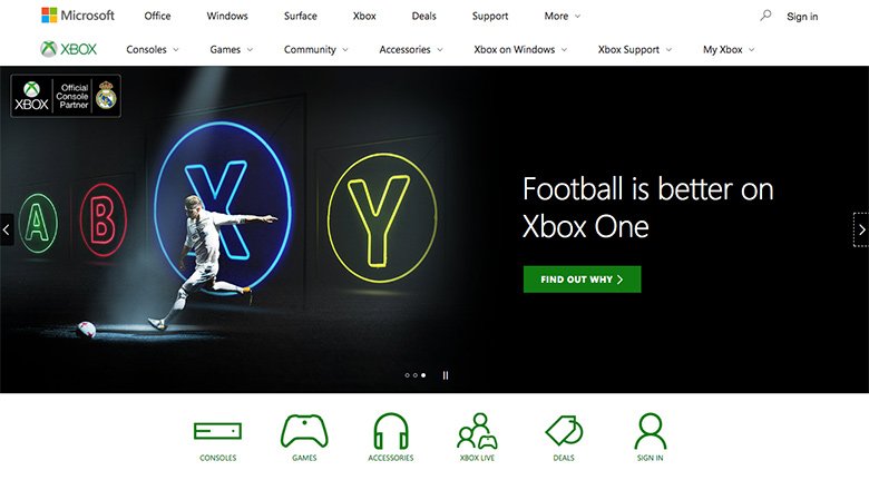
Again, Microsoft uses a slider to showcase its Xbox One and the range of games available to play.

Showcase slider - Xbox
Showcase slider – Xbox

Like with anything in web design, there’s a place for everything and everything in its place. You just have to know when sliders are right for your users – and then design and configure them appropriately.

Tips for Creating Beautiful Sliders

If using a slider, or sliders, is a good fit for your website and would benefit your users, here are some tips to ensure you use them well.

  • Design, design, design – The best sliders are beautifully designed (remember the Squarespace homepage?) and use high-resolution images.
  • Use responsive design – Make sure your sliders are responsive and look great on every device, from big desktops to small mobile screens.
  • Optimize images – Always use correct images sizes and ensure they’re compressed for fast loading. To help further speed things up, consider lazy loading images.
  • Limit number of items in slider – As the research above clearly shows, interaction with slides tends to drop off after the first image. It’s best to stick to a maximum of 3 or 4 slides.
  • Keep text to a minimum – A slider isn’t the place to display a lot of text. Instead, ensure any message you want to convey is clear and concise. And if you’re using a call-to-action button, use one or two at most.
  • Use clear navigation – Ensure your sliders are easy to use. The idea here is that users shouldn’t need an instruction manual to work out how to use your slider. Sliders that use clear controls help to encourage interaction.
  • Consider SEO – Ensure you’re using correct HTML tags with the right attributes.
  • Consider Accessibility – Don’t forget accessibility. For more, check out the W3C’s guide to sliders and carousels.
  • Always A/B test content – Hope isn’t a strategy – always A/B test your sliders so you know what content, navigation and other elements are working and not working.

Should YOU Use a Slider?

Yes… and no. Whether you use a slider or not all depends on the context. It’s silly to use a slider purely because you want to jam more content into a tight space. It’s important to think about whether the slider is appropriate for the page and the content you want to display and whether it will be useful for the user.

More research is needed into sliders and their effectiveness. The research often cited by slider haters is old and outdated. Web development and design have advanced considerably since 2013 when most of the research was released. While the Mobify data offers some insights into how mobile users interact with sliders on eCommerce sites, it would certainly be interesting to see new data on how users are interacting with sliders on non-eCommerce sites that use sliders for other purposes.

However, the Mobify research does clearly show that sliders are an ideal design tool in the right situations. Retail, fashion, photography, real estate – these types of businesses that heavily rely on imagery are ideal candidates for sliders, particularly as users have come to expect them when scrolling through image galleries when buying online.

If you do decide to use a slider on your site, be sure to consider the tips included in this article. No one likes a boring header slider – they’re so 2013. So do us all a favor and ensure you put time into designing your slider, optimizing images, using responsive design and making it accessible and easy for anyone to use.

Raelene Morey

About Author

Raelene Morey is the Chief Bird at Words By Birds , an agency that helps WordPress businesses make better content. Computer science grad turned newspaper journalist and ex-managing editor at WPMU DEV. Raelene has been developing WordPress sites for over 10 years.