There’s one thing most people do when they’re about to create a new slider. They look at slider templates and see if they can find anything they can use. Generally, this means the template needs to fulfill two criteria. First, it’s topic needs to match the topic of the site. Second, it needs to look appealing for the site owner.
It’s a common misconception that the template you choose must have the same topic as your site. You can actually choose any template you like. In fact, with Smart Slider you can completely customize any template you import. As a result, you can create a slider for your site’s topic from a template that’s totally different. So, you’re free to choose from any of our templates.
How to choose a slider template for your site?
What you should consider when you choose a template is which one helps convey your message best. For example, if your message is text based, your best bet is choosing a slider template that has lots of text. However, if your goal is to use lots of images to help deliver the message, you should pick an image heavy slider instead.
The most important thing you should keep in mind is that you can customize the template. Basically, after you import a template, you can edit it the same way as you’d edit a slide you created. If your site uses a different color scheme than what the template you like does, you can replace them with yours. Does the template use images which are completely different from your site’s topic? No problem, you can upload yours. Additionally, you can replace texts, or even remove some layers you don’t need.
What do we want to create?
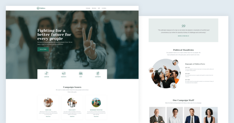
Let’s say we want to create a landing page for a political themed website using sliders. We need four main sections. One to display the campaign issues and another for the political manifesto. Then we need one for the campaign staff and to call for volunteers. And, of course, it would be useful to have some kind of navigation and a captivating header. A good quote can always strengthen the message of a political website. So it would be great to find a template where we can insert one. All in all, we need 6 sliders or blocks for our politician themed slider.
In this article we’ll show you how to create this political themed slider from another template. In fact, you can find a detailed video tutorial below what you can follow. Additionally, you can find the template ready for use amongst our template sliders.
What kind of sliders do we need?
The campaign issues section needs to showcase three issues. They are the following: senior care, public safety and environment protection. Each issue has a short description and a link to its dedicated page. So, we need a slider that can display these three elements in a nice way.
The manifesto section will display the biography of the political party. So it will be more text heavy, but if the template has an image, that’s also nice.
The campaign staff consists of 8 members. We want to display their name and occupation and also a picture so voters can familiarize with them. So, we need a slider that helps us display so many images in a nice layout.
Last but not least, the call for volunteers section. Here the most important thing we need is a CTA button, and of course a headline. There’s not much else we need here, so probably this would be the simplest section to find a slider for.
Finding the perfect sliders to start from
As mentioned earlier, you can change any template to your liking and to match your niche. We decided to use the Iceland Adventure template as the base of our political template. It has everything we need: a menu, a nice header and a block for each section we want to build. In fact, it has two extra sliders that you’re free to remove. Let’s go through each slider to see what we are going to build and what is our starting point.
1. Header section

The header section contains a menu and a hero block. It’s similar to the original header, which also contains a menu, which we kept for the Political page. However, we removed the video lightbox from the hero as we didn’t need that. Additionally, we replaced the original slider’s Shape Divider with a row. This row is another navigation element for the new page.
Additionally, the new hero has some cool effects. For example, it has a background parallax. Also, the button has a nice incoming animation to bring attention to it. While the original Iceland Adventures template had layer animations, too, they were present on all layers. So, the layer animations highlighted all layers, as opposed to focusing on one.
2. Issues section

The block under the header displays the campaign issues. We gave the original layout a main and a subheading and also some box shadow on the columns. A major change here is adding a box shadow to each column, which serves two purposes. First, it helps to present the columns. Second, it gives a nice hover effect by making the shadow darker on mouse enter.
3. Quote section
The Iceland Adventure’s quote block is a bit more fancy than what we wanted for this template. So, we removed the original template’s background video. Instead, we decided to create a single but more subtle design element. Then we set a white color as the slide background and added a solid green color behind the content. Then we replaced the avatar with a quote image.
4. Manifesto section
We changed a lot of things in this block. In fact, it barely resembles the original block at all. What did we do? First, we adjusted where (and how) the layers that are in Absolute position appear. Second, we removed the background image. Third we added a main and a subheading to this block as well.
5. Staff section
The changes on this block don’t seem to be too significant. Nevertheless, we had to make a lot of major changes. For example, the images in the original block are the background images of the column. However, for the Political template we rather used image layers to display them. The reason it was important to use image layers is because we needed the texts to be below the image.
6. Volunteer

The last section we wanted to have was a way to display a call for volunteers. So, we needed a template with a nice CTA button on it. The final section in the Iceland Adventure template is a slider which seemed perfect for this. However, it’s a slider with three sliders and we actually only need a single slide. So we decided to remove two slides from this slider. Finally, added the Ken Burns effect to the block to make it more outstanding.
Finishing touches
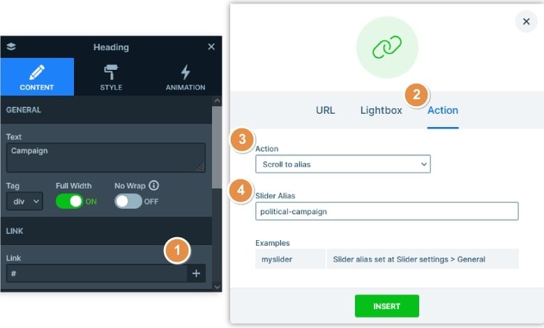
Once all sliders are ready the last thing to do is to set up the navigation. You can use the Slider Alias for the navigation and it’s easy to set it up.
First, you need to set up a unique alias for four sliders: Campaign issues, Manifesto, Staff and Contribute. When you’re done go to the Menu slider and select the first menu item. At its Link option click on the plus icon, go to the Actions tab and choose Scroll to Alias. Finally, enter the Alias you set at the Campaign slider. Repeat these with the other 3 sliders.

How to transform the Iceland Adventure to a political template?
We created a step-by-step tutorial video to show the full process of the transformation. In the video you can see how to customize the layers, edit your content and create an amazing end result. You can watch the video below:
Conclusion
Although Smart Slider has more than 150 templates, it’s possible you won’t find one matching your site’s topic. But don’t worry even if you don’t find a matching slider. You can completely customize any Smart Slider template you import. Even if its topic is not the same as your site’s, you can make any changes to make the template fit. As a result, you can actually use any template you like on your website and modify it to fit your site’s topic.
Tags: Template
About Author
Hi, I’m Ramona and I’m a member of Nextend‘s awesome support team. You’ve probably chat with me if you’ve submit a support ticket. When I’m not answering support emails I read a book or go cycling. I enjoy writing as well, both for our blog and for my private projects.


