Around this time of year, articles predicting web design trends are a dime a dozen, they’re everywhere. So I thought I’d jump on the bandwagon and write another one. Original, right?
The only difference is that this post focuses specifically on what’s happening in the WordPress world. Because there’s a helluva lot going on right now. Gutenberg, mostly. ThemeForest is still dominating as the go-to marketplace for themes. Page builders aren’t going anywhere. Then there’s the REST API and the Tide project.
In putting this post together, I looked at hundreds of themes to see what’s hot and what’s not, and talked to WordPress designers and developers to gauge their thoughts on this year’s theme and design trends.
Here’s what I found.
1. Gutenberg
Gutenberg. Everybody’s talking about it. So I can’t not mention it first. Whether you love it or hate it, 2018 is going to be the year of Gutenberg. It’s slated for inclusion with WordPress 5.0, which at the time of writing doesn’t have a release date, just sometime this year.
If you’ve been living under a rock during the past 12 months, Gutenberg is basically a new page builder that will add content block and page builder-like functionality to WordPress. When in use, it will replace TinyMCE as the default content editor.
There’s been a lot of healthy debate going on around Gutenberg. WordPress co-founder Matt Mullenweg has been pushing for it and you can read his thoughts on it here: We Called it Gutenberg for a Reason. WP Tavern has published an exhaustive collection of posts and conversations about Gutenberg here: A Collection of Gutenberg Conversations, Resources, and Videos.
Since 2010, there’s been a default WordPress theme released each year with the exception of 2017. Mullenweg said the decision to skip a year was to “keep the focus on the focuses,” for WordPress core last year, which were the REST API, the Editor and the Customizer. There will be a default this this year, however, with Mullenweg promising at WordCamp US that there would be “extra cool stuff for next year” in the Twenty Eighteen default theme.
The upcoming merger of Gutenberg into core has kept theme developers on their toes, particularly those that have products with drag and drop. Robby McCullough, co-founder of Beaver Builder, said the page builder was “in a bit of a limbo period awaiting the arrival of Gutenberg.”
“The initial release of Gutenberg is not going to provide an alternative for what Page Builders are doing now, but we know the core team is going to tackle site customization next. Our strategy is to double down on developers and web professionals. Big names in WordPress like WP Engine and Crowd Favorite trust and use Beaver Builder. We want to continue to focus on stability and features that cater to professionals and power users.” – Robby McCullough, Beaver Builder
2. More Hand-Drawn Illustrations
As far as actual design trends go, let’s kick off with illustrations and custom graphics, and how we’re seeing more of both. In past years, developers and designers have relied heavily on stock photography to fill out imagery in themes. But heading into 2018, we’re seeing the work of illustrators and graphic designers take center stage.
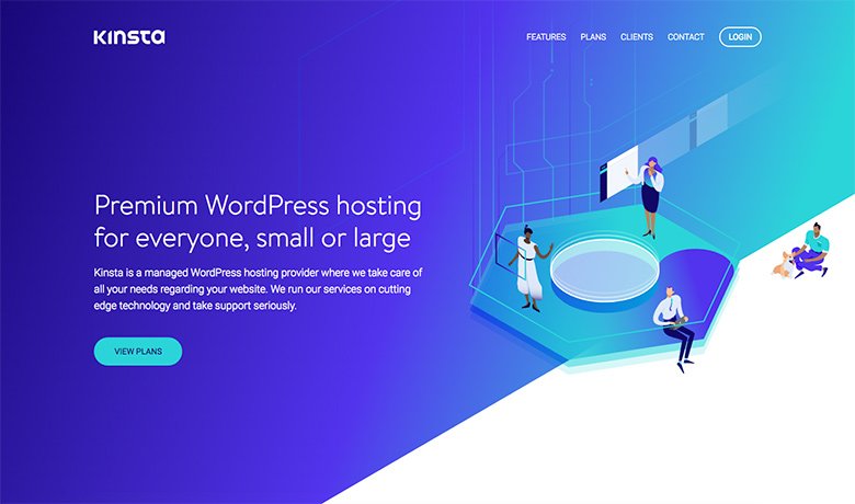
Take web host Kinsta‘s recently redesigned homepage, for example. The completely custom graphics are eye-catching to say the least. Imagine if they’d used a stock photo instead?
Brian Jackson said the competition in any WordPress niche or space was pretty fierce and to stand out, having the best features or prices wasn’t enough.
“Your design, brand, and illustrations also need to catch people’s attention. When our team discussed the idea of needing a complete refresh, there was no hesitation in outsourcing this to a professional local design agency. Even three months after launching our new site and branding we’re still working with the agency and designers to help improve other areas of our service, such as the UI in our hosting dashboard. Unless you have amazing in-house designers, let the professionals do what they do best! Working with an outside agency was a great investment for us, both timewise and getting the quality of work we wanted.” – Brian Jackson, Kinsta
It’s interesting that more and more WordPress companies are using the talents of illustrators. WPMU DEV and Yoast, for example, both have in-house illustrators on staff who create all of their custom graphics, animations and blog post feature images.
Julian Savio, the designer who creates all of WPMU DEV’s illustrations, said illustrations were able to trigger interest and create instant connections with people in a way that stock imagery couldn’t.
“Unlike stock photography, illustrations can be be uniquely created to explain complex topics, emphasize an article’s theme, or simply created to compliment a client’s site – something that would be very costly and time consuming to achieve even with an in-house photographer.” – Julian Savio, WPMU DEV
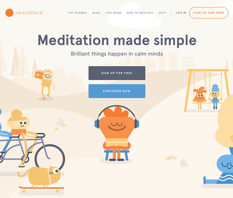
Outside of WordPress, one of my favorite examples of how illustrations have been used effectively is the meditation app Headspace. As John Moore Williams describes in his design trends round-up for 2018, “illustrations can be very powerful in bringing more abstract concepts to vivid life.”
Williams notes that illustrations can neatly resolve representational challenges posed by photography. In recent years, off-line organizations have scrambled to ensure any photography they use features a diverse mix of people. You’ll notice that Headspace’s illustrations leave specifiers like race, gender, nationality, and much more undefined, making it easier for us, as Williams notes, “to project ourselves into the role of that lone thinker, contemplating the creative possibilities illuminated by a guiding light.”
3. Bolder Typography Choices
Big, bold typefaces have been on trend for a couple of years now and you can expect to see more of it this year. Not only are bigger fonts ridiculously eye-catching and hard to miss, but they fill white space well and allow businesses focus their message.
ThemeFuse’s Dimi Baitanciuc said it wasn’t too long ago when using custom fonts on the web meant having to include them as rendered images with JavaScript.
“It was a mess. Now you just embed Google Fonts (it’s free), Typekit (if you want a premium top notch option) or even a custom font you purchased. The access to thousands of custom fonts empowered designers to create very cool typography on the web. I think typography will always be an important aspect, and we’ll continue to see great typography in websites in 2018.” – Dimi Baitanciuc, ThemeFuse.
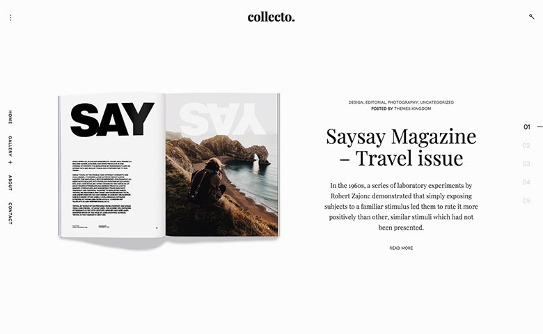
Serif fonts are also everywhere right now. They’re classy and bring to mind feelings of elegance and literary polish, both of which are evident in Themes Kingdom’s Collecto theme:
4. Broken Grid Layouts
Designers are breaking free from the constraints of grids, creating rule-breaking layouts with images and text that overlap and converge. Some designs even look like they are unintentional errors that are the result of broken CSS.
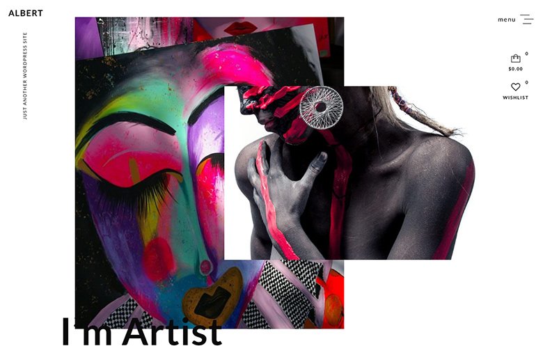
A quick scroll through ThemeForest and you’ll see the majority of themes play it safe, sticking to the same ‘ol layouts they’ve been using for years and trying to secure sales using tried and trusted designs techniques. A bit boring if you ask me. However, some themes like Albert are embracing modern trends.
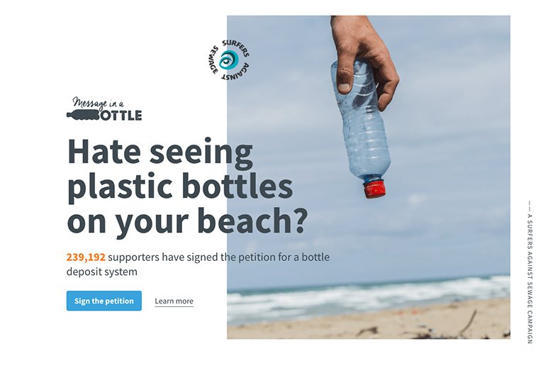
Outside of WordPress, sites like Surfers Against Sewage and Roccafiore Winery use broken grids more subtly.
5. CSS Grid
“…the web is about to become a much more beautiful place than what we’re accustomed to,” according to Robin Rendle on CSS-Tricks who goes on to explain that CSS Grid is the “first real layout system for the web.”
“It’s designed for organizing content both into columns and rows and it finally gives developers almost God-like control of the screens before us. That means that we can finally ditch decades of hacks and workarounds for setting elements on a web page – ultimately it means that complex layouts and beautifully typeset pages are now not only possible but easy and maintainable.” – Robin Rendle, CSS-Tricks
Themeco’s Kory Wakefield, a lead developer for the popular X theme, said that with all the incredible new layout power that CSS Grid offered, he was excited to see what creative solutions developers would come up with to age-old layout problems, not to mention the potential for new design patterns and approaches compared to flexbox.
“I might even go so far as to say that using CSS grid for all layout considerations is better in terms of consistency, a more readily apparent mental model, and greater control over the relationships between cells across rows. I also love that I can create “self-referential” layouts that respond to element size rather than global media queries using CSS grid’s minmax()function. It gives me just a tiny glimpse of what using “container/element queries” down the road might be like if we ever get to see such features developed, and it’s a very powerful tool to have at your disposal.” – Kory Wakefield, Themeco
6. Brutalism and “Ugly” Websites
Big, bold blocks of web safe colors, lots of white space (though it usually isn’t white), color combinations you’d never think to use (think blue and pink), and even links that are hard to find… yes, you’ve stumbled across a site with a brutalist design.
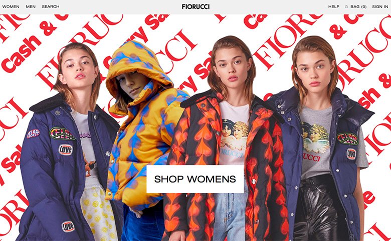
Brutalism comes from the French word for “raw”. At first, many brutalist websites look like a horror show of random images and clashing colors and fonts. But there is some method to the madness. Well, sort of. Interestingly, fashion websites such as Gucci and Fiorucci have embraced this trend.
7. Louder, More Vibrant Colors
Dropbox made a splash and got designers talking when it launched its redesigned website, surprising everyone with its bold use of color, a huge departure from its previously clean design.
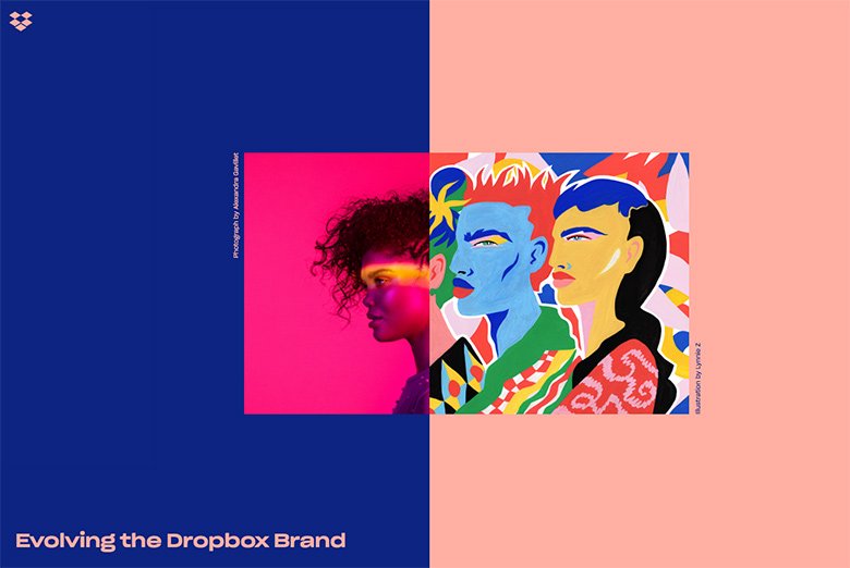
We’re going to see an excess of colors online this year as designers say goodbye to web-safe colors and continue to experiment with bolder color combinations and super-saturation that looks amazing on retina screens.
There are explosions of color on ThemeForest, especially when you search for newer themes. Pinata is a fun example and offers multiple homepage designs using lots of bright colors.
Inside The Head, an online publication inspired by the delusions, confusions and illusions experienced by young adults, used bold, block colors in combination with gentle animations.
8. Dynamic Gradients Are Back
In 2018, they’re making a come-back in their own right with loud, bright colors. We’re also seeing gradient filters over photos – a great way to breath life into less interesting images. Take the Ivery theme, for example, which features a large photo over a gradient background.
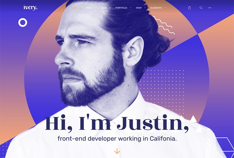
The folks at Wyde Themes who created the Ivery theme said gradients were on-trend for two reasons: they allowed for unique color combinations and were memorable.
“As you know, there are not enough different colors in order to let brands create their unique identity. When using gradients, you can fade two or more different colors so you have something that feels like a new color and unique. Also, we don’t see gradients in web design a lot. Our eyes catch them as something new. We remember these unusual colors much better than usual and flat colors. And, of course, being memorable is exactly what you want for your design.” – Wyde Themes
Stripe is a prominent example of a site that uses gradients to create a sense of movement.
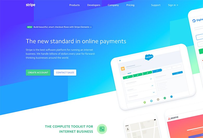
The great thing about gradients is that they can provide an on-trend solution for sites that lack photography, illustrations or other imagery.
9. Microinteractions and Animations
The things about microinteractions is that they’ve become so pervasive now that when you come across a site that doesn’t have them, they tend is feel a bit boring and lifeless.
These small moments are the little bits of magic that delight and surprise users. At the same time, they provide the subtle animation needed to direct a person’s attention to the right content at the right time, ensuring site visitors don’t miss crucial links of copy or important CTAs.
The popular Bridge theme uses microinteractions beautifully in its Bakery demo, bringing to life the everyday elements you would find in a kitchen as the homepage loads.
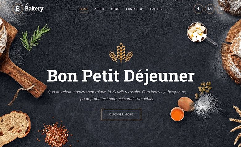
The designers at Qode Themes who create Bridge’s demos said thanks to touch devices and apps, users had come to expect microinteractions online.
“We think that striving to integrate or to replicate similar functionality for WordPress themes is very good because users who are already used to this will recognize similarities and they will appreciate it. In short, when you are used to something which is good, you don’t want to change it, and offering the same thing will make users comfortable using your product. Designers have recognized this, and we think that the popularity of this trend will continue for some time.” – Qode Themes
10. A Greater Emphasis On Copyrighting and UX Writing
“Words are really important because the graphics don’t make sense sometimes.” So says John Maeda, Automattic’s head of computational design, in his 2017 Design in Tech Report.
As it turns out, code isn’t the only unicorn skill. Copywriting, and more specifically user experience writing, is finally being acknowledged as necessary to web design. It’s still an emerging field, but as Google explains, the role of a UX writer is someone who helps “shape product experiences by crafting copy that helps users complete the task at hand.”
MailChimp is my go-to example for UX writing. If you’ve ever used it, you’ve probably felt a little pinch of anxiety just after hitting send on an email that’s going out to thousands of people. The folks at MailChimp know that feeling, so their email success message helps lighten the mood:
By itself, the animation is fun, but it doesn’t mean much without the words that go with it and provide meaning and context.
As a UX writer myself, I’m really excited to see that copywriting is becoming an important role in web and product design. Interestingly, more and more theme developers have reached out to me in recent months, asking for help with copy because Lorem Ipsum just doesn’t cut it anymore.
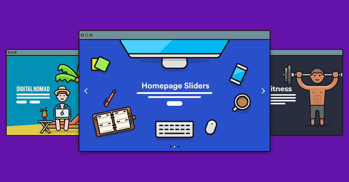
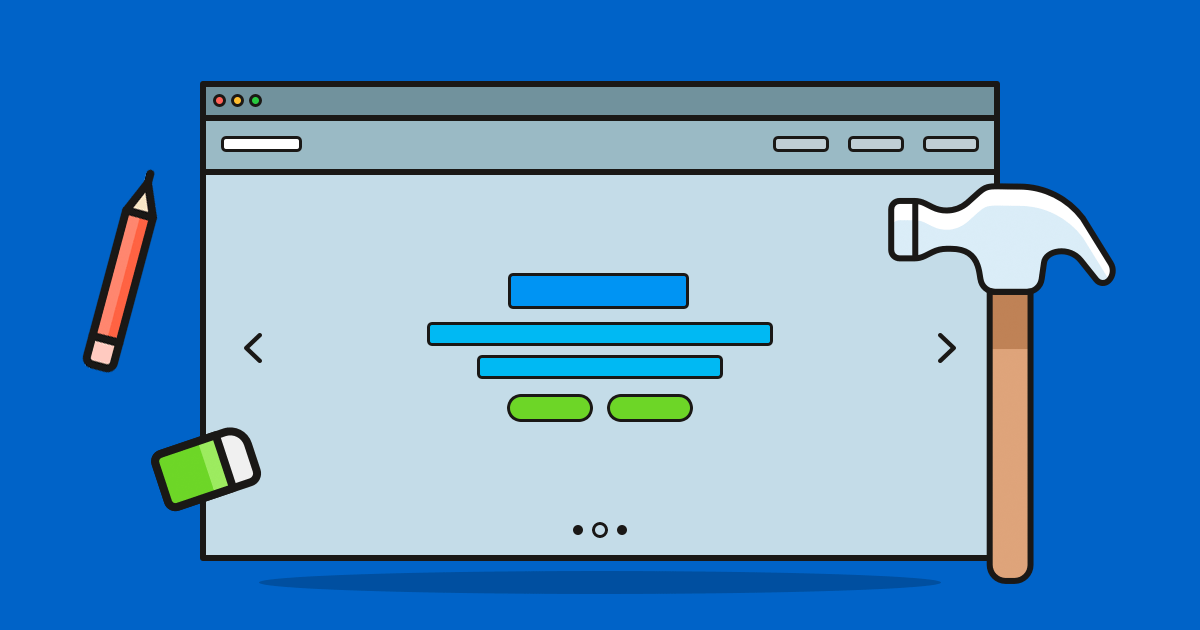
11. Sliders Will Become Even More Pervasive
I want to say that sliders are making a coming back, but the truth is, they didn’t go away in the first place. Whether you realize it or not, sliders are everywhere.
I wrote about sliders recently for this blog and provided extensive proof of the pervasive nature of sliders in modern web design, how companies big and small are using them, and that – for the record – they don’t suck.
I don’t want to reinvent the wheel, so check out the post for more. But here’s a sneak peek of one of my favorite modern implementations of a slider:
12. WordPress REST API
The REST API has been around for a couple of years now and while WordPress development agencies are using it extensively to build custom projects for enterprise-level clients, it’s yet to become a mainstream inclusion in everyday themes.
There are some themes that use the REST API, such as the Wallace theme and Foxhound, the latter of which is a React-based them and the first in the WordPress.org directory to use the REST API endpoints included in WordPress 4.7.
At last year’s WordCamp U.S. Mullenweg said the REST API still needed a lot of work to make it a “first-class citizen” in the WordPress world. So it will be interesting to see how it evolves and how agencies continue to use it to create WordPress projects that look nothing like WordPress.
13. The Tide Project
Last, but not least, I want to mention Tide, a project that XWP, Google, Automattic and WP Engine have teamed up on in an effort to raise the code quality of themes and plugins across the WordPress ecosystem. As Rob Stinson explains on the XWP site:
“Tide is a service, consisting of an API, Audit Server, and Sync Server, working in tandem to run a series of automated tests against the WordPress.org plugin and theme directories. Through the Tide plugin, the results of these tests are delivered as an aggregated score in the WordPress admin that represents the overall code quality of the plugin or theme. A comprehensive report is generated, equipping developers to better understand how they can increase the quality of their code.” – Rob Stinson
The project is still in development and, according to WP Tavern, the Tide team is continuing to experiment with different ways to making the plugin audit available data, as well as refining how the data is weight when delivering a Tide score.
13 + 1: Elementor Page Builder
If you want to create posts and pages for your WordPress website, then a page builder plugin is the best way to do so in 2018. Elementor is not only the fastest growing page builder, but also one of the most popular WordPress plugins of all time less than two years after launch. With over 800.000 active installations, and a 4.9 out of 5 stars rating based on 720 user reviews.
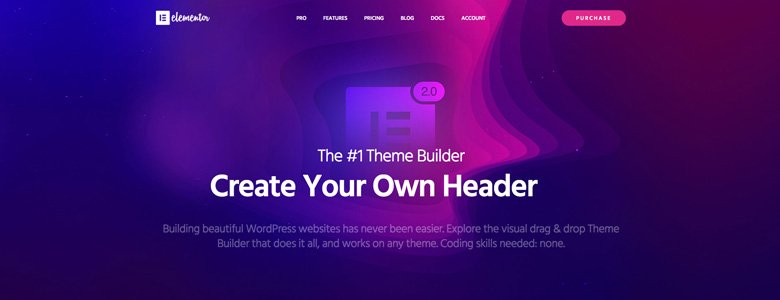
“Elementor Theme Builder is the perfect all-in-one tool to take your theme design to the next level. Visually customize your header, footer, single post and archive page without using any code. Take control over your theme design, customize different styles for different blog categories, edit ACF content. What used to take hours of PHP code can now be done in minutes.” – Ben Pines
What Do You Think 2018 Will Hold for WordPress Theme Design?
Looking back on what’s I’ve covered in this article, there’s so much going on right now in design. I had to leave some things out, such as page transitions and unexpected scrolling rates, that were trending in 2017 but look to be sticking around this year.
It’s great to see so many theme designers and developers experimenting with the latest design trends and creating some truly gorgeous themes. But at the same time, it seems some theme authors are stuck in the dark ages and haven’t updated their themes in years.
Do you have a favorite trend or one you think I’ve missed that you’d like to highlight? Let us know in the comments what your WordPress design predictions are for 2018.