
💡 Best features in this slider
- Highlighted heading layer
- CTA button
- Image layer in absolute position
- Animated shape divider
- Arrow control
Settings
A banner is one the most important parts of your site. This is the slider the visitor sees first when they arrive on your site. So it’s crucial to have a well-thought banner with quality images and content. And, of course, it’s important to let the users know there’s more content for them to see. One of the best tools for this is creating an automated rotating banner. This way you can replace the slider’s content and images alike automatically. Of course, this should happen after the visitor had enough time to learn what’s the slide about.
It’s critical to leave enough time for the visitor to read the content of each banner. Otherwise, they’ll get frustrated. Frustrated users might leave your site instantly without having a second thought. Providing a way to navigate back and forth between the banner slides are just as vital. This allows people to navigate through your slides and find the one that interests them the most.
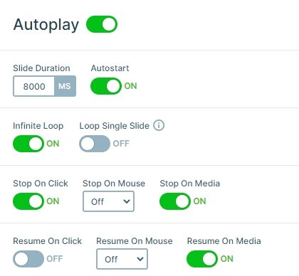
This slider rotates automatically after 8 seconds. This leaves enough time for visitors to read the texts and helps them know there’s more to see. There are stylish arrows at their disposal to speed up the slide rotating process. And just above every slide’s heading there are small images which serve the same navigational purpose.
Layers
This slider contains image layers, a highlighted heading, a text layer and a button layer. When you create an automated rotating slider, you should always use quality content. This includes short, attention raising texts and good images. The colors are also important to get the visitor’s attention. For instance, if you have a CTA be sure that it’s easy to notice. Use different colors and greater font size or even another font family. Basically, do everything to make your CTA stand out but keep the nice and clean look of the banner.

Regarding the texts: make sure they have good legibility. Use font colors that have high contrast with the background and choose a font family that’s easy to read. When you create an automated rotating slider, avoid using lots of texts. People won’t have time to read them, and constantly having to go back is frustrating. Write short and clear text and rather offer a read more button if needed. This allows the visitors to learn more and lets you keep a nice and clean banner.
Animations
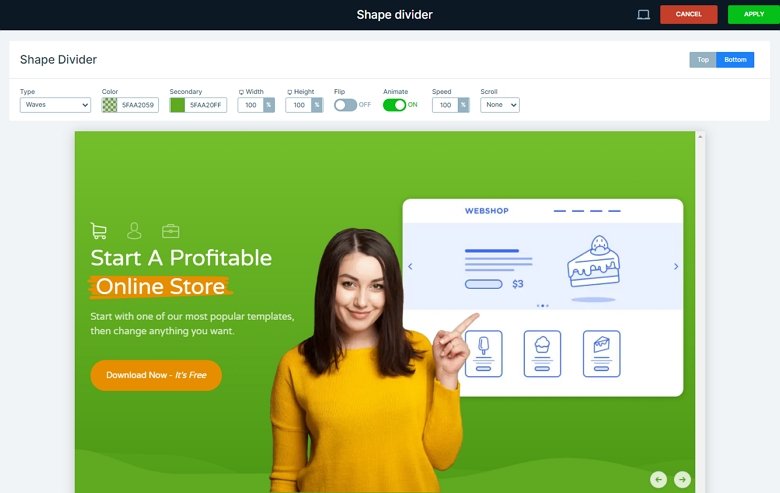
You can see more kinds of animations on this slider. The first, you will notice is the animation on the layers. The 2 main columns of the slider have a layer animation, the left side goes to the bottom, the right side to the top. Besides that, you can see a continuous animation in the background, the 2 colors animated shape divider. You can customize the shapes at the Animations tab of the Slider settings.
Layout
Once you have your beautiful images and the perfect title it’s time to create the actual slider. To create the automated rotating banner example on the top of this page, we mixed Smart Slider 3’s two positioning options, default and absolute. Absolute positioning works like PhotoShop, you can drag your layers anywhere on the canvas. Default positioning builds your content using structures. It allows you to create a slider which has great responsive behavior. And the best part is, you won’t have to spend hours to achieve that. The good result is instant.

On this slider you can find all content at the back of the slide. That’s right, the texts on the left and the image on the right are both in default position. This lets the texts keep their legibility on small screens, which is always good. You can also manage your layout faster and better. There’s only one layer in absolute position, the one on the front showing a different person on each slide.
Responsive
When you check the slider in tablet or mobile, you can see that the image in the absolute position is hidden. With hiding this layer we have enough space on mobile, and the visitor can focus on the content of the slider.
Related Post: 11 Beautiful Full Width Slider Examples
Related Post: Add Beautiful Section for your Website with Shape Dividers


