Slider Settings
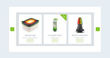
This template uses a Carousel slider, which is a great option for displaying multiple slides side by side at once. Since it’s a full-width slider, it makes the most of the available screen space. You might also notice a background image behind the slides that stays in place as the slides move.

There are several ways to navigate through the slider. The most obvious are the arrows on either side of the slides. For touch screens, you can swipe to browse through the slides, and for desktops, you can easily drag them with your mouse.
With Carousel sliders, you can customize both the slider size and the size of the individual slides. The slides shown next to each other are grouped into a single pane. You can set a maximum width for this pane, which allows you to control how many slides are visible at once. In this particular slider, there are 6 slides displayed in each pane.

Layers
The Brew Yourself template uses some of the more common layers, like image, icon, heading, text, and button. But if you look closely, you’ll notice a few unique ones as well.
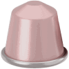
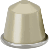
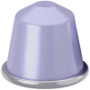
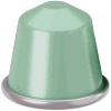
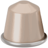
For example, the backgrounds behind the capsules are created using an Image Area layer. Unlike a standard Image layer, the Image Area layer allows you to cover a specific area with your chosen picture. It can even crop parts of the image to fit perfectly, making it highly customizable. These are built using absolute layers, giving you full control over their placement.

Another interesting element is the Area layer, which you’ll see on each slide. This is an empty layer that lets you fill the background with color. It’s perfect for creating the colorful, growing animations behind the capsules. As the background expands, it adds an eye-catching effect to that part of your slide. Like the Image Area layers, these are also absolute layers, ensuring they look exactly how you want them.

Animations
The Main Animation of this slider moves horizontally. One special setting for carousel sliders is the Single Switch option, which lets you move through slides one at a time. Another option is the Justify Slides, which controls how slides are positioned within the slider pane. In this case, the Center option is chosen, so the slides are aligned in the middle, with a minimum distance set between them.

You might also notice a hover animation on the slides. This effect is created using IN and OUT animations on both absolute layers as well as the capsule image layer. For the Area layer’s IN animation, the Easing is set to Quad in, with the layer scaling up by 1% on both the X and Y axes. For the OUT animation, the Easing is set to Quad out, with the same scaling settings.

The image area layer has a similar IN animation but with a slight delay. Its Opacity is set to 5%, and it scales to 100% on both axes. The OUT animation follows a similar pattern. The capsule’s image itself has a nice rotation effect. It rotates 45 degrees on the z-axis and scales up by 20%.
Each of these animations is triggered by specific events. They play when the mouse enters or leaves the slide, using the SlideMouseEnter and SlideMouseLeave events. This means the animations respond directly to mouse actions.

Layout
The layout of the slides remains consistent throughout the whole slider. If you open the Layer list, you can view all the layers that make up your slide.

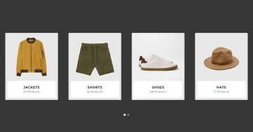
As mentioned earlier, the Carousel slider can show multiple slides at once. The number of slides it can display depends on a few things, primarily the slide size you’ve set and the overall slider size. The narrower the slides are, the more of them can fit into the slider.
So, if you want to display more slides at the same time, you can simply adjust the slide width by reducing it, this allows for more slides to appear within the same space.
Responsive
By default, all navigation elements are hidden on mobile, but in this case, the bullets are used to indicate that there are more slides to view. Since this type of slider only shows one slide at a time on smaller screens, the bullets come in handy for navigation.

With carousel sliders, as the screen size gets smaller, fewer slides are shown at once to maintain the original slide sizes. This makes it easier to ensure the carousel looks good on mobile devices. If you want to make additional responsive adjustments, there are plenty of options available. For example, you can hide certain layers on smaller screens or reduce font sizes.