Slider Settings
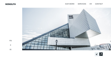
The Around the World is a beautiful full-page slider that fills up your whole screen. It’s got three separate slides and it plays through them automatically.
Additionally, you can switch between these slides by dragging or swiping on your phone and clicking the arrows in the bottom right corner.

But if you wish you can customize the slider to make it your own. Just adjust the Size and Control settings to match your style.
Layers
Each slide comes with the same set of layers: a video serving as the base for the content, some images, a few bold headings, and an accompanying text to communicate the message effectively.
What’s more, the slider supports MP4 video format, which is currently used in this slider template.
Additionally, you can add links and interactive elements easily. Whether it’s to direct users to another page on your website with a simple button click or to enable smooth navigation between slides, like here with the arrow images, your site can be turned into a more interactive experience for your visitors.

Animations
The Around the World slider features eye-catching animations that bring your content to life.
You can see the textual and image layers gracefully reveal, starting with the main content elegantly appearing on the left side of the slider. Then, the bottom right content and its navigational arrows make their entrance.

These not only look impressive but also cheer up your site, enhancing the overall user experience. Plus, with the ability to synchronize these animations in the timeline, you can create animations that capture your audience’s attention.
Additionally, the Main Animation keeps things simple in the background by adding a subtle horizontal animation between slide-switching, ensuring that your content shines every step of the way.
Layout
The slider presents a 2-column layout, designed to maximize both functionality and aesthetics. On the left column, you’ll find your textual content, while the right column has navigational elements at the bottom, each with its own customizable settings.
But that’s not all, conveniently located within this layout, you’ll also spot thumbnail images of the other slides, providing a sneak peek into what’s to come.

And let’s not forget about the absolute layers, adding an extra layer of visual appeal, you can find decorative elements subtly improving the layout at the bottom of the slider. However, stealing the spotlight is the continuously playing video in the background.
Responsive
Smart Slider offers a variety of tools to ensure your slider looks its best, even on smaller screens.
When you preview your slider on mobile devices, you’ll notice that the columns gracefully wrap under each other. This automatic adjustment optimizes space, allowing your content to look good on every screen.
Additionally, you can adjust font sizes independently for each device, as well as fine-tune margins and padding around layers. This lets you have full control over every aspect of your slider’s appearance.


