Settings
The Showcase slider is another special slider which is easy to create with Smart Slider 3 Pro. Like a WordPress Carousel, it can display many slides at once and that’s great to show your posts. The biggest advantage of the Showcase slider is that it keeps one slide in the middle. This helps the visitor focus on one post at a time while they also learn that there is more content to see. In a carousel slider the number of sliders you can see depends on the space there is in the pane, but the showcase slider type can even show a part of the next and the previous slider.
If you want to use this demo slider as a dynamic slider, you can follow our documentation. First you should import this template, and click on the slide what you want to use, and copy it. Then you can create a dynamic slide, and set the dynamic generator. Finally you can paste the copied slide, and you can replace the layers’ content with variables, and they will change dynamically. You can replace the date, the author, the title and a short description of the post, also you can put the link of the article on the heading layer.
Layers
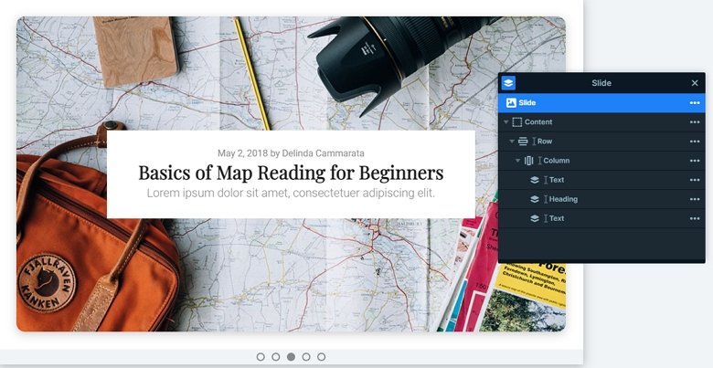
Each slide contains 2 text layers and a heading in the middle. These layers are under each other in a one row one column structure. The content layer has 650px maximum width which limits the width of the layers, too.
Animations
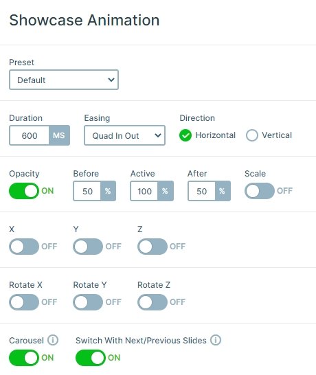
The showcase slider switches their slides horizontally. The previous and next slides have 50% opacity, so you can focus on the slide in the middle. If you click on the next or previous slides, you can switch slides, and if you have enough slides in your slider, you can make a continuous circle, so after the last slide the first will come.
Layout
Clicking on a not active slide, the slider switches to that slide so the visitor can check its content. This is a nice and convenient way to encourage the visitor to check more slides and posts. Besides, there is an option at the showcase type sliders that you can reduce the space between the slides if you set the slide distance to 0. And you can customize the active slide, the previous and next slides as well. There is an option to change their opacity, or you can rotate or scale them.
Responsive
All of the layers are visible on smaller devices, but they are a bit smaller. You can change the font sizes with the text scale option which is a device specific setting, so you can set it on each device differently.
Related Post: Enrich your Blog with a Post Slider
Related Post: 11 Beautiful Full Width Slider Examples


