Settings
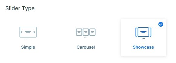
Fancy sliders and colorful images might not suit all websites. The Testimonial Showcase slider is a great choice to show customer feedback when you need something simple. The color palette contains mostly light colors, like the gray slider background color.
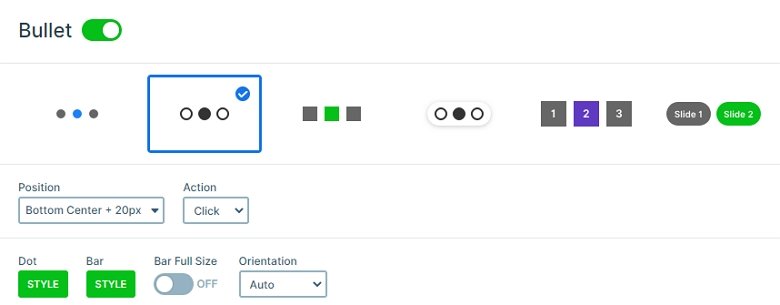
The button and bullets have the same color, which encourages visitors to take action. They’re both green, which stands out and makes them noticeable.

Layers
Each slide contains 2 heading layers, a text layer, a button layer and an image layer. The image layer is a colored element in the slider, so the visitor can focus on the star rating at the top right corner. This rating shows how satisfied the customer is with the product or service in a visual way. This visual display highlights the rating and helps to build trust.
This slider does not have customer avatar, but it has a nice title instead. This title summarizes the testimonial text and highlights what they like the most. Right next to the customer’s name there’s a date, which shows how up to date their testimony is. This helps showing how trustworthy the product or service is. For instance, if there’s lots of recent good reviews that means the quality is still high.
Animations
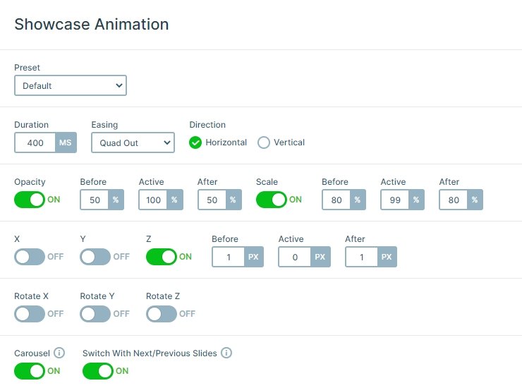
The slides switch with a nice animation, which fits the slider perfectly. You can switch a slide with clicking on the previous or the next slides, you can drag with your mouse, or use the bullets on the bottom. At every slide switching you can see that the slides are coming with a horizontal animation.

Layout
What’s the best part of this slider? It displays three slides at a time. The active slide is in the middle. On its right and left side there’s the next and previous slides respectively. This makes it clear for visitors that there are more testimonials to read.

Responsive
The mobile behavior of this slider is special. Instead of displaying the whole testimonial text, it shows the title, name, rating and a button. The button has the Read More text on it, which encourages the visitors to go and read the full testimonial. This practice helps to keep the slider height small. Not having to scroll through a long slider improves the user experience. The fraction of the next and previous slides show still, but the bullets are hidden. The mobile visitors can switch slides by swiping left or right.
Related Post: Best Testimonial Slider Examples for WordPress
Related Post: Create a Unique Layer Slider with Smart Slider 3
Related Post: 11 Beautiful Full Width Slider Examples


