Slider Settings
The Office Exercises slider template uses a simple slider type. You have probably seen this type of slider on many websites. The cool thing about these sliders is that they show one slide at a time, so visitors can easily check out every part of it before moving forward.
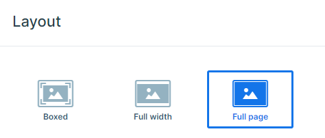
Moreover, this template has a full-page layout. This means that it takes up the entire width and height of your browser’s viewport. Therefore, when you open this slider, all that’s visible on your screen is the full-page slider. So there are no distractions.
You have three ways to browse the slides. On a smaller screen, the easiest option can be dragging the slides horizontally to switch between them. However, there’s more, on smaller screens you also have the option to use the bullet points and select the slider that you would like to view. They are especially useful when you want to see how many slides are available.
In addition, if you are on a desktop, you have a third option. You’ll see arrows on either side of the slide, so you can click on those to move between the slides. It’s entirely up to you.
Layers
Smart Slider 3 has some awesome layers that you can add to your slides to make them look even better. You can add headings and text to your slides, as well as buttons and images.
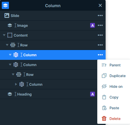
In the Office Exercise slider, you can play around with many different layers, but the Image Area layer stands out the most, which is used as an absolute layer. It’s perfect for adding a bit of design to your slides, and it’s super easy to manage too. All you have to do is click the layers icon at the top and you’ll be taken to the layers list. You can check, copy, paste, delete, hide, duplicate, or reorder the layers here.
Animations
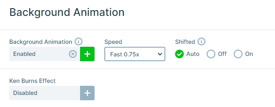
The Office Exercises slider is full of animations. You can notice an animation effect on the slider’s background when you switch slides. For the Background Animation, we used the Slices-Simple animation, which makes the background move in a special way.
In addition, each time the slider loads, you can see the layers move in from different directions, or be revealed in different ways. These are the layer animations that you assign to each layer, to introduce them in a fancy way.
To easily manage the layers’ delay and duration use the visual timeline at the bottom of your slide editor.
Layout
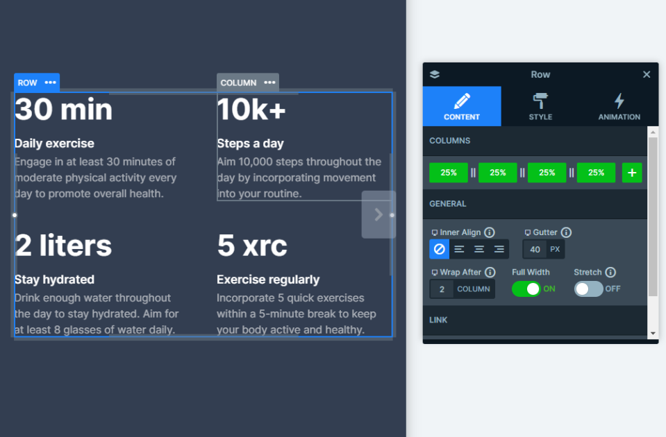
Most of the slides are using a 1 row and 2 or 3 columns structure. Each layout makes use of Smart Slider 3’s useful features. Like the columns and row settings, where you can adjust each layout to your own preferences.
The Numbers slide shows a layout where all of the columns have the same space between them. This is the result of the Gutter setting, which was used on their row container. Another very useful setting is the Wrap After feature, which is very useful if you want to adjust your layouts to different screen sizes.
Responsive
Smart Slider’s responsive settings are designed to make your life easier. It has a “Hide On” option which helps you out by hiding layers on smaller screens. Furthermore, the Font Resizer is another great feature that Smart Slider 3 offers. With it, you can easily optimize your text for every device, so your slider looks great no matter what screen size your visitors are on.
The best thing about its responsive settings is that it will make your visitors’ experiences as smooth and pleasant as possible, whether they are on a small or large screen.
