Settings
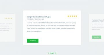
The Monolith Energy template comes with a showcase slider that you might’ve seen on other websites. It’s super useful because it lets you display multiple slides at the same time. The one in the center grabs all the attention, while the slides on the sides kind of hang out in the background, making it easy to switch between them.
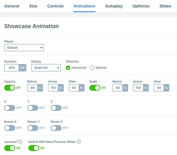
The slider stretches across the full width of the screen, so it’s just you and the slides, no distractions. To make the center slide stand out even more, the side ones are a little transparent and slightly smaller. All of this is set up using the Animations tab, so it’s pretty customizable.
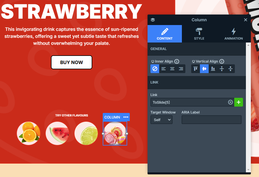
There are many ways to navigate the slider. On smaller screens, you can swipe left or right to scroll through. On desktops, just click on the next or previous slide to move along. Plus, there are the little circular thumbnail-like buttons at the bottom left that let you jump straight to any slide you want. They also give you a quick look at how many slides are in the slider. You can set those up using the link action options in the element’s content settings.
Layers
Each slide in this slider is built using the same set of layers. You’ll see the basic layers, like Headings, Images, Texts, and Button, across all the slides. But there are also some standout layers.
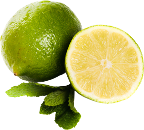
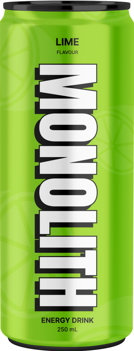
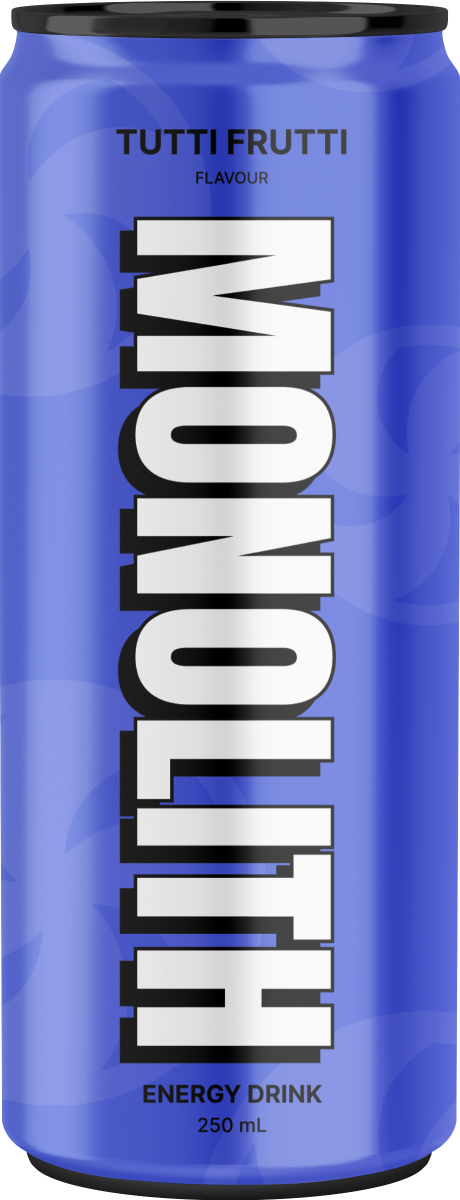
Take a look at the slide backgrounds, for example. On both the left and right sides, there’s a slightly see-through layer that adds a nice touch. These are added as Image Area Layers, which you can resize however you want, and the image will automatically adjust to fit. They’re set up as absolute layers, meaning you can easily move them around by dragging and dropping them anywhere on your slide.
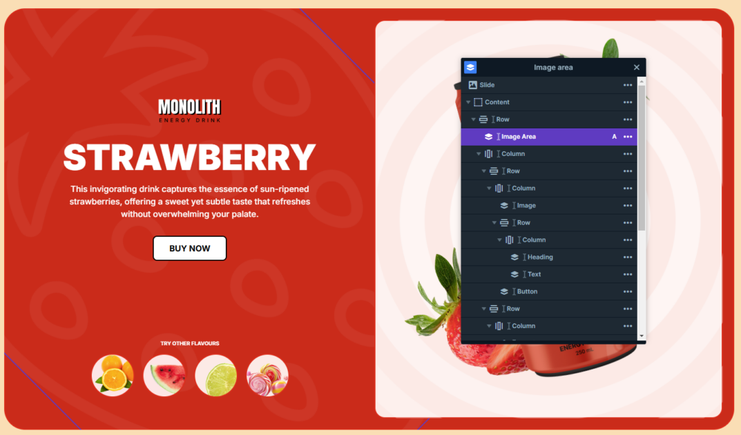
To keep everything organized while you’re editing, you can tell the layers apart by their colors in the Layer List. Absolute layers are marked in purple, so they’re easy to spot. These layers are linked to other layers at the same level. When you link an absolute layer to another layer, it stops being positioned based on the slide or the default parent layer, and it becomes attached to the one it’s linked to instead. In this example, the small images are linked to the middle one.
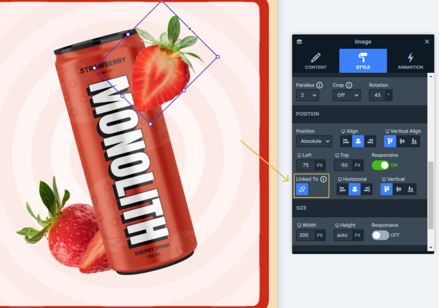
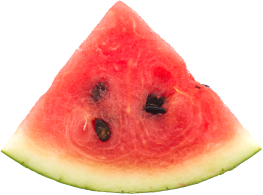
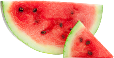
You might’ve noticed some effects on the right side of the slides, like the nice moving effect when you hover your mouse. It’s thanks to the layer parallax setting. Just hover over the images on the right side, and you’ll see it in action.
Animations
This slider has a bunch of effects that make its layers feel more interactive and engaging. One standout is the layer parallax effect we mentioned earlier. You’ll also notice some nice incoming animations throughout the slider, which make each element’s entrance way more eye-catching.
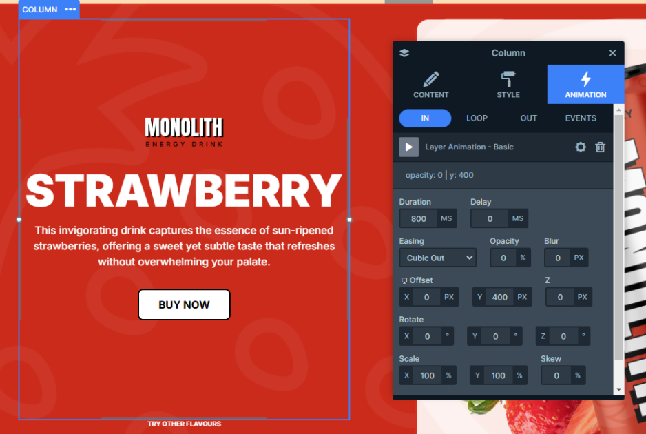
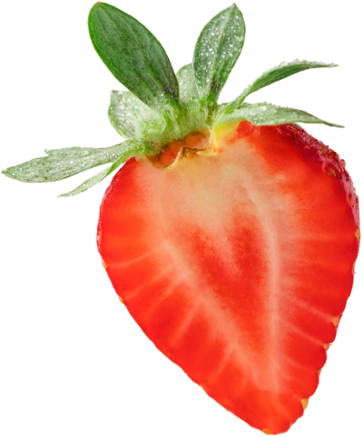
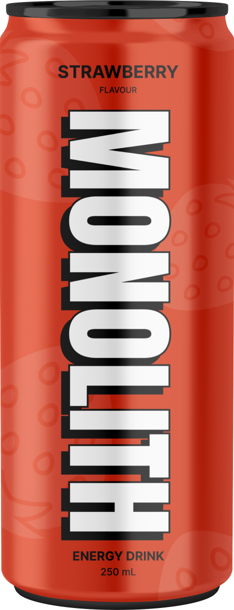
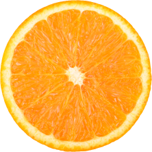
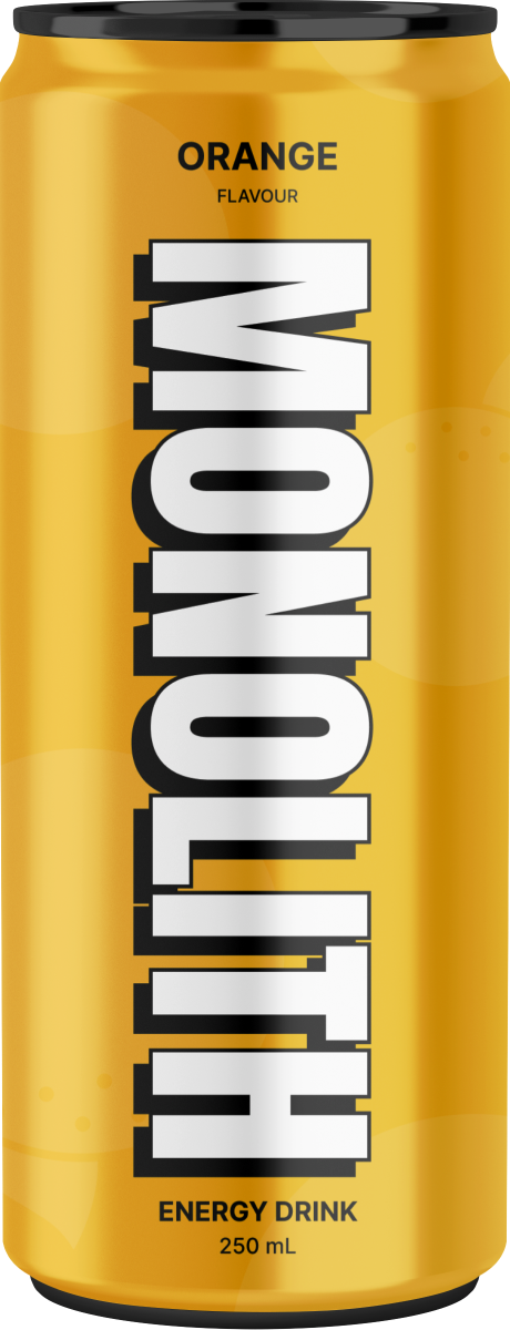
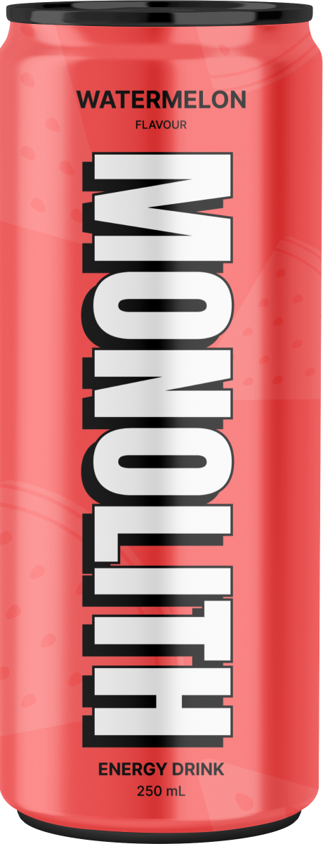
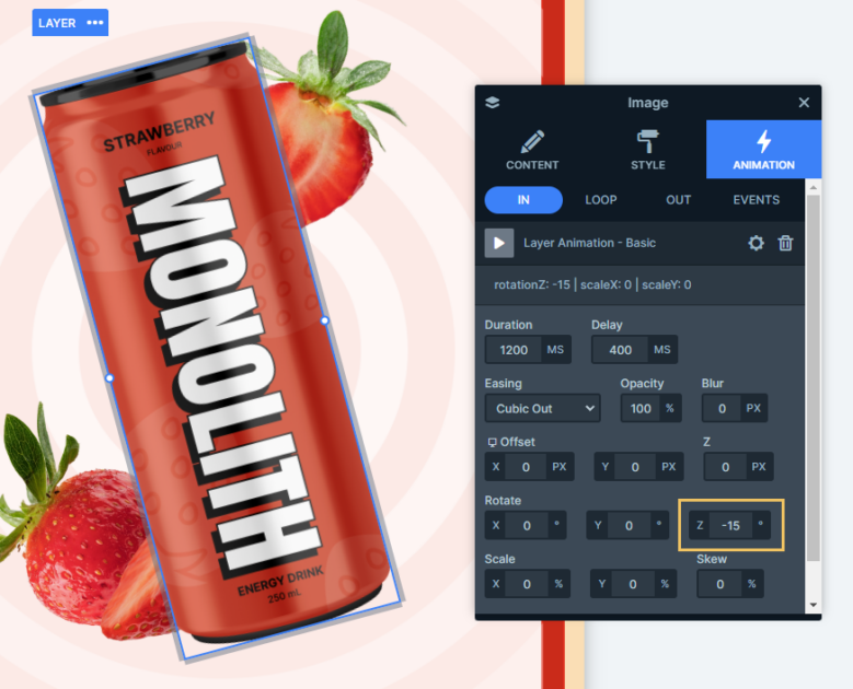
Take the left side, for example. One part of the content slides in from the top, while the other comes up from the bottom using the Offset setting. Over on the right side, the rotated images have their own animations. First, the image in the middle rotates into view, and then the smaller images appear, coming out from behind it.
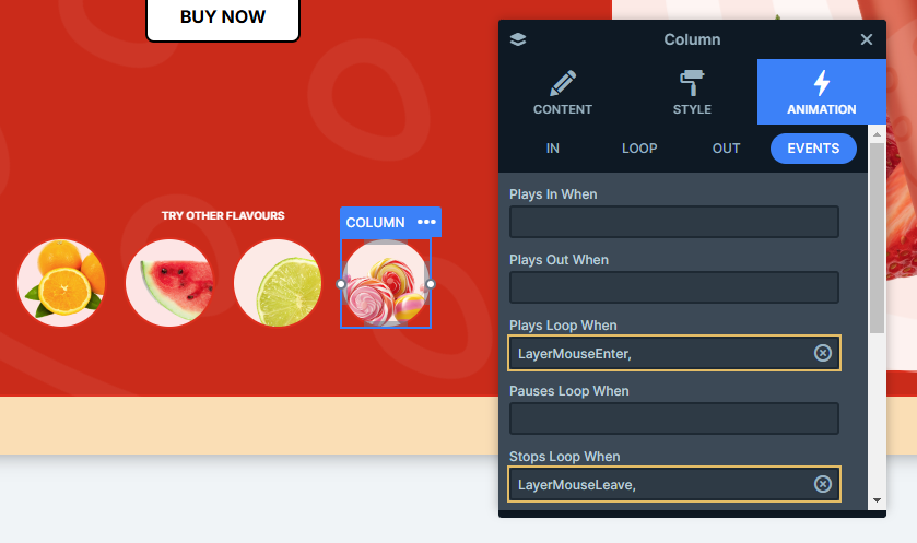
Even the thumbnail-like images have their own animations. They’re added as loop animations and when you hover over them, they scale and rotate for a nice interactive touch. These animations are all event-triggered, meaning they start playing when your mouse enters the layer and stop when your mouse leaves.
Additionally, the slider is set to autoplay. That means it moves through the slides on its own, but you can adjust its options however you want in the slider settings.
Layout
The slide layout stays consistent throughout the entire slider, which makes it super easy to work with. The structure uses rows and columns: the images are on the right side, and the main content stays on the left. This setup is pretty useful, especially for smaller screens like mobile. The images will automatically move below the text without you having to do anything extra. But if you’d prefer the images to appear first, you can easily adjust their order in the row’s settings.
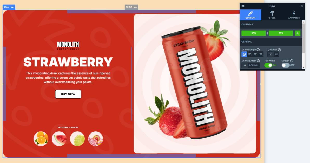
The images on the right are positioned strategically. They use a z-index to make sure the layers overlap in just the right way, giving the design a clean look.
Responsive
In Smart Slider, you don’t have to put in much effort to make it look great on smaller screens, it practically takes care of itself. A lot of responsive settings kick in automatically, making your job easier. But if you want to customize things further, there are some really useful options you can use.
One of the most popular features, and the one used in this slider, is the font resizer. It lets you adjust font sizes so everything fits perfectly on smaller screens.
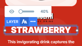
Another great option is the ability to hide certain layers on smaller devices. If there are parts of your design that aren’t necessary for mobile, you can simply hide them to keep things organized.
