


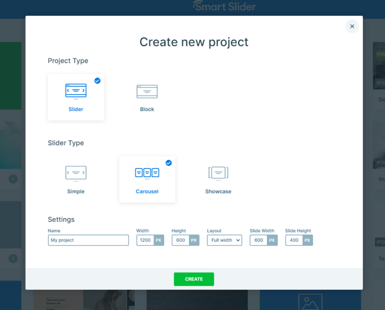
Settings
This template features a Carousel slider, which is perfect when you want to show off several slides side by side. Since it stretches across the full width of the screen, it makes great use of space and creates a clean, eye-catching layout.
One standout detail? The subtle background image that stays put while your slides move it adds a nice touch of depth and makes each slide shine even more.
Navigating the slider is super easy. You can click the arrow buttons on either side, swipe through on touch devices, or just click and drag if you’re on a desktop.
You also get a good amount of flexibility with how your slides are sized. You can adjust the height and width of your slides, set a max width for the whole slider pane to control how many slides show at once, like in this example, where you can see four slides at a time.

Layers
This slider template is a great example of how powerful the basic layers, like Image, Text, Button, and Heading, can be when you put them to good use. With a few thoughtful touches, each layer brings something unique to the overall design.
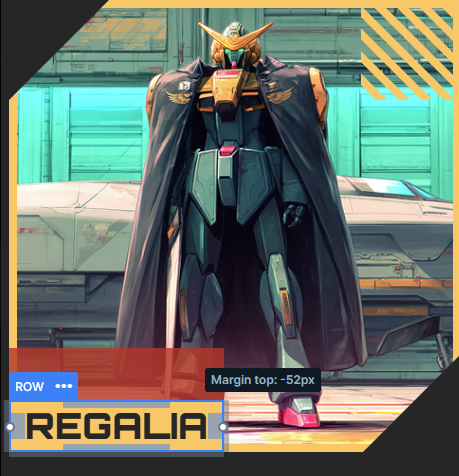
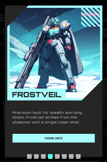
You might’ve noticed that some of the image layers are placed in a more decorative way, these are absolute layers. They’re super useful when you want full control over where things go. In this case, they’re tucked into the corners, adding a fun twist to the layout.
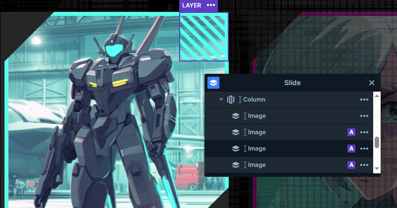
To keep everything perfectly in place, these layers use the Linked To feature. It basically locks them into position, making it much easier to create a smoother look without stressing over pixel-perfect placement.
The main image is another standout, it takes up the top half of each slide and features a custom border color that really helps it pop. The color ties in beautifully with the rest of the design, including the decorative elements and even the button, giving the whole slider a nice vibe.
Animations
Animations always bring a bit of fun and energy to sliders, and this one is no exception. It’s got some nice effects that help give it a unique feel.
One effect you’ve probably spotted is how a row slides up when you hover over a card. That’s made possible using the ‘Plays In When’ and ‘Plays Out When’ settings in the event options. Basically, when your mouse enters the card, the animation plays in, and when it leaves, it plays out.
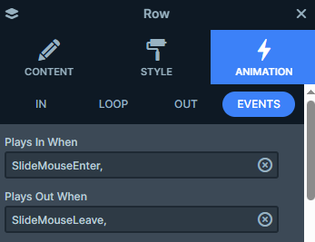
Now here’s where it gets interesting, the front row uses something called Special zero. What that means is, instead of animating back slowly, it snaps instantly back to its starting position as soon as your mouse moves away. This makes the slide-up effect feel responsive. In this case, the row moves -800 pixels on the y-axis when it slides up.
Meanwhile, the other row uses more traditional IN and OUT animations to smoothly slide up and down, again, by -800 or +800 pixels on the y-axis, depending on the direction.
And don’t miss the little detail on the arrows. They’ve got their own subtle animation that moves them side to side when you hover. It’s a small touch, but it adds to the overall interactive feel of the slider.
Layout
Each slide in this template follows the same organized layout, using rows and columns to keep everything tidy. The content is stacked neatly, one row under the other, giving it a balanced look.
You’ll notice that the name boxes are positioned right in the corners of the images. That’s done using a bit of clever styling, a negative margin helps tuck them into place just right. It’s a simple trick that adds a lot of visual interest.
Padding is also used throughout to fine-tune the spacing, so everything sits exactly where it should, comfortably.
And just like we mentioned earlier, some of those decorative, abstract images use the Linked To feature. This keeps them locked into the corners of the images, so no matter what happens with the layout or screen size, they stay put.
Responsive
All of our sliders are fully responsive, so they’ll look great no matter what screen size you’re on. That means you don’t need to do any extra adjustments just to make things look good on smaller screens.
That said, if you want to personalize things, you’ve got options. For example, if you’ve viewed the slider on a phone, you might’ve noticed that the arrow navigation disappears, and instead, you’ll see bullet points at the bottom. These dots show how many slides there are and let users tap through them easily.
With carousel sliders, there’s also a smart adjustment happening behind the scenes. As the screen gets smaller, the slider automatically shows fewer slides at once, so each one still keeps its original size and stays easy to view.