Settings
The Lawyer Slider is a full width video slider, and can fit to any page. You can use it as a hero header, so this slider can be the first that your visitors can see on your page.
The first thing you might have noticed that there is a video in the background. The video is used as the slider background, so it’s always visible below the slides. You can change it in the Slider settings → General tab → Slider design.
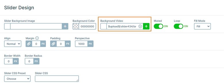
The slider contains 5 slides, one of them is a Static overlay, where the navigation is. You can use it to switch to the other slides. None of the slides have background, just layers which create the content. As a result, the slider background video is visible at each slide.
Layers
If you go through the slides, you can meet with different layers: headings, images, and buttons. The last slide offers special layers: animated counters. They give a nice visual experience, and attract the attention of your visitors. Also, with counter layers you can present numeric information in a more interesting way.

In Smart Slider 3 you can use links and actions on your layers. For example, a button layer can have a link to go to another page of your website. Or you can use link actions, like on the Static Overlay, to navigate to the other slides of the slider. This kind of navigation makes your site more interactive.
Animations
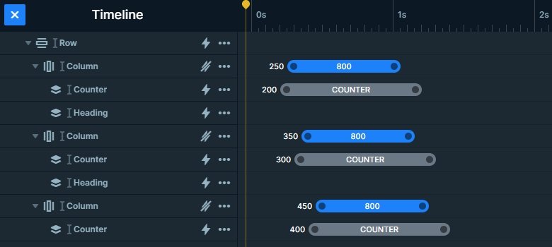
Each layer has a great incoming animation. When the slide loads, the layers are coming in one by one. You can check these animations in the timeline. The timeline is a visual way to check your layer animations. Additionally, it lets you view and change the duration and delay of the animations. Furthermore, you can add new animations, or copy them from layer to layer here.
Layout
Each slide has a different layout. There are the layers under each other in the first slide. On the second slide the layers are in a 1 row – 6 columns structure. The row wraps after 3 columns on desktop and tablet, and after 2 columns in mobile. On the third slide you can also see a row just in case with 3 columns.
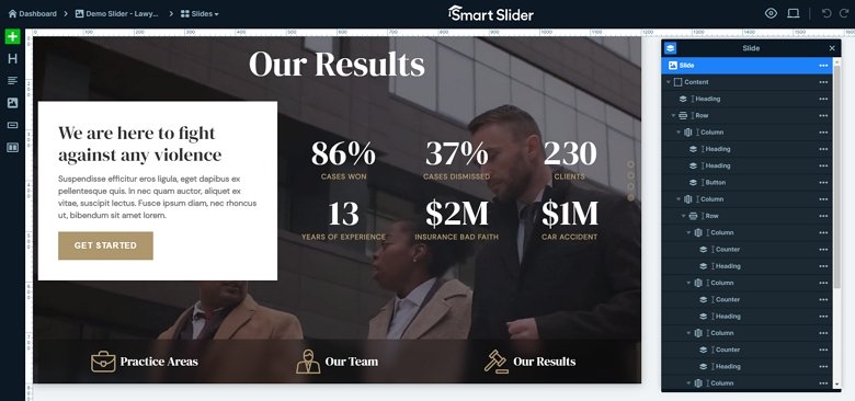
But the last slide has a special layout: there is a row with 2 columns, and another row in the second column. The left column has a white background but the right one is transparent. So the content can be separated from each other. All layers can be found in the layer list, where you can change their order. Additionally, you can select a layer which you want to customize.
Responsive
The Lawyer Slider is fully responsive, so it looks good on each devices. To make the texts more legible on mobile, we used the Text scale option. Also, there are layers which aren’t visible on mobile devices, to avoid making the slider too tall. Of course, you can find these layers in the Layer List.
Related Post: 11 Beautiful Full Width Slider Examples
Related Post: Why do You Need a Video Slider on Your Website?


