


Settings
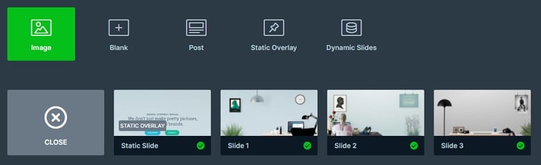
The free static slider is a boxed slider, so it fills the container where you put in. It can be used for example as a hero header but you can put it everywhere on your page, because you can fully customize the slider. The specialty of the slider is the static overlay. The content is on it, and it is over the other slides. So when the slider switches their slides, the content doesn’t move away, only the background image changes. You can create a static overlay at the slide creating by clicking on the green Add slide button. This slide is marked with a label from which you can recognize it.
The slider autoplay is enabled, so the slide switches its slides every 5000ms. You can change that duration or you can disable the autoplay at the Autoplay tab of the Slider settings. Also, you can stop the autoplay if you hover over the slide.
Layers
All of the layers are in the static overlay. There are 2 differently designed headings, and then 2 button layers come which are next to each other. A button makes your site interactive. It basically screams for the user’s attention without disturbing them and it is widely used to direct the users to some other part of the current page, or a new page.
Animations
The slider switches their slides with a horizontal main animation. There are 4 options to the slide switching where you can see this main animation: the slider plays automatically, you can drag or you can use the controls like the bullets or arrows.
Layout
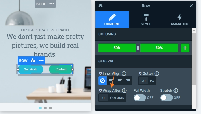
The slider has a simple layout, there are 2 headings on the top, and a row comes below them. The row has 2 columns, which are next to each other. The full width option is disabled at the row, so the layers are closer to each other.

Responsive
By default the rows wrap after 1 column in mobile, so the buttons should be under each other. But at this layout we wanted to put the buttons next to each other in each device, so we have set the wrap after value to 0, with the columns won’t wrap. The fonts are smaller on mobile, and the arrows are hidden, so the slider is fully responsive, and looks good in each device.
Related Post: Create a Unique Layer Slider with Smart Slider 3