Slider Settings
This absolutely stunning Construction slider is a full-width slider. As its name suggests it takes up the entire horizontal width of your browser, making it a popular choice for those with wide monitors. Plus, it’s fully responsive so it looks great on any device.
There are three ways for visitors to browse the slider. The first option is to use the arrows located at the bottom right corner of the slider. These arrows have a cool hover effect which makes it simple to switch between slides.
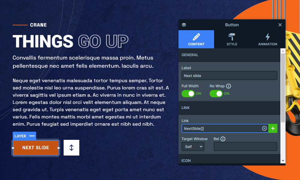
The second way is by selecting the “Next Slide” button, which will take the user through the slider one by one. This one is created by using the Content tab’s Link option.
Alternatively, visitors can also navigate by dragging the slider horizontally. This method is particularly useful for touch screens, as swiping the slide is more convenient.
Layers
It’s got all the essential layers like Headings, Text, and Buttons to get you started. But that’s just the tip of the iceberg because it makes use of Smart Slider’s power to showcase some truly unique options.
Let’s dive in with a couple of standout examples, the Image Area and the Area layer. You’ll find these on all three slides.
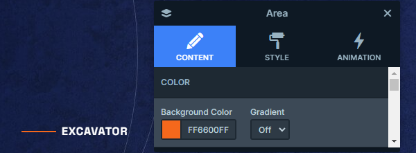
The Area layer lets you add a splash of background color to your layers, which makes it perfect for the Construction slider template to give its product names that elegant touch they deserve.
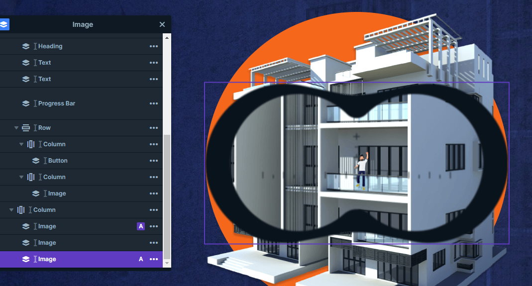
On the other hand, if you’re in the mood for some stylish decoration, the Image Area layer has got your back. This layer lets you cover a designated area with your chosen image, which you can effortlessly adjust to fit your needs. In this case, it adds a touch of flair with its striped design at both the bottom and the top left corner of the slider.
But wait, there’s more! Slide number two reveals the List layer, a subtle yet incredibly handy addition that can easily elevate your content.
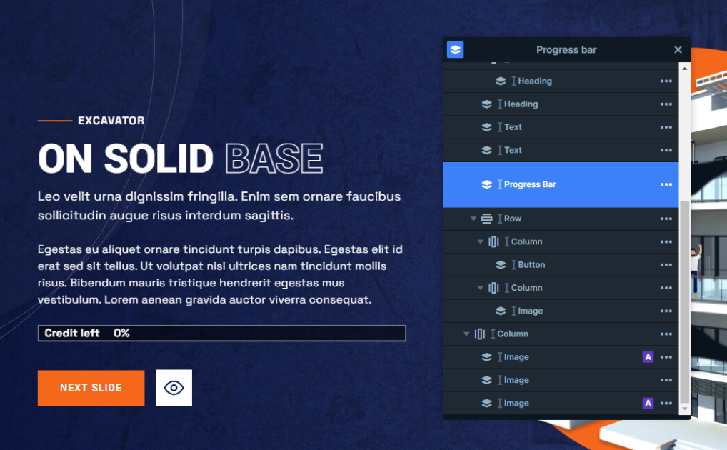
And if you’re looking to really make your slider shine, don’t miss the third slide, which introduces the eye-catching Progress Bar layer. It’s that one layer that takes your slider to the next level.
Moreover, you can notice that some headings contain parts that are designed differently than the rest of them. this effect can easily be achieved by adding custom CSS to them in the Developers tab. Once you’ve added your unique designs you can include their classes in the containers of the style settings. This template’s headings stand out with a transparent design, making the content even more engaging.
Animations
The Construction slider template is full of amazing animations, so let’s dive in!
First up, let’s talk about the Main Animation. It’s set to Horizontal, which gives your background a cool sliding effect. It slowly and gracefully moves from right to left, catching your visitors’ eye.
But that’s just the beginning. this template doesn’t stop at the background, it’s got layer animations and events as well. These animations are like magic for your content, making them stand out in all the right places. Watch as layers enter the slider, some sliding in from all sides, and others elegantly scaling up.
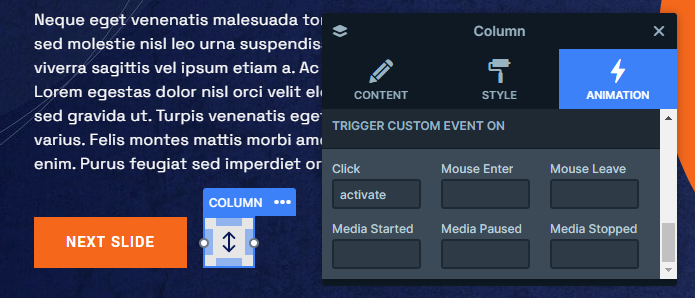
And here’s the best part, in Smart Slider you can use events to trigger these layer animations at just the right moment. In this template, it’s as simple as clicking those white buttons. It provides the perfect way to captivate your visitors and keep them engaged with your content.
Layout
This template has a neat and organized structure going on. Each slide follows a two-column row structure.
On the left side, you can find all the text content occupying the space. Meanwhile, the right side is all about the visuals, showcasing interesting images.
However, the real stars of the show are the Absolute layers. Absolute layers float on the slide, without taking up any real space. This means that you can place them wherever your heart desires. They are your ticket to creating decorative content on the slider.
Responsive
Smart Slider comes with many tools to fine-tune your slider for smaller screens.
It also has responsive settings that activate automatically, which means your content needs little to no responsive adjustment.
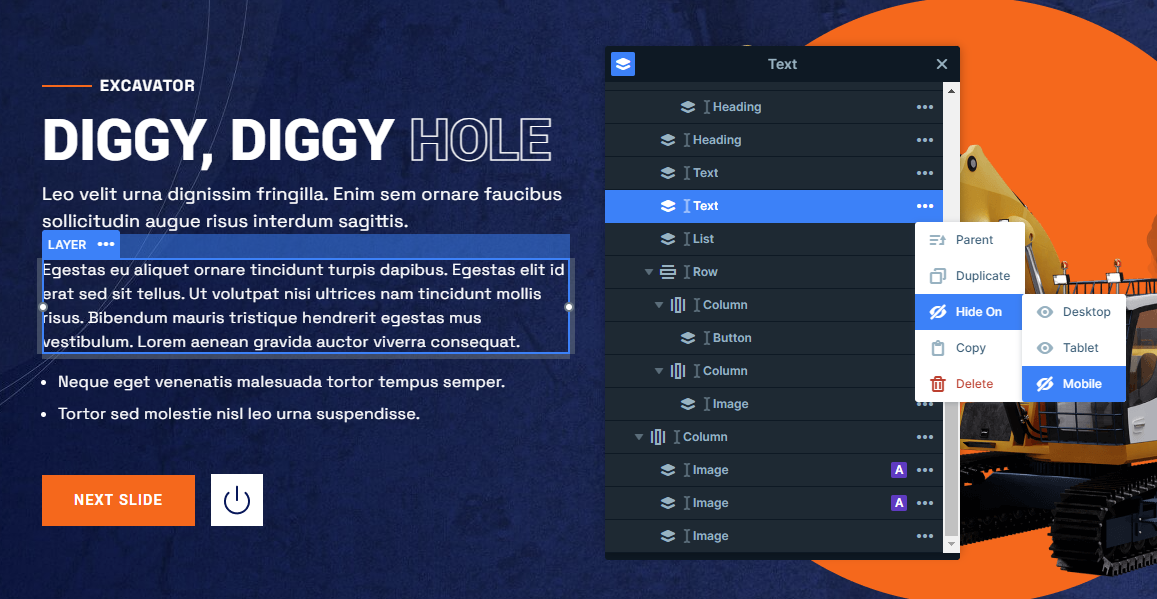
However, if you still think you need to make some changes, you can easily edit the font size or even hide some layers you don’t want to show on smaller screens.
