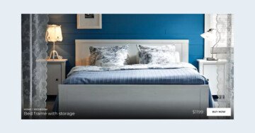
Settings
This is a Carousel slider. Instead of showing one slide at a time, it lines several product cards up next to each other. Three of them fit on a normal desktop screen. It also uses full width, with Force Full Width turned on. That stretches the whole carousel edge-to-edge across the browser.
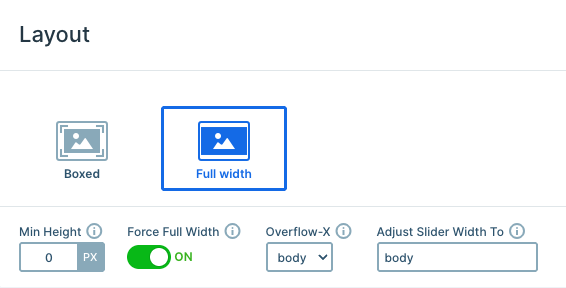
Visitors can move between cards by dragging or using the arrow and bullet controls. The Animations tab also turns on Carousel looping, so browsing wraps seamlessly from the last card back to the first.
Layers
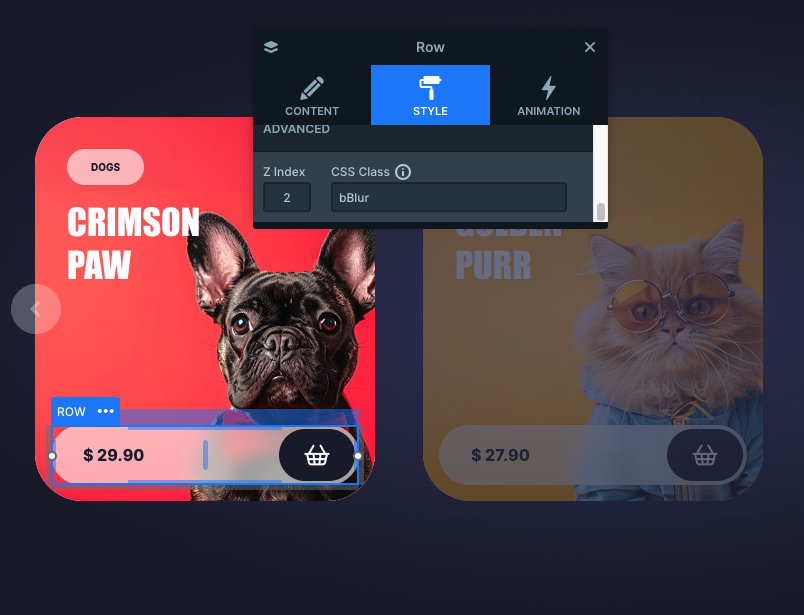
Each card uses familiar basic layers. A full-bleed product image and a small pill-shaped category tag sit at the top. A bold heading names the product, and a row near the bottom holds the price and a cart button.
That price row is the standout. The Advanced section of its Style tab assigns it a custom CSS class. The Developer tab’s CSS field defines that class as backdrop-filter. That gives it the frosted-glass, pill-shaped look that sits on top of every card. A Z-Index of 2 keeps that row above the product photo, so the photo never covers it.
Animations
This carousel switches cards with a Horizontal Main animation. It runs over 800ms with a Quad Out easing that keeps the motion feeling smooth rather than mechanical. Carousel also keeps the last card flowing straight back into the first.
There’s no extra layer animation on the cards themselves. The focus stays on that one clean sliding motion. The arrows get their own small touch though, with a subtle Fade animation on hover.
Layout
Because this is a Carousel, each card behaves like a fixed-size tile rather than a percentage-based column. The slide size sits at 340×384px, and a Max pane width of 1200px caps the whole pane. A Minimum slide distance of 40px keeps consistent breathing room between cards. Together, that’s what lets exactly three cards fit on a normal desktop screen.
On top of that, Side spacing adds 120px of fixed space on both sides of the carousel. That gives the arrows room to sit comfortably without crowding the outer cards.
Responsive
True to how the Carousel type behaves, the number of visible cards shrinks automatically as the browser narrows. It starts with three cards on desktop, then drops down card by card. Eventually, only one full-width card fits, once there’s no longer room for a neighbor.
At that single-card width, the bullets become the main way to browse. The arrows step back in once there’s a little more room again. Side spacing also drops to 60px on mobile. That lets the card use more of the available width instead of floating in a lot of empty space.