


Settings
This template features a full-width slider that fills the entire browser window, creating a great experience. Unlike traditional sliders, this template offers a unique navigation system designed specifically for browsing the festival lineups.
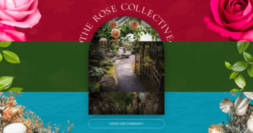
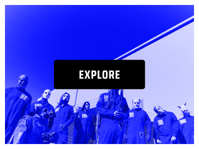
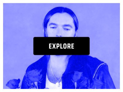
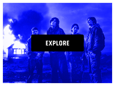
On the first slide, visitors can choose between exploring the festival’s performers or heading straight to ticket purchasing using the buttons in the bottom right corner. Selecting “EXPLORE” takes them to a lineup list, where they can click on any artist to view their dedicated slide.
Each artist’s slide includes a day selector at the top, allowing seamless navigation between performers. No matter where visitors are in the slider, they always have the option to jump directly to ticket purchasing.
All navigation buttons use a link action setting, ensuring smooth switches between slides with a single click. This approach makes it easy for users to browse performers and easily secure their tickets.

Layers
This slider is designed to be super user-friendly. It’s built with all the basic layers, like images, headings, text, and buttons, making it simple to customize. You’ll also notice some cool design elements added as absolute layers. These are highlighted with purple color, so they’re easy to spot. You can even link them to other layers to make positioning easier.

One neat feature to check out is the second slide’s columns with the band names. When you hover over them, they get a stylish border. You can easily achieve this by setting a border to be fully see-through in normal mode and then choosing a color to appear when someone hovers over it. The same is done for the text it contains.

Animations
You’ll probably notice some smooth animations as you switch between the slides. The main animation uses a horizontal “quad-out” effect, which gives everything a nice, smooth feel.
Most of the layer animations happen on the second slide, though. For the absolutely placed image layers, they’re set to scale up when you hover over them, using In and Out animations and layer events to make everything feel super respondent.

Layout
Each slide is organized neatly with rows and columns. The artist slides all follow the same layout, with the day’s buttons at the top, and the content below split into two columns, one for the image and the other for text. The buttons are spaced out with some padding and have a border at the bottom of their row for a clean look.

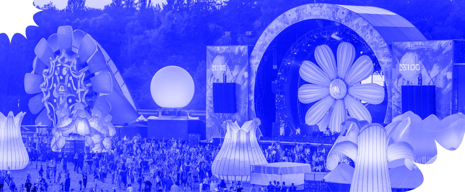
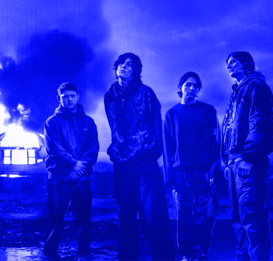
There are three slides with a bit of a different layout, though. The first slide has the image taking up the top half, with the buttons and text arranged in the bottom half. You’ll also notice a decorative absolute layer nicely placed on this slide.
The second slide stands out by using mostly absolute layers, these create the unique animation we talked about earlier with the images, plus they add some extra decoration. The layout here is simpler, with just centered columns of headings stacked under each other.

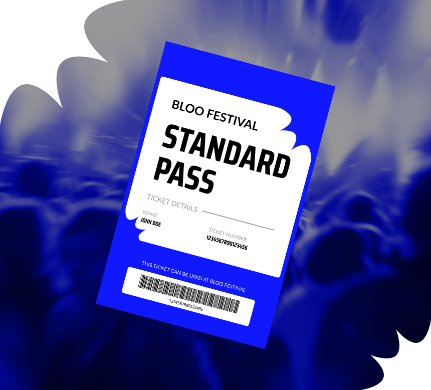
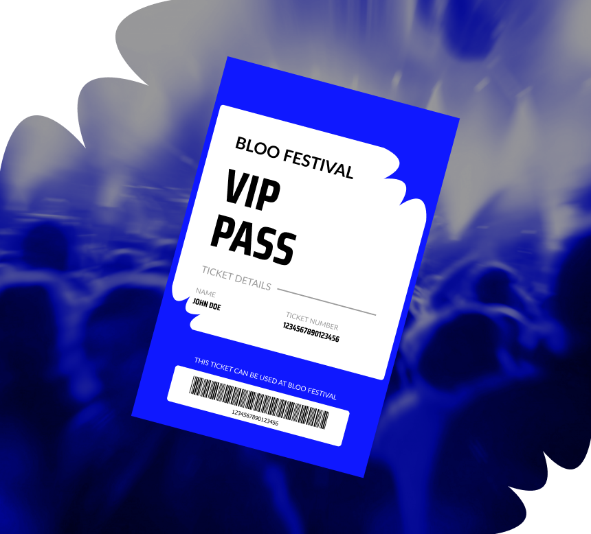
Lastly, the tickets slide is styled differently as well. It’s divided into two equal columns, each showcasing the ticket image and the text and a button at the bottom. To make it clear which is which, each column has a border around it, setting the tickets apart.
Responsive
You can easily adjust the sliders to make sure they look great on any screen size. When you switch to mobile view, you might notice that the artist slides don’t show all the buttons at the top, only the “NEXT” and “PREV” buttons are visible. This is because we’ve hidden the row that holds the extra buttons on smaller screens using the “Hide on” option. The row with the “NEXT” and “PREV” buttons, on the other hand, is set to be hidden on larger screens.

For the ticket slides, you’ll see that the ticket images are gone, leaving just the text and buttons. This is achieved by hiding the image layers using the same “Hide on” option. Keep in mind, that this works on a per-layer basis, so you can control exactly what shows up depending on the screen size.