Smart Slider has always been known for its huge library of ready-to-use slider templates. Not only do these templates look great, but they also give you a head start when you create new sliders. Additionally, they help to show the powerful features of Smart Slider. or this reason, we have a special page on our site where you can see all these sliders. A few days ago we made huge improvements to this template page. In this article I want to show you the most important changes.
New Template Page

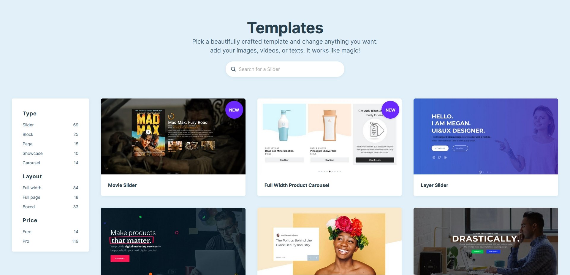
Most important changes
The template page got a new and fresh design, which looks clean and more modern. Just looking at the new page it’s obvious what a huge improvement it is. Additionally, it’s a lot lighter and fits into the design of our website more.

There are some aspects of the new template page that are worth looking into. So, let’s take a look at the most important changes!
New Design
Looking at the new template page the first new thing you’ll see is the design. The thumbnails are a lot bigger, which makes it easier to get a glimpse of the slider behind them. Also, the slider titles are immediately visible now. Before this, they only showed up when you hovered over the thumbnail image. Additionally, the slider thumbnails look a lot closer to Smart Slider’s own Dashboard.
Better category list
Another crucial improvement was to re-imagine the category list. Every slider template has their own categories that describe their most important aspects. For example, the Fullwidth Slider is in the following categories: Full Width, Layer Parallax or Highlighted heading.
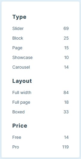
From now on we display the most important categories on the left side of the template list. These categories let you browse sliders by their type, layout or price. For example, the type category lets you browse sliders by their overall look. You can browse between simple sliders, blocks, showcases, carousels or pages. At the layout you can choose whether you want to see full width, full page or boxed sliders. Additionally, each category displays how many sliders you can find in them. Very cool new feature, right?
Search
Smart Slider has tons of templates. At the time of writing, a total of 133 sliders are available and it can be hard to find the perfect slider for your needs. We know this feeling and were keen to make the process of choosing the slider easier for you. As a result, we created a smart search to make your lives easier.
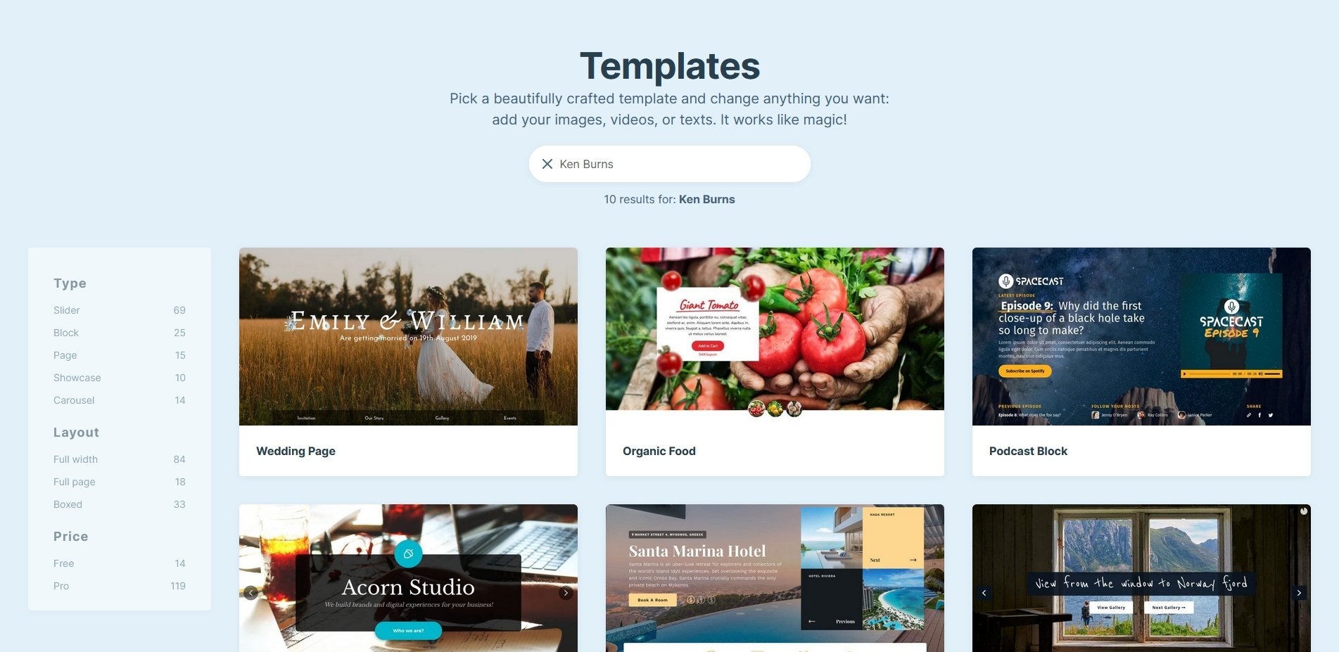
Need to find a slider? Simply type in what you’re looking for and flip through the results. Didn’t get the result you were looking for? Feel free to let us know so we can improve the search system.
New import page
Another change worth noting is a UX improvement. If you used the old UI, you probably remember how the import process worked. You had to hover on the thumbnail of the slide you wanted to import and click on the button. Clicking anywhere else on the thumbnail did open the slider in a new browser tab. But this action was not obvious at all, and many people could miss it.
We decided to make this a bit more user friendly as well. From now on if you hover on the slide thumbnail for import, it will display two buttons. First you’ll see an eye icon to view the template. Second, you’ll see the actual import button. It’s a lot more user friendly and we hope it will help you choose the perfect slider for your site.
Conclusion
Smart Slider has always had an incredible amount of slider templates to choose from. They help you create good looking sliders fast, as they let you change anything on the templates, including texts and images. We’ve always kept the list of the slider templates curated and added many new sliders over the time. For example, when we added a new feature, such as the recent Before After layer.
In the future we’ll keep adding new and new sliders for you to use. So it was a good time to improve the template page to help you find all the amazing templates. Got a new template idea for us to add? Drop us a line!
