Settings
The Architecture slider is a full-page slider, meaning it always takes up the entire width and height of the browser. This makes it a good fit for large visuals, especially images, since they have plenty of space to stand out.
You’ll notice that the bars at the top, sides, and bottom stay fixed while the slides change behind them. This is done with a static overlay, which simply means those elements sit on top of all slides instead of moving with them.
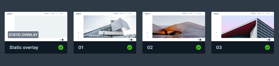
For navigation, you can either drag through the slides or use the arrows at the bottom. The arrows are part of the static overlay and are set up with the link action, so they’ll always stay in place and work the same way on every slide.
Layers
In this slider, most of the content sits on the static slide. That’s where all the text layers go, for example, the heading in the top left, plus the navigation and social links. The navigation arrows are added as images, so they stay in place as well. The other three sliders work a bit differently, they only use images for their content.
Animations
Another unique feature of this slider, besides the static layer, is its vertical Main animation. Unlike the more common horizontal slide effect, this one moves up and down, which gives it a distinct look. Apart from that, the slider keeps things simple, there are no extra layer animations or effects. This creates a clean, smooth feel without any distractions.
Layout
Both the static slide and the regular slides use columns and rows to keep content organized. The static slide has a more unique setup, its main row is split into two columns, one narrow (16%) on the left and a wider one (84%) on the right.
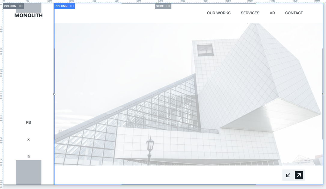
In the left column, you’ll find the heading at the top and below it a row divided into three equal parts for the social links. Padding inside the column helps space them out neatly.
The right column is divided into three rows:
- the top row holds the website’s navigation links
- the middle row contains the regular slider (and takes up most of the space)
- the bottom row holds the navigation arrows
All the main column and row backgrounds in the static slide are set to white. This creates a clean overlapping effect, making the slide images appear framed behind the layout.
Responsive
Smart Slider is fully responsive, so your designs automatically adapt to smaller screens. In the Architect template, a few extra steps were taken to make sure everything looks good at any size.
For example, on smaller screens, the text is scaled down using the Font resizer, so it stays readable without taking up too much space. On mobile, the row with social icons in the static layer is hidden, something you can easily do in Smart Slider by setting layers to show or hide at different screen sizes.
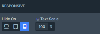
By default, rows also wrap after one column, so content naturally stacks and adjusts for mobile layouts. This gives you flexibility while keeping the design clean and usable on any device.