


Settings
The AI Art Gallery slider is a full-screen visual experience. It stretches edge to edge, giving your visitors an immersive, distraction-free space to focus entirely on your message.
It shows one beautiful slide at a time, making sure each piece of content has its moment to shine before gently guiding viewers to the next. You can swipe through slides on your phone or use the handy arrows on the left and right sides to navigate.
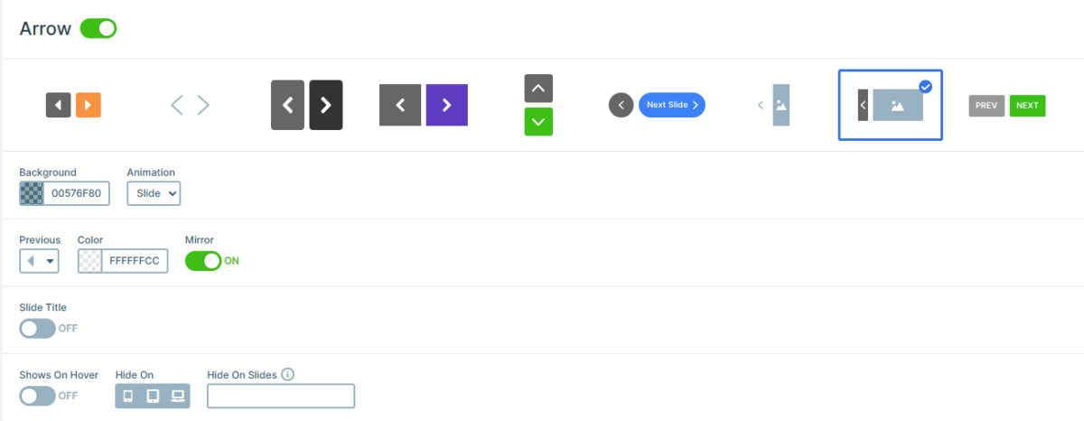
Hovering over these arrows reveals a small preview of the previous or next slide, so your visitors always know what’s coming up next. It’s smooth, intuitive, and keeps the focus right where it belongs, on your content.
And of course, if you want to make it your own, you can easily adjust the size and control settings to better match your style and layout.
Layers
This slider template was made with ease in mind, so building something beautiful feels effortless.
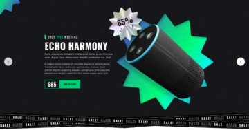
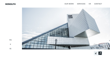
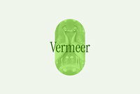
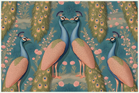
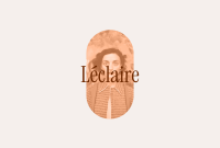
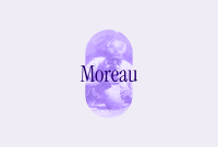
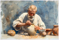
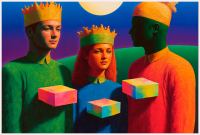
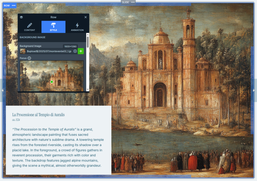
You’ll find two types of slides included. The first one is a bit more layered, as it uses rows, columns, images, headings, and text to create smooth slides.
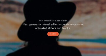
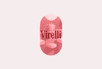
The second keeps things light and minimal, with a focus on layout layers and clean text elements. These even feature a bold image background that spans nearly the entire content area, giving your message a strong visual touch right from the start.
Animations
This template doesn’t just look good, it moves beautifully too. The main slider animation runs horizontally, giving a smooth transition between slides.
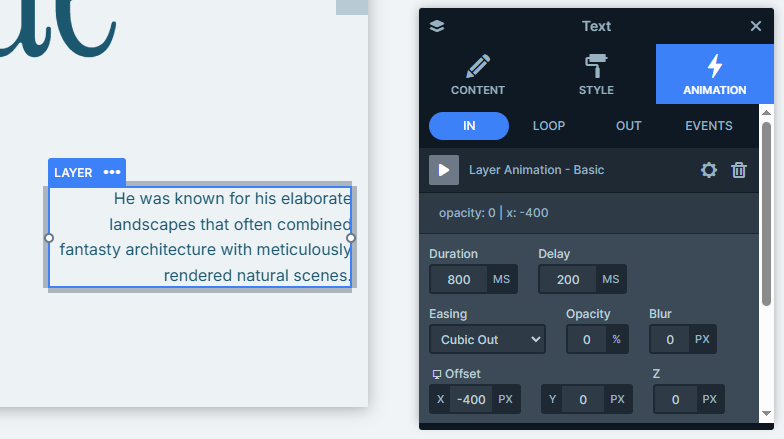
In the first slide type, the top content gracefully drops in from above using vertical (y-axis) animations, while the two text paragraphs at the bottom slide in from opposite sides (x-axis). Each layer is timed just right, creating a smooth, staggered entrance.
The second slide type keeps the motion going with text that slides up from the bottom. Its image background is introduced with a reveal animation, where each slide gets its own unique color to match the featured image.
Layout
This slider keeps things simple, so your content always feels clear and uncluttered.
On the second type of slide, everything is neatly placed in the bottom-left corner. It’s all stacked in a single row and column, making it super easy to read.
The first slide type gets a bit more creative, it uses an absolute layer for the image, which means it’s placed exactly where it looks best, without interfering with the rest of the layout.
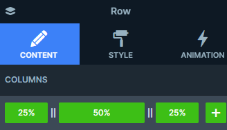
And the area down at the bottom is built with three smartly sized columns: 25% on the left, 50% in the center, and 25% on the right. It’s a flexible setup that keeps everything aligned.
Responsive
No matter where your visitors are coming from, desktop, tablet, or phone, Smart Slider makes sure your slides always look their best. It’s fully responsive, so everything adapts beautifully.
You’ve got tools for fine-tuning things on smaller screens. You can easily resize your fonts so your text stays readable, and choose to hide certain layers on specific devices to keep things clean.