

Settings
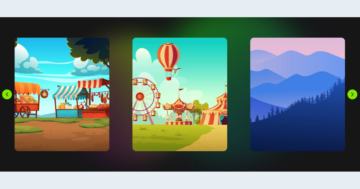
This is a classic full-width slider, the kind you’ve probably seen on tons of websites. It shows one slide at a time, keeping the focus exactly where it should be, on your content. The slides stretch edge to edge across the screen for maximum impact.

You can swipe through on smaller screens, or simply click the arrows to move back and forth.
Layers
This template keeps things simple and stunning. It uses basic layers like headings, text, buttons, and images to create a clean, eye-catching section for your page. Each slide follows the same layout, so everything stays consistent as visitors swipe through.
Some layers come with a little extra styling. For example, the button has a box shadow that gently fades when you hover over it, thanks to a smooth transition added with custom CSS.

The two larger images on the right also have some custom styling, applied via CSS classes in the Developer settings. These settings help the images subtly blend with the background, giving the slider a nice feel.
Animations
This slider doesn’t just look good, it moves beautifully too. The layers on the left side of each slide animate in one by one, sliding in from the top and bottom with a slight delay between them, using IN layer animations.
Meanwhile, the larger images on the right use a continuous Loop animation, drifting gently in opposite directions along the x-axis, adding a dynamic feel without being distracting.

On top of that, the entire slider uses a smooth horizontal Main animation to transition between slides, smoothly tying it all together.
Layout
Each slide follows the same balanced layout, and it’s all in the details. The main row is split into two columns, where the left one takes up 40% of the space, while the right gets a little more room with 60%.

You’ll also notice a few creative overlaps in the design, that’s done on purpose using the z-index setting, which controls which elements sit in front or behind others.
Responsive
Smart Slider makes it easy to build sliders that look great on every screen. It comes with useful features to help you fine-tune your design for tablets and phones.
For example, you can quickly adjust text sizes with the Font resizer, perfect for making sure everything fits nicely on smaller screens.
If you’re using rows, the columns will stack by default when the screen gets narrower, left goes on top, right goes below. But don’t worry, you can easily change the column order on mobile to create a layout that feels right for you.