Slider Settings
This slider spans the entire width of your browser, perfect for those modern, wide screens everyone loves.
But here’s the real beauty of it: it’s totally responsive. Therefore, whether your customers are browsing on a phone, tablet, or desktop, your slider will always look their best.
Additionally, you’ve got many options for navigation. There’s a white arrow button with a blue border, guiding your visitors to the next product. And then there are those little bullets on the right side of the slider. They do double duty: not only do they let you jump straight to a specific slide, but they also give a count of how many slides are in the lineup.

Moreover, this slider supports swiping, so your touchscreen users can glide through your offerings with ease.
Layers
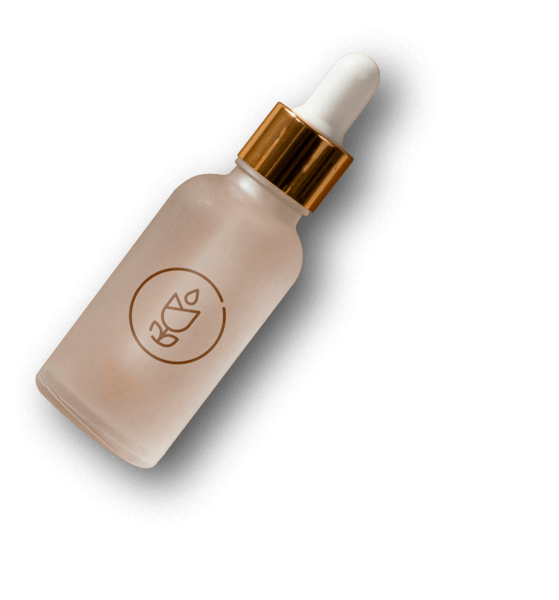
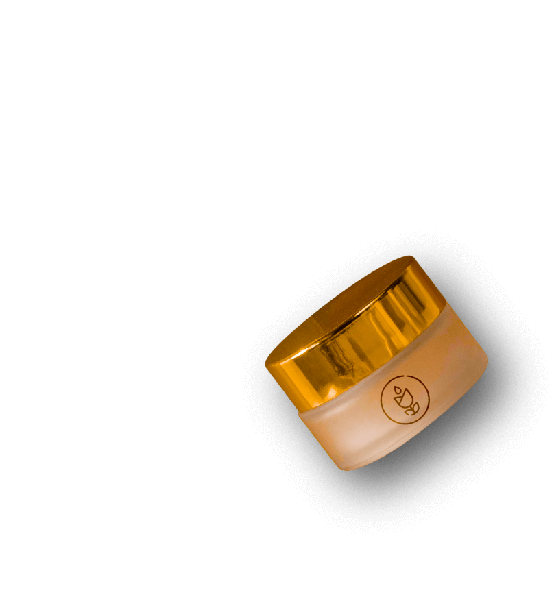
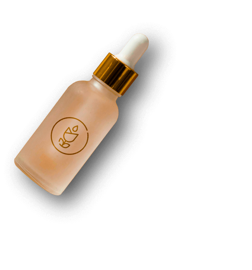
Layers are the secret factor that gives each slide its style. This template includes some basic layers from text to headings to images, these layers work together to create a polished and sophisticated vibe for the skin care products.
And here’s the best part: consistency. You’ll find the same set of layers on every slide, making it easy to maintain that stylish look across your whole slider.
In addition, if you need to adjust a layer just head up to the layers list at the top. With a simple click, you can check out all your layers, rename them, copy, delete, or even hide them.

Animations
It has subtle vertical movements that smoothly introduce the content, catching your viewers’ eyes in an instant. However, the real showstoppers are the layer animations here.
Every layer can have its own unique animation, and the customization options are endless. Take those decorative plant images as an example. With just a little tweak, they can rotate into view, adding a nice touch to your slider.

It’s all about the details. With Smart Slider, you can bring your slides to life with animations that elevate your sliders from ordinary to extraordinary.
Layout
Each slide starts with a simple two-column layout. On the left side, you’ve got all your text neatly arranged. And on the right, it’s all about the visuals and eye-catching images.
If you want to add a decorative touch absolute layers are your go-to. Just add them wherever you like and watch your slider come to life.

Responsive
Smart Slider is super flexible when it comes to responsive settings. You’ve got options like Hide On, which lets you hide layers on smaller screens, keeping things neat.
And then there’s the Font Resizer, a useful tool that lets you adjust your text to look just right on any device.
The goal here is to make sure your visitors have a smooth browsing experience, no matter what device they’re using.


