Settings
The Christmas Postcards template uses a Showcase slider type, which you may have seen on other websites. With this type, you have the convenience of displaying multiple sliders at once.
The one in the middle takes the spotlight, and the ones on the sides kinda hover around it, making it easier to switch between them. The middle one stands out even more because the ones before and after are a bit transparent, thanks to the settings in the Animations tab.
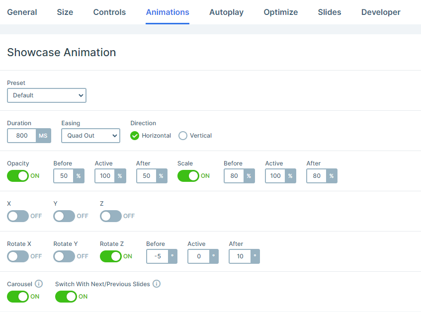
Have you noticed the slides on each side tilt in different directions? This can also be adjusted in the Animations settings with the Rotate section.
This slider has a full-width layout, taking up the entire width of the browser window. No distractions, just the slider.
Navigating through it is a breeze. On smaller screens, you just need to swipe horizontally. On the other hand, on larger screens, you can use the bullet points to pick the slide you want. It can be super handy to see how many slides are actually available.
There’s also a ‘Next Letter’ button on each slide. Click on it, and that’s it! You’re onto the next slide.
Layers
Guess what’s great about Smart Slider 3? It’s got these amazing layers that take your slides to a whole new level. Add Headings, throw in some text, create buttons, and don’t forget the images.
However, the real deal is definitely the Absolute layers in this slider. Drag and drop them wherever you want, just like we did with those Image layers on the right side.
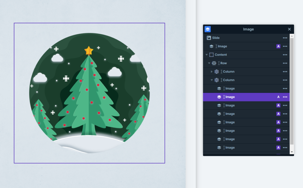
They are strategically placed, each image layer adding to the festive landscape. And here’s the secret ingredient: Z index. It ensures that these layers overlap in the best ways, creating layouts that are just downright mesmerizing.
There’s more magic with the layer parallax setting. It’s a simple trick but so effective. Check it out on this template, hover over the images on the right side, and see the layer parallax in action. It’s like the images come alive, adding an extra flair to the Christmas vibe.
Animations
There are several features in this slider that make its layers more interactive. One of these is the above-mentioned layer parallax effect.
Another specialty of this slider is the Particle effect you can spot in the background. These are small moving particles behind the slides, that interact with each other and the mouse as they are moving. The snowing effect on this template is the result of custom particles we’ve created. You can also customize the particle effect in the particle manager, by changing its effect, the number of particles, and its behavior when you hover or click on it.
In addition, you can spot incoming animations on most layers, which can be very useful to make their entrance more eye-catching. One of the more outstanding ones is the Reveal animation. It’s a perfect way to slowly reveal your message while engaging the visitors.
Layout
All of the Christmas Postcards slides create a captivating layout using Rows and Columns for their structure. They have their image and absolute layers on the right side while the main content stays on the left one.
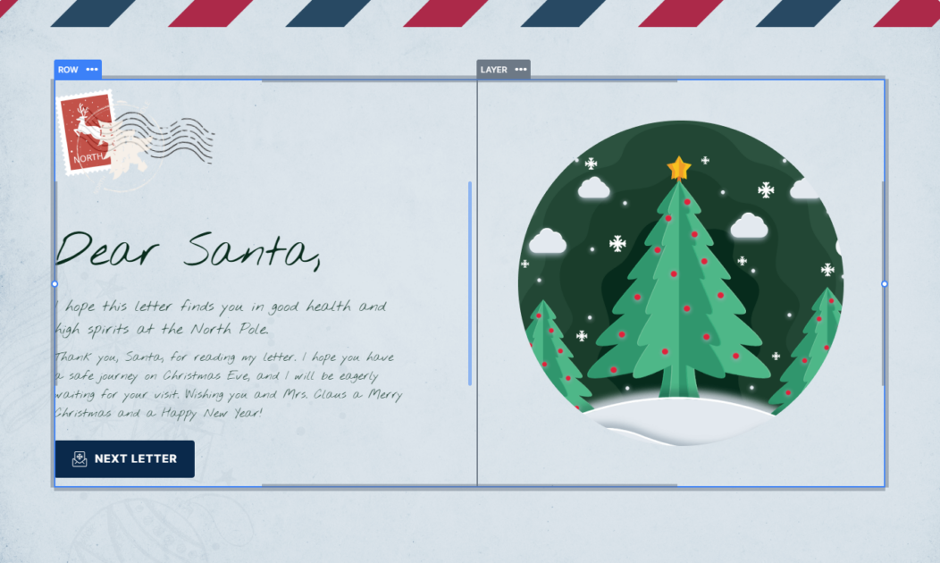
This layout offers you the perfect opportunity to place your images below the text on smaller screens, like mobile view, without any hard work.
However, if you’d like them to appear in a different order, you can easily adjust them to show the images first in the column’s settings.
Responsive
In Smart Slider, you really don’t have to do much to make your sliders look amazing on smaller screen sizes.
Many settings activate automatically to make your work easier, but if you’d like to make some additional changes, then there are some great responsive functions that you can set manually.
For example, you can increase or rather, decrease the font size to fit smaller screens with the Font Resizer. In addition, you can also simply hide layers that you deem as non-necessary on mobile view.
