


Slider Settings
The Instagram Carousel is a full width slider, so it fills the browser width horizontally. It uses the Carousel slider type, which can display more slides next to each other. Based on its settings, the Instagram Carousel slider can display up to 4 slides together.
Switching between the slides of the carousel is super easy. There are arrows on each sides of the slider, and there are bullets at its bottom. Apart from that, swiping is supported on touch screens.
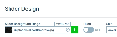
One of the most interesting aspects of the Instagram Carousel is the background image. It’s the background of the slider itself, so it covers the whole slider area.
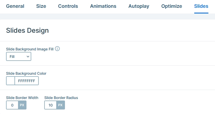
Additionally, the slides have rounded corners. This looks super nice and gives a card-like layout to the carousel. You can change the border radius option, which is responsible for the rounded corners at the Slides tab.
Layers
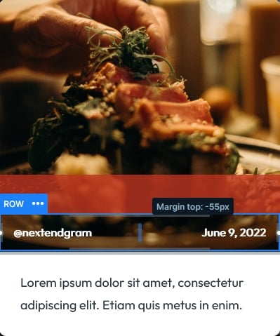
The layout of the Instagram Carousel is pretty simple. On each slide there’s an image layer and two rows. One row has two columns to display the Instagram username and another column to display the post date. However, the other row has one column only, and it displays the text layer at the bottom.
Animations
There are no special animations on this slider. The only effect you can see is the Horizontal Main animation of the Carousel, that moves the slides.
Layout
The Instagram Carousel has an interesting layout solution. The username and date of the post are displayed on top of the image. How did we do that? Simply set a negative top margin to the row that contains these text layers.
Responsive
Smart Slider is a responsive slider and has many cool options to optimize your sliders for small screens. However, at this carousel we didn’t really needed to make changes for small screens. This is because of the Carousel type’s default behavior. As the screen gets smaller, it starts to display less slides, and won’t resize them until there’s only one slide. So, each slide has almost the same size on tablet and mobile.
Related Documentation: How to use a demo slider in your generator
Related Post: How to Add an Instagram Slider for your WordPress Site?