



















Settings
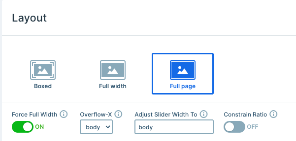
This template uses a full-page layout, so only one slide shows at a time, and it fills the whole browser window. Force Full Width is on as well, which lets the slider break out of its container and stretch edge to edge while keeping its proportions.
Instead of the built-in controls, every slide carries its own pair of arrow images. Both use the Link Action setting to move to the previous or next slide. To set this up yourself, click the + icon next to the Link field, then pick the slide navigation action you need under Actions.
Autoplay runs on a 5-second slide duration with Infinite Loop turned on, so the quotes keep cycling on their own. Autoplay also stops on click, which hands control back to the visitor the moment they interact. Play When Visible adds one more touch: the slider waits until half of it sits in view before it starts.
Layers
Every slide follows the same structure and relies only on basic layers: rows, columns, images, and text. That keeps eight slides easy to manage, because editing one means you already know where everything sits on the other seven.
The oversized quotation mark is an image layer and a column, and it does most of the visual work on each slide. Because it sits behind the text rather than beside it, the quote stays perfectly readable while the shape still fills the space.
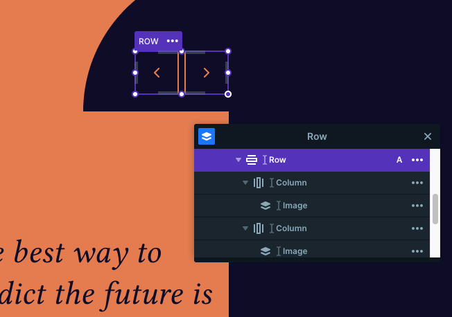
The two arrow images live in their own columns in a small row, keeping them neatly aligned next to each other. Each slide then closes with two text layers: the quote itself in an italic serif, and the author’s name below it in spaced-out capitals. Swapping the accent color per slide is the only real change from one quote to the next, so the set feels varied without much extra work.
Animations
The Main animation is Horizontal, with an 800ms duration and Quad Out easing, giving each quote a smooth slide across. The Carousel setting then runs the last slide straight back into the first, so browsing never hits a dead end.
The arrow row also carries an IN layer animation. It starts at 0 opacity and 80% scale, then settles into place over 800ms with Back Out easing, which gives the arrows a small bounce as they arrive. Layer animations play once the main animation ends and use Skippable mode, so quick clicking never leaves them half-finished.
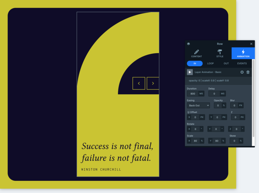
Mouse parallax rounds it off, with both horizontal and vertical movement following the cursor from the slider center. It lends the flat shapes a bit of depth as you move across the slide.
Layout
Each slide nests a few rows and columns inside one another to build the offset composition. The outer row holds the colored background area, while an inner row splits into two narrow columns for the arrow images. The quotation mark and the text column sit in that same structure, which is why the shape and the quote overlap so cleanly.
The slide’s own background stays transparent with zero padding, so the color comes from the row instead of the slide. Recoloring a quote therefore takes a single change.
A custom class in the Developer tab’s CSS section gives the dark panel an aspect-ratio: 1 value, holding it square on wider screens.
Responsive
That same custom CSS releases the square ratio below 1140px, so the panel can grow taller as the screen narrows and the quote keeps its breathing room. This template also works from its own breakpoints rather than global ones, switching at 700px and 1199px.
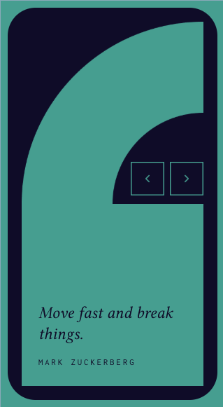
Mouse parallax stays off on mobile, which keeps touch devices calm and skips the work of tracking a cursor that isn’t there. For further fine-tuning, you can scale text with the Font resizer or drop individual layers per device with the Hide on option.