


Settings
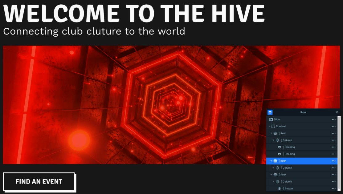
The Hive template uses a full-page slider, meaning it takes up the entire browser window for a nice experience. But what really makes it stand out is the interactive navigation between slides, it’s designed specifically to show off the club’s events and artists in a fun way.
Each button connects to another slide, making it easy to explore the club’s events, learn about Hive, and discover its artists in one smooth experience.
Each navigation button uses the Link action setting, making it easy to connect slides with just a few clicks.
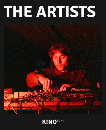
On the Artists slide, you’ll notice each artist’s country appears as a small superscript next to their name. That detail is styled directly in the Developer tab of the slider settings under CSS.
Layers
The slider is simple and intuitive, built mostly with the basic layers you’re probably already familiar with, like headings, text, images, buttons, and nicely organized rows and columns. That means it’s super easy to design to make it your own.
You might also notice a nice little detail on the buttons: when you hover over them, the white box shadow goes away. This effect is pretty easy to recreate, just set your box shadow values in normal mode, then switch them to 0 in hover mode for this clean transition.
Animations
You’ll notice some smooth animations as you move between slides. This happens because the slider uses a horizontal “quad out” main animation for an effortless glide effect.
All the layer animations happen on the final slide, where each image gently zooms in on hover. This is done using the In and Out layer animation settings, giving the whole slider a unique feel.
Layout
Each slide is cleanly structured with rows and columns, making customization easy. The last two slides share a two-column top row, heading on the left, button on the right.
The first slide uses three rows: text, image, and a navigation button. The second has a two-row grid, each split into four equal columns, with consistent spacing and 16px padding. Images are set as backgrounds, and text is aligned to the bottom.
The third repeats the top row and adds a layout with a larger image column beside text. The fourth closes the sequence with a smooth 2×4 grid, creating a balanced look.
Responsive
Smart Slider makes it easy to ensure your sliders look great on any device.
On the second slide, most images are hidden, only one remains, with a text column above and another below it, both linking to other slides.
The About slide keeps things clean by hiding extra text on smaller screens using the “Hide on” option.
And on the Artists slide, the rows automatically wrap after one column, while some are manually set to be hidden on mobile.