Settings
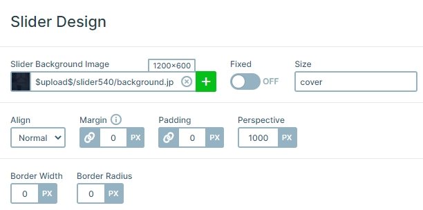
The Testimonial Thumbnail slider is a great example of how the slider background works. The slider background image stays static behind all slides, so only the content moves in front of it. This creates an appealing effect, and makes the slider look fresh. You can change this background image in the General tab of the Slider settings.

Layers
This is a colorful slider: there are two font colors and there are logos which have lots of other shades. There are three layers: a heading, a text and a button. The heading layer has a pinkish color and smaller font size. It displays the name and occupation of the customer. The color brings attention to the text as it’s always important to know who has written the testimony. In the middle of the slide there’s a text layer, with light color and big font size. It contains the actual testimonial text. Thanks to the large font size, it’s easy to read for all audiences. The last layer on the slide is a Read more button. It’s very useful when you have a long text and you only highlight a small part in your testimonial slider.
Animations
The slider navigation is the most special part of the Testimonial Thumbnail slider. There are three ways to do it: using arrows, thumbnails or dragging. The dragging is the most straightforward action, especially for mobile users. When you go to the next or previous slides, you can notice the horizontal animation. This is the main animation of the slider which you can customize in the Animations tab of the Slider settings.
Layout
The slider has a simple layout: there is a slider background image, and the slides are in front of it. Each slide has 3 layers which are under each other. You can see arrows on the left and right, and thumbnails on the bottom.
The arrows are special in this slider. By default there’s a white arrow, which has a light background and a slightly darker border. When you hover the arrow, the background and border color changes. Instead of the opaque white, they now have the pinkish color which the first heading layer has.
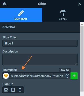
The primary feature of the slider is the thumbnails at the bottom. They show the company logo which the customer works for. The thumbnails help with the navigation while showing how many slides there are to see. Of course, you can change them to the user’s avatar. You can change them in the Content tab of the Slide settings.

Responsive
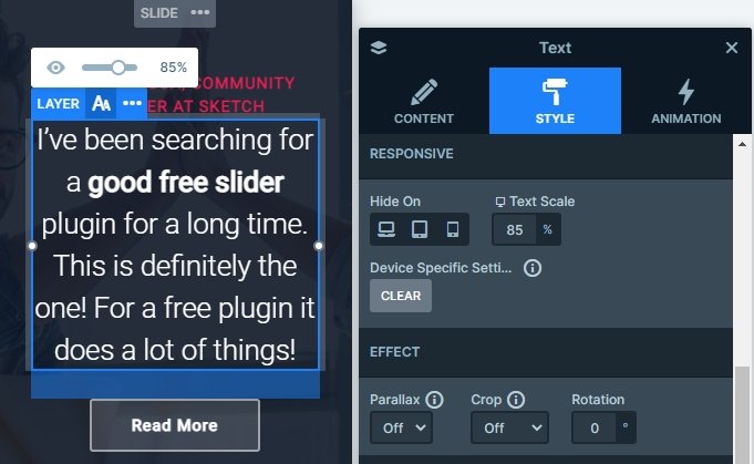
The slides were built using default positioning to make them responsive with minimal effort. You can use the text scale option to make you text lower on tablet and mobile. This setting is device specific, so the font size won’t change on other devices.

Related Post: Best Testimonial Slider Examples for WordPress
Related Post: Create A Responsive Thumbnail Slider


