Settings
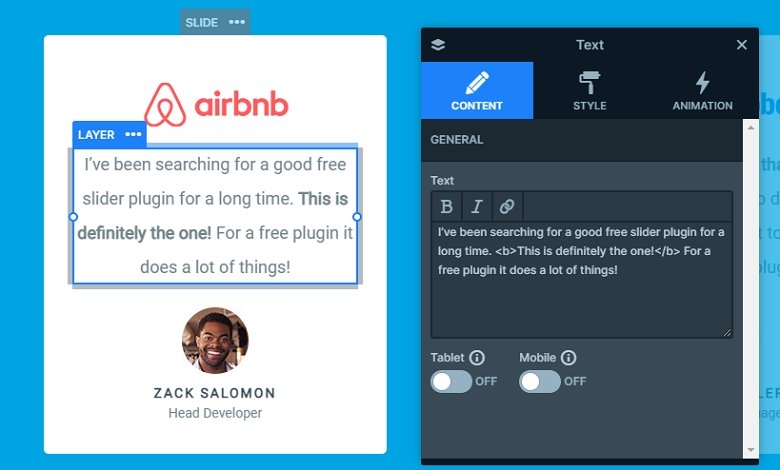
Minimalism and simplicity are the two expressions that surround the Testimonial Carousel slider. Displaying testimonials doesn’t always need fancy stuff. It’s not the effect that will convince your hesitant visitors to be your customers. The slider above isn’t fancy, it uses its minimalist design to convert. It has all testimonial slider requirements: the customer’s words, name, image and occupation. You can see all information the slider displays in a simple but clear way.
The slider has three different navigation options. The two most obvious are the arrows and bullets. The arrows are placed at the left and right side of the slider. They take a minimalistic approach, and their white color is easy to see on the blue background. You can find the bullets at the bottom of the slider. Just like the arrows, they have white color, although with a slight opacity. The active bullet is marked with an empty circle, which means it has only border but not background. The third way to switch slides is to click on them. Each slide has a custom link action to switch to the next or previous slide. This custom navigation makes the WordPress Carousel look and feel special. You can use the layout in your dynamic slide generator to create dynamic testimonials.
Layers
We’ve used the default positioning to build each slide, which makes sure their responsive behavior is great. There’s a company logo at the top, which isn’t required to create a good a testimonial slider, but it’s a nice addition. Below the logo you can find the customer’s testimony. It’s the most important part of the slider, so the text is written using an easy to read font, Roboto. The 18px font size and dark-grey color also helps the legibility. Below the text we placed the customer’s image. This helps making the testimony believable and building trust. The name and occupation of the customer is placed on the bottom.

Animations
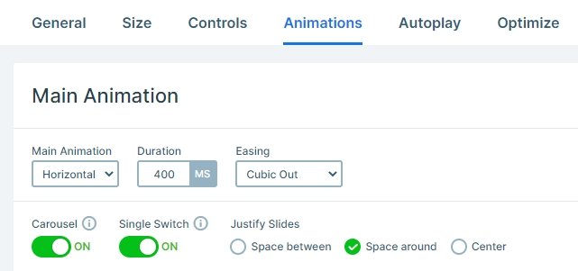
This carousel slider has a horizontal main animation, so when you switch slide, it will move horizontally. The single switch option is enabled, so you can switch only one slide.

Layout
In carousel sliders each slide is next to each other, and you can display more slides at the same time. The layout of the slides is the same: there are layers under each other.
Responsive
By default controls like arrows or bullets are hidden on mobile, but at this slider they are visible. At carousels you can display only whole slides, so you can’t display a part of other slides. If you check it on mobile, you can notice that one slide is visible, but thanks for the controls, your visitor can notice there are more slides.
Related Post: Best Testimonial Slider Examples for WordPress
Related Post: All You Need To Know About Carousel Slider Type


