


Settings
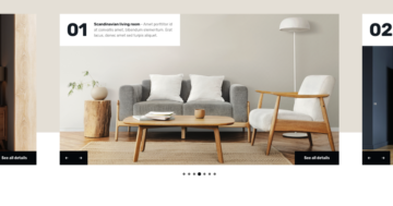
The Productivity slider is built using the showcase slider type, which makes it stand out right away. Instead of showing just one slide at a time, it lets you display multiple slides next to each other. The main slide sits in the center, and when there’s enough space, additional slides appear on the left and right, giving visitors a better overview at a glance.
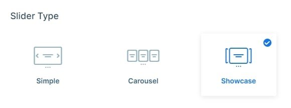
This slider is also set to full width, meaning it stretches across the entire browser window. On larger screens, this makes it especially effective, as it can comfortably display more slides side by side.
Navigation is flexible and intuitive. On smaller screens, users can swipe through the slides horizontally, while on desktop, clear navigation dots appear below the slider. These dots are clickable and also give a quick visual cue about how many slides are available. If you prefer a more direct interaction, you can even enable clicking on the slides themselves to move forward or backward using the Switch with next/previous slides option.
Each slide also has a few subtle visual tweaks applied to it. There’s a soft box shadow added using CSS, which helps lift the slides slightly off the background without being distracting. You can set this easily in the Slides settings, under the Slide CSS option.
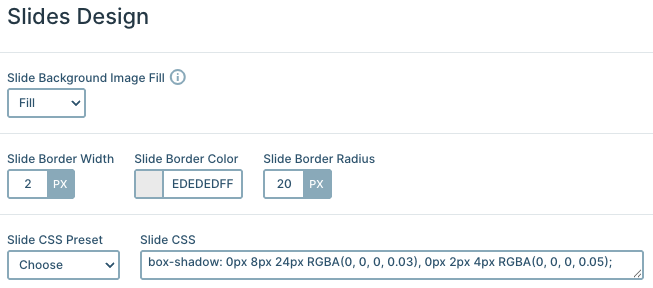
On top of that, each slide has a gentle border applied. You’ll notice a light gray outline and softly rounded corners, all configured in the same Slides settings. This is done by setting the Slide Border Width, Slide Border Color, and Slide Border Radius, all of which are used in this Productivity slider to give the slides a clean, structured look.
Layers
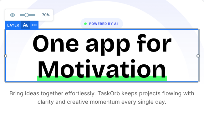
One of the first things you’ll probably notice in this slider is the Animated heading layer. It adds a fun, dynamic touch to the content and immediately draws attention. This layer is especially useful when you want to show multiple messages in the same spot, saving space while keeping things visually interesting.
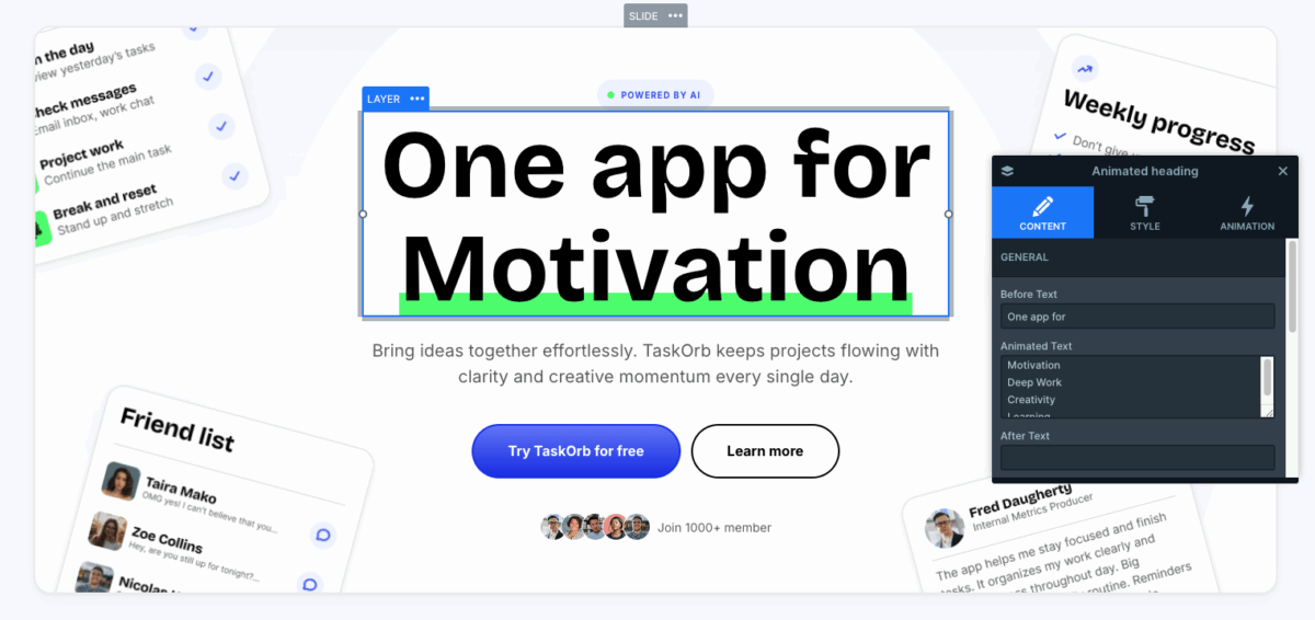
You can choose from several animation styles, like a typewriter effect or the currently used Chars animation, where words or sentences rotate continuously. On top of that, there are extra settings available, so you can fine-tune the animation to better match your design and pacing.
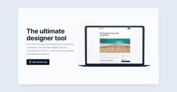
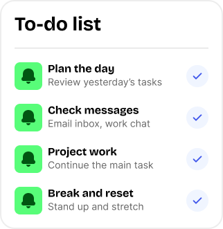
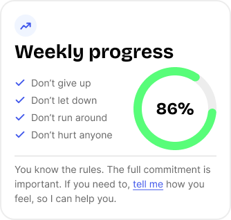
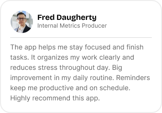
Aside from the Animated heading, each slide uses the same layers, like rows, columns, images, and text. Some of the images stand out a bit more because they’re slightly rotated and appear to float above the background. To achieve this effect, these images are added as absolutely positioned layers. They’re aligned to specific corners, rotated slightly, and positioned using pixel values from the top and sides, giving you precise control over their placement.
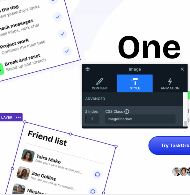
The depth effect on these images comes from a small custom CSS setup. In the image layer’s Style tab, a CSS class called “imageShadow” is applied. Then, in the Developer settings, that class is defined to add rounded corners and a custom box shadow, helping the images pop without feeling heavy or distracting.
There’s also a subtle visual highlight under the animated heading text. This is done with a bit of custom CSS that creates a soft, marker-style underline behind key words, without changing the text color itself. It’s a small detail, but it helps guide the viewer’s eye and emphasize important parts of the message. This styling is also handled in the Developer settings under CSS.
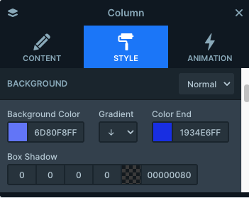
Finally, there’s a uniquely styled column that doubles as a button. The “Try TaskOrb for free” button has a slight 3D feel, created using a gradient background. In the layer style settings, this is achieved by combining the Background Color, Gradient, and Color End options. The result is a button that feels more inviting, without relying on heavy effects.
Animations
As mentioned earlier, the Animated heading layer is one of the key elements that grabs attention right away. Beyond that, each slide also uses subtle layer animations on the absolutely positioned images that sit around the main content. These animations act as gentle entrance effects, helping introduce the visuals in a smooth and engaging way.
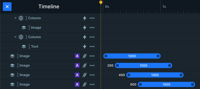
The images don’t all animate in at once. Instead, they appear with slight delays, creating a scattered feel that adds movement without overwhelming the viewer. Each image comes in from a different direction, which keeps the animation feeling natural and dynamic. While every slide uses these incoming animations, the directions aren’t strictly consistent across all slides.
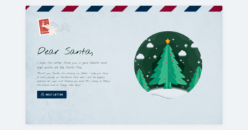
You can see this most clearly on the last slide, which includes more images than the others. Here, all the images animate in from the bottom, but with different durations. The images positioned higher up take a bit longer to arrive, so they don’t rush across a larger distance. This way, even though the timing differs, all images move at a similar speed, resulting in a smooth animation overall.
Layout
Each slide’s content is laid out using row and column elements, with everything centered inside a main column. This creates a clean structure and helps guide the viewer’s eye naturally through the content. The spacing between sections is handled by adding margins to the row elements, making it easy to control how airy or compact the layout feels.
Aside from the absolutely positioned images, this row and column setup is what’s used to place all other content on each slide, keeping the layout predictable, flexible, and easy to adjust.
Responsive
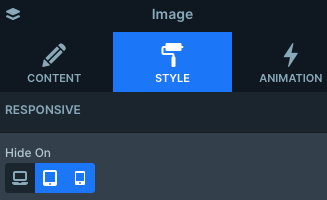
Smart Slider offers a lot of flexibility when it comes to responsive settings, and this slider makes good use of them. All slides take advantage of the Hide on option, which lets you hide specific layers on certain devices. In this case, the absolutely positioned images around the main content are hidden on both tablet and mobile views, keeping the layout clean on smaller screens.
The showcase slider also includes a few extra responsive options in its General settings. One of these is Side spacing, which lets you define a fixed distance between the slider container and the slides themselves. This space can be useful for placing navigation controls or even adding a title next to the slider. You can even set different values for desktop, tablet, and mobile, giving you precise control.
Another helpful feature used here is the Font resizer, applied to text layers. It allows you to fine-tune text sizes for different screen sizes, so headings and copy stay readable and well-balanced across desktop, tablet, and mobile without needing separate layouts.