


Slider Settings
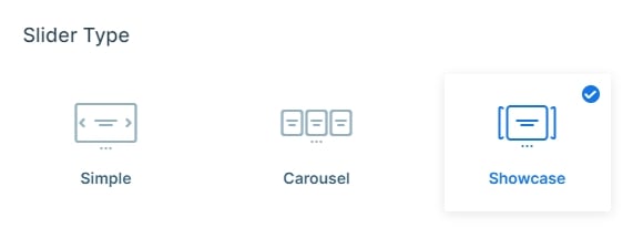
The Monolith Boxed Slider makes use of the Showcase slider type. One of its unique features is that it can represent more than one slide next to each other.
However, the selected slider is completely in focus drawing the visitors’ eye. The ones on each side have a lower opacity to enhance this effect even more. It results in a design that makes them look slightly faded out. Setting it up is very simple and you can easily achieve this in just two easy steps. First, set a slider background color. Then, lower the opacity of the Before and After slides.
On top of that, the layout of the slider is full-width, which means it fills the browser horizontally. As a result, it’s easier for more slides to display, especially on today’s large monitors.
You can browse them using one of the three options it offers. For smaller screen sizes the most beneficial is to drag each slide horizontally, as swiping is mostly used on them.
Besides this, there are three easily noticeable dots under the slider. Your visitors can use these bullet points to choose the slide they would like to view. Moreover, bullet points are very helpful in case you want to show the number of slides available in the slider.
And last but not least, the third option is to click on one of the slides slightly shown on each side of the main one. This is very optional if you would like to navigate between the slides one by one.
Layers
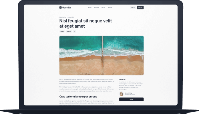
You can see mostly the same layers on all of the slides. Some simple layers are the Text layer, Heading layer, Button layer, and Image layer. Almost all of them can be found on each slide. What’s outstanding about them is how they are implemented to create a sophisticated look.
In addition, without any doubt, the most unique layer is the Image Area layer. This layer is perfect for adding a design element to your overall look.
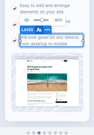
You can easily check and change your layers in the layers list. It’s accessible from the top, just select the icon. Here you can check all layers of the slide, change their name, copy, delete, hide them, or change their order.
Animations
The most eye-catching animation on the Monolith Boxed Slider template is the Horizontal showcase effect. This slider type comes with many unique animation effects that you can try out and play around with to create your own individual design.
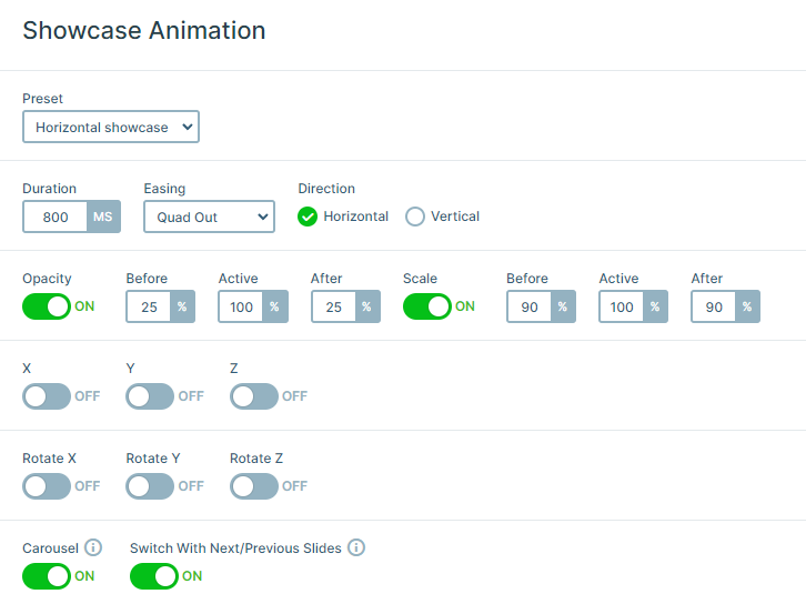
There are also basic incoming animations on all of the layers separately. They come in from different directions of the slide, smoothly introducing them. These movements together create a subtle but elegant look.
To configure the layers’ delay and duration use the visual timeline at the bottom of your slide editor.
Layout
All of the slides are built using the 1 row 2 columns structure, except for the Testimonial slider. This block is separated into three equal columns taking up the full width of their container.
However, the most intriguing solution may still be the Portfolio slide’s layout. It creates a captivating gallery with its special arrangement. There are three columns, which contain three images in each of them.
Besides, all of its columns have the same space between them. This can be achieved by setting up the Gutter on their row container.
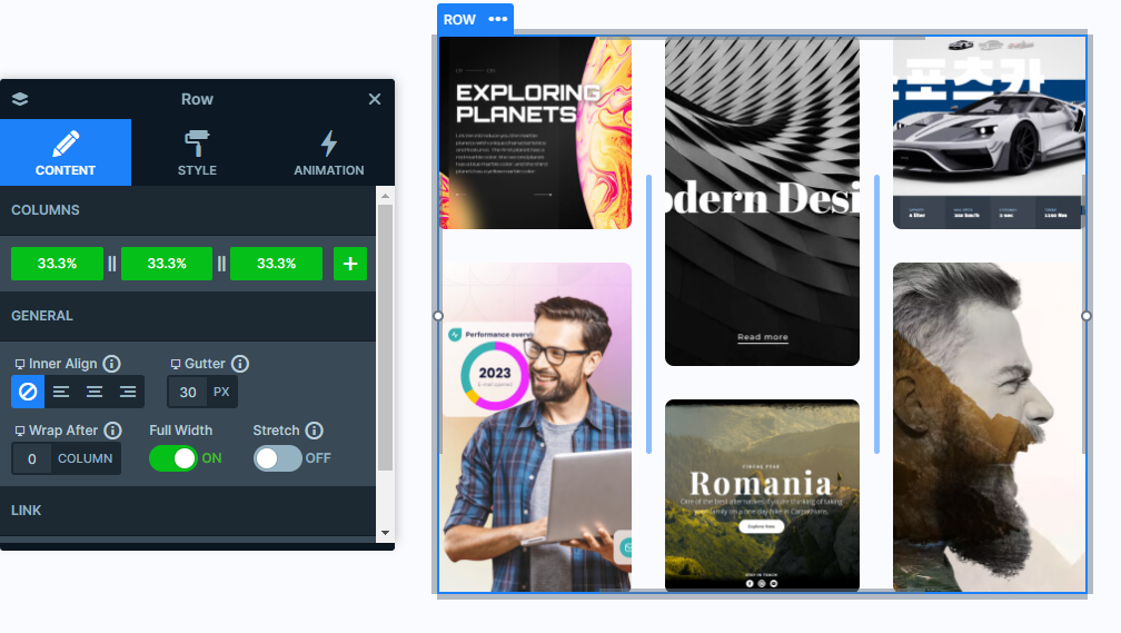
On the other hand, the images are simply separated by the top margin added to them.
Responsive
Smart Slider is very versatile in its responsive settings. Many of the layers take advantage of the Hide On option, which makes it easier to hide layers on smaller screens.
Not to mention the Font Resizer, which is one of the most useful gadgets, as it lets you uniquely optimize your layers device specifically.
Their main purpose is to offer your visitors a pleasant experience while browsing your site whether they are viewing from a smaller or larger screen.