


Settings
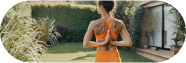
This slider template uses the Simple slider type, which gives you the flexibility to make it your own. One of the coolest things about it is that it’s full-width, so your content takes center stage without any distractions.
When it comes to navigating the slider, you’ve got a few options:
- Swipe horizontally: Perfect for mobile users who prefer a smooth way to browse.
- Navigation arrows: Easily move through the slides using the arrows on each side. Plus, you can customize their look in the settings, including color changes on hover, and their subtle animation.
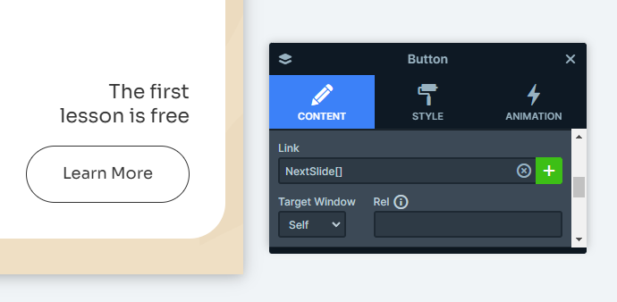
- “Learn More” button: You can guide your visitors with just one click.
Layers
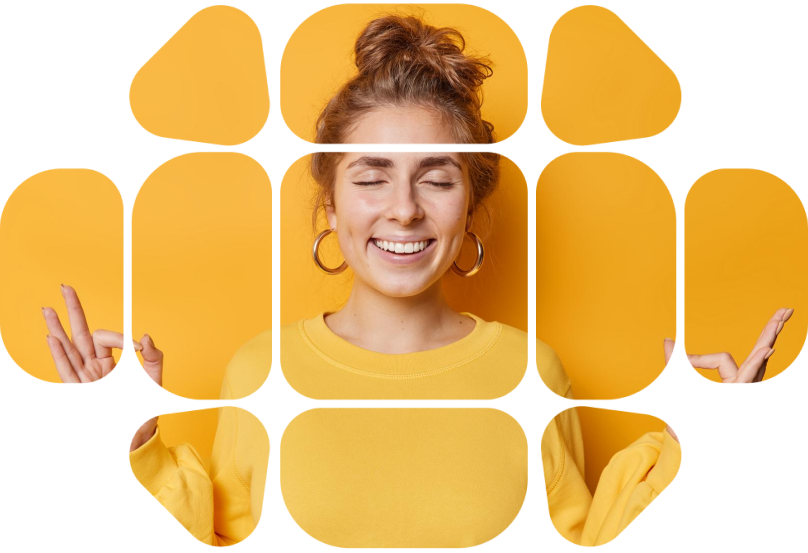
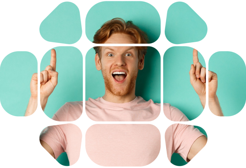
Layers let you take your slides to the next level by adding headings, text, buttons, and images, all nicely arranged in columns and rows for a clean, structured look.
But the real game-changer? Absolute layers. With this feature, you can drag and drop elements anywhere on the slide, giving you total creative freedom. That’s exactly how we placed those star image layers.
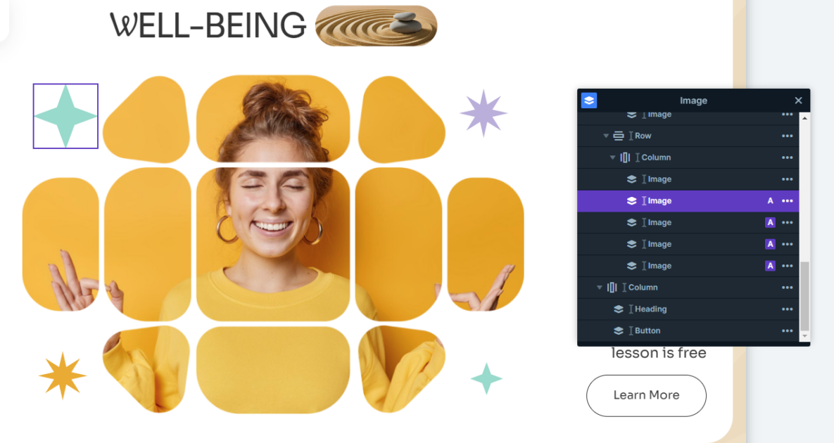
At the top, you’ll notice different heading fonts and images are set in separate columns. This lets you style each element individually, creating a unique look where text and images blend beautifully side by side.
Animations
This slider is packed with animations that make everything feel more dynamic and interactive. Each layer comes with smooth incoming animations, so when you switch slides, elements appear in an eye-catching way.
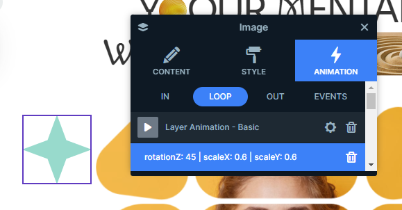
The absolute layers unlike the other elements, keep moving even after their initial animations play out. Each star has a loop animation, with some rotating continuously and others even changing size for an extra effect.
Layout
Each slide’s content is arranged in three columns, giving you an organized layout. You can easily adjust the width of each column by dragging the percentage settings in the column options, so you have full control over the sizing.
Here’s how the layout works:
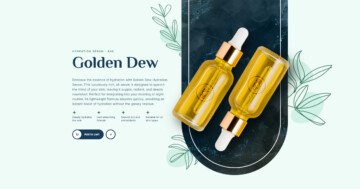
- The first column holds the quote content, aligned to the top.
- The last column has its content anchored to the bottom.
- The middle column is where things get more interesting. As mentioned earlier, the heading and images at the top use columns for each design to create this unique blended look.
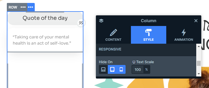
Responsive
You really don’t have to do much to make your sliders responsive. The slider automatically adjusts to different screen sizes, so your content looks great on any device.
But if you want to further customize things, there are plenty of customization options. One great trick (which we’ve used in this template) is hiding certain layers on smaller screens. Some of them might not be essential on mobile, so hiding them keeps the design clean and ensures everything stays smooth.