Settings
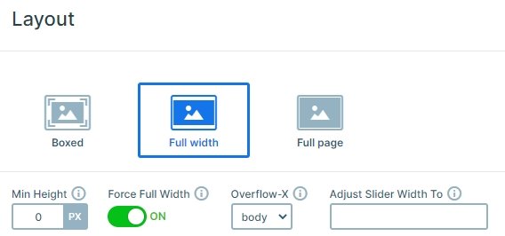
When you think of full width sliders, usually you picture a large section on the page which has huge, moving images. This gradient slider example takes a different approach. While it does have images on each slide, these are small pictures. Each slide in this slider has a linear gradient as background. We built it in a way that each slide’s starting color is the finishing color of the previous slide. This creates a continuous gradient effect throughout the slider. The effect gives the gradient slider example a modern look.
Layers
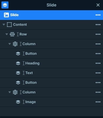
You can find a heading layer, a text layer, 2 button layers and an image layer on each slide. The button layers are useful which can be used as a great call to actions, and you can navigate your visitors to other pages. The images on the right are different on each slide, and you can change them to your own image.
Animations
When you switch slides with the arrows or dragging your mouse, you can notice a horizontal animation. This animation is the main animation of the slider. You can change that also you can set the animation duration to bigger or lower at the Slider settings → Animations tab.
Layout
The slider uses a simple layout: there is a row with 2 columns. The left column contains the textual layers, and the image is on the right column. On mobile this row wraps after 1 column, so the image will be on the top, and the textual elements are below that.
Responsive
The slider is mobile friendly, which means several important things for small screen users. The most important part is that this slider is completely touch friendly. Viewers can easily switch slides by swiping. The button is big enough to be a great target for fingers. This behavior happens because of Smart Slider’s unique slide building way, the Default position. This positioning mode allows you to work on your slides fast and create content with amazing responsive behavior. And you won’t even have to spend hours to achieve such a great look on small screens.
Related Post: Do you need a Free Full Width Slider for your Site?
