Sliders are super versatile design tools, and always find a place for themselves on a website. However, there are lots of websites which use sliders in a bad way. Website owners often look at competitor’s sites to see new trends. Since sliders are still trendy, they’ll see lots of ideas to create new sliders. As a result, many good and bad slider practices are copied from one site to another.
What are bad slider practices?
Bad slider practices summarize the problems that ruin the visitor’s experience. When you create a website or a slider, you should always keep the visitor experience in mind. The more comfortable and happier the visitor on your site is, the more time they’ll spend there.
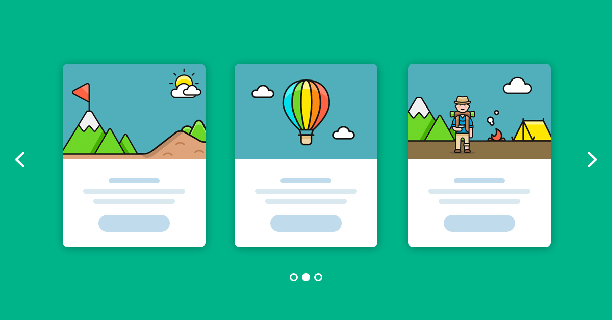
The new way to build a Slider
Next generation visual editor, customizable animations & effects, and access to hundreads of premade templates.
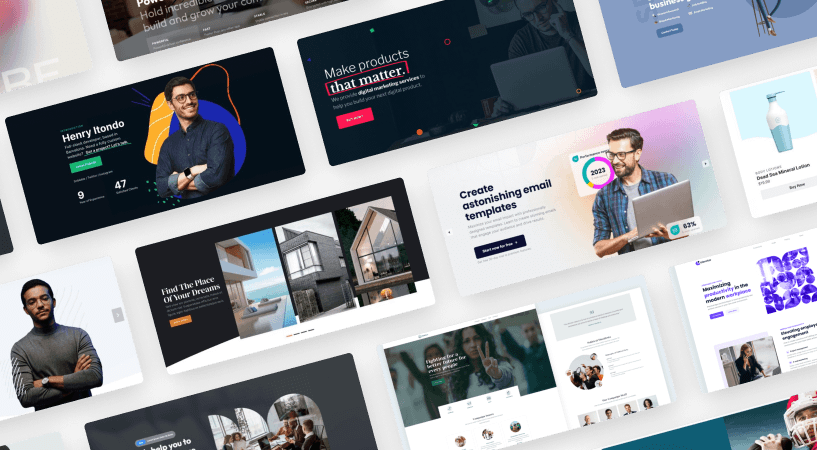
There are many ways to create a bad user experience. I’ve collected the 9 most common bad slider practiceshaving all texts needed on the picture that create a bad experience. The examples can help you learn from their mistakes and create better sliders.
1. Text on images
Placing text to images is a favored way of displaying content. Probably it originates from the desire of enriching blog posts with captivating visuals. A simple editor, like Classic Editor or Gutenberg, doesn’t allow placing text on top of the image. So, the only way of creating such visuals was to create an image that looks exactly the way you want. This includes having all texts needed on the picture.
However, if you use a modern solution to enrich your posts, you don’t need to create your visuals in an image editor. In fact, most modern sliders offer such functionality via layers. So, if you want text to appear on top of the image, you should use them instead.
What’s the problem with having the text in the image file? The first problem is the responsive behavior. Images are scaled down to fit into small mobile screens. The text on the image might look good on a 1920px wide monitor but it will be way too small for mobiles.
Additionally, these texts are not accessible by screen readers. So visitors using any assistive technology won’t be able to access the text. However, if you use layers the text will behave like any normal text on your site. So, the screen readers will have no trouble reading them. Moreover, if you add the text to your site instead of burning it into the image, even Google can see it. So, this method has SEO advantages.
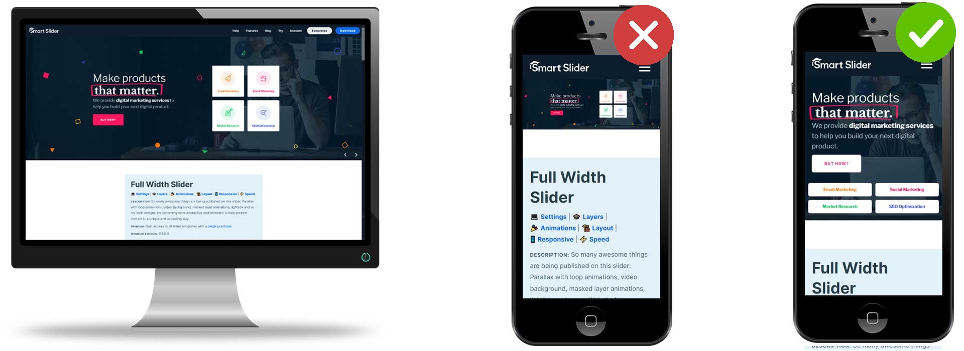
2. Forcing the desktop look for mobile
Lots of people want their visitors to see the exact same page on all devices. This is rarely a good practice. The exact same layout can’t work well on large and small screens. For example, on a desktop you can easily fit two columns with text and buttons next to each other. They’ll be easy to read and have a nice white space. On the other hand, the exact same layout will not look good on mobile.
Desktop layout (left), which is forced on mobile (middle) creating a negative experience. A different, but more optimized mobile layout (right) looks a lot better.
So, if you want to create a good experience for mobile, don’t try to force the exact same layout. Allow columns to break below one another. As a result, the visitors can see what’s on the images and can read the text without problems.
3. Using the wrong images
There are many ways to use images in the wrong way. The most common problem is using an incorrectly sized picture. For example, trying to show a portrait image in a landscape image’s place.
Another common issue with background images is not setting the focus point correctly. The focus point of an image says the most important part of the picture, that should always stay visible. For example, imagine that you want to display a picture of your team members. You need to set the focus point to make sure that the head of the people is not cropped.
Using stock photos is quite popular on the web. After all, not every business has perfect photos to display on their site. In fact, it can be so much easier to look for a free to use picture. When you use a stock photo, make sure it fits your business. For example, if you have a lawyer site, try to get pictures of people who wear suits. An image about a beach is not really suitable for such websites.
Another thing you need to pay attention to is the watermark. There are sites that sell images and put a watermark on the previews which people can see without paying. Using a heavily watermarked image makes your site look unprofessional. Additionally, it’s one of the fastest ways to make the visitors leave the site. If you use your own watermark, that’s fine, although try not to make it cover the whole picture.
4. Autoplay without control
Autoplaying slideshows are quite popular. They help show the visitor that there are more slides for them to see. In fact, when used properly, they can help save time and clicks for the visitors. However, it’s not easy to create a good automatically rotating slider. First, you need to consider the duration of the autoplay, so the time when each slide shows. You have to provide enough time for the visitor to read any text that’s visible on the slide. Keep in mind, they see the content for the first time, and they might read a bit slower, so they’ll need more time than you do.
The way to create an autoplaying slider is to give control to the visitor. Place a button to pause or resume the autoplay which they can use. Also, you can pause the autoplay when the visitor hovers on the slide. Hovering on the slide means the visitor wants to interact with the slider. The autoplay should not interfere with that. Additionally, it’s a good idea to resume the autoplay when the mouse leaves the slider area. This way the visitor can read every text on the slider which improves their experience.
5. Invisible navigation
When you create a slider, you want your visitors to view and enjoy all slides. To be able to do so, you need to give them clear navigation options. For example, add arrows or bullets to your slides.
While you set up the controls, make sure you choose their colors carefully. The colors should have a high contrast with the background of your slides. So, if you use dark images, make sure you choose light colors for your arrows.
6. There’s no connection between slides of the slider
When a visitor checks a slider, they expect it to act as a container of similar content. So, if you create a product slider, they want all slides to be product related. However, in a testimonial slider visitors want to see how satisfied your customers are. They don’t want to see, for instance, a slide that tells them to subscribe to your newsletter.
Adding slides that have no relevance to the slider’s content distracts visitors. Additionally, it ruins their experience. Moreover, these unrelated slides can be very confusing for them. Since they will not understand what happened, they might leave your site.
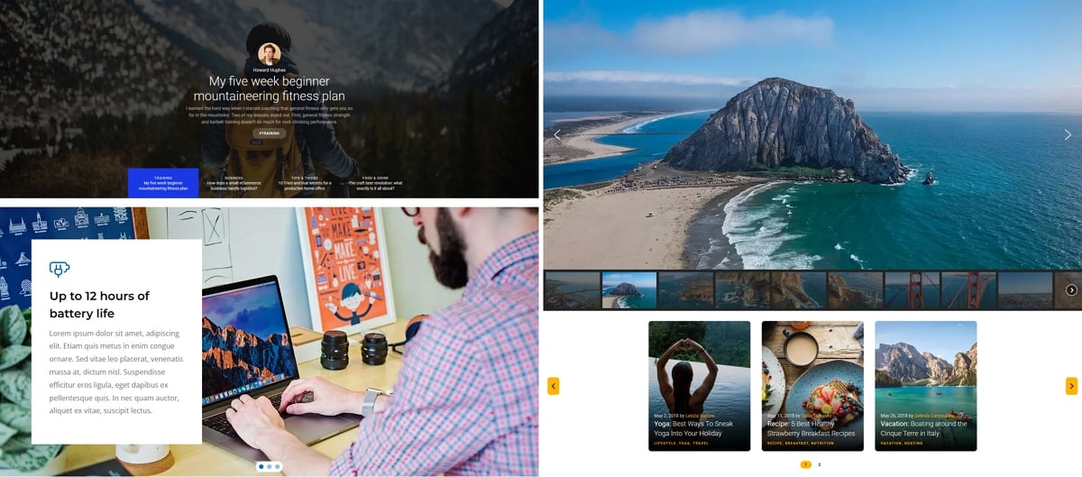
7. Using too many slides
Sliders are great tools to create a visual presentation. However, it’s not easy to keep the visitors interested in browsing through too many slides. You need to find the right amount of slides for your particular slider.
Carefully plan your content to display the optimal amount of content (right) and avoid showing too much slides (left)
Generally, we don’t recommend creating more than 5-6 slides per slider. Of course, if you create a carousel where more slides are displayed next to each other, you can have more slides. However, in this case you shouldn’t really have more than 12-16 slides either. Otherwise, the visitors won’t check the slides because they’ll feel they don’t have that much time.
8. Using sliders for tasks they were not meant for
Sliders are versatile design tools, and you should always think of them this way. So, you should use sliders to create a visual presentation or an image gallery. But you should not try to use the sliders, for example, to create a complex menu for your website. Additionally, using a slider for displaying a blog content is not a good idea either.
What are good slider practices?
A good slider practice is what makes your slider and site stand out from the crowd. It makes your visitors like your site and enjoy their time interacting with your slider. So, following the best slider practices helps creating a better user experience. Additionally, they can increase your conversion!
Good Slider Practices
Creating a slider is easy, but creating a good slider is not. A good slider needs to have a purpose and help your website and its visitors. So, you should make sure you create your slider with a clear goal in mind.
Here are some good practices you should keep in mind when you create your next slider.
1. Create clear navigation
People don’t like having to guess or search for the next course of action on a website. So, they don’t like sliders where it’s not clear that there are more slides for them to see. Additionally, they don’t like to wonder how to get to these other slides.
Clear navigation on the slides: visible arrows, bullets and thumbnails
So, make sure you offer them clear navigation. This can be a simple arrow which they can immediately notice. Or, it can be a dot, numeric or text bullet. Additionally, you can use thumbnails for making the navigation clear for the visitors.
2. Design for all screens
Nowadays lots of people use their phones for browsing. When you create your website, you need to make sure it looks good on all screens. In fact, the same is true for your sliders as well. You need to check them on different screens and make sure they look good.
For instance, to create a good mobile look, you might want to hide some content. Or you can change the order of the content to make the layout more mobile friendly.
3. Use sliders with a clear purpose
Anything you add to your website should have a purpose. In other words, you should have a reason why you add the slider to your site. For example, if you create a hero slider, you want visitors to learn more about your site. Or, if you have a testimonial slider you want to build trust in your visitors. As a result, they’ll be more likely to spend money on your product or service.
In other words, use a slider to help you and your website, not because all other websites have a slider as well. It’s a bad practice to copy the slider of your competitor’s site so you can have one, too.
Get on board! Join our 142,416 subscribers!
Get our latest news, tutorials, guides, tips & deals delivered to your inbox.
No spam. No charge. Just curated emails.
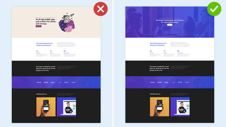
4. Make sure the slider fits into your website
Sliders need an attractive design to catch the visitors’ attention. However, this design needs to fit into your website. For example, if your site’s main colors are white and red, you should use these colors in your slider as well. Avoid creating a slider that uses completely different colors, such as blue and yellow. It will make the slider look like it’s not part of the website. Additionally, it can lead visitors to believe the slider is an advertisement. As a result, not only will they not check out the slider, they’ll completely ignore it.
A slider that doesn’t fit into the page (left) and another one that does (right)
Conclusion
Creating a good slider is not so easy. You need to think about how the slider will benefit your website. Also, ask yourself how it will create a good experience for your visitors. To create a good slider that your visitors will enjoy, make sure you avoid the bad practices listed above.
Hi, I’m Ramona and I’m a member of Nextend‘s awesome support team. You’ve probably chat with me if you’ve submit a support ticket. When I’m not answering support emails I read a book or go cycling. I enjoy writing as well, both for our blog and for my private projects.