


Settings
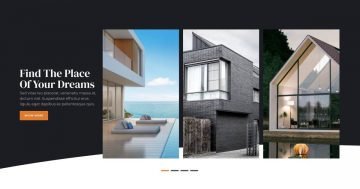
This slider focuses on a single slide at a time, using a full-width layout to give each slide plenty of space to shine.
Navigation is kept simple and intuitive with arrows, which you can fully customize in the Controls settings. In this example, the arrows stand out with a subtle hover effect, making them easy to spot without being distracting.
For a more natural experience on touch devices, visitors can also drag the slider, which makes browsing feel smooth and effortless.
Layers
All slides are built using the same set of layers, which keeps the design consistent and easy to manage.
Instead of traditional dots, this slider uses a more custom way to show which slide is currently active. A row contains three image-based indicators: one appears as a white line for the active slide, while the other two show up as softer, gray dots.

As you move through the slider, the white line shifts accordingly, clearly highlighting your current position.
Alongside this indicator, each slide includes familiar layers like headings, images, and buttons, all structured nicely with rows and columns. The result is a clean, minimal layout that feels intentional without being overcrowded.
Animations
The Main animation is set to Horizontal, which creates a smooth left-to-right sliding motion as you move between slides. Carousel mode is also enabled, allowing you to continue seamlessly from the last slide back to the first without interruption.

This setup keeps the slider feeling clean, with no extra layer animations competing for attention. If you want to experiment further, Smart Slider offers plenty of animation options to explore and fine-tune the experience to your liking.
Layout
Each slide follows a consistent layout, making it easy to adjust. The content is built using rows and columns, taking full advantage of Smart Slider’s layout controls.
In this case, all layers sit inside a single row that’s split into two columns, with the space divided at 35% on the left and 65% on the right. The wider column is dedicated entirely to a large image that fills the available space, while the more detailed setup happens on the left side.
The text content is placed at the top of the left column and aligned to the left, working together with the custom slide indicator setup we explained earlier.
At the bottom, four smaller image columns showcase additional winter outfits. Each of these columns takes up an equal 25% of the row, with a consistent 8px gutter between them.

Extra breathing room around the content comes from carefully applied paddings and margins, giving the whole slide a balanced feel.
Responsive
On smaller screens, the two columns stack neatly on top of each other, making the content much easier to read and navigate. This slider also takes advantage of font resizing on smaller devices, so text stays readable without feeling oversized. Together, these tweaks help the slider feel comfortable on any screen size.

And that’s just the start. You can fine-tune responsiveness even further by hiding layers on specific devices, giving you full control over how your slider behaves everywhere.