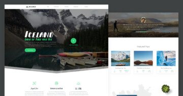
Slider Settings
The Minimal Designer slider template uses the simple slider type. These slider types can be found on many websites, all thanks to their benefits of showing only one slide at a time. Therefore, visitors are not distracted by different content and can move forward at their own pace.
Besides being a simple slider type, it also uses a full-page layout, which means it takes up the entire width and height of your browser.
One compelling feature of the Minimal Designer slider lies in its setup. Using six slides, it includes a Static Overlay alongside five regular slides. The Static Overlay is a unique type of slide, that is continuously displayed on top of all regular slides. This template makes use of it to display a navigation bar above the content of each slide. It displays the logo in the center accompanied by two arrows on the far left and right.

Layers
You can find some of the basic layers on almost every slide, like the Text layer, Heading layer, Image layer, and Button layer. Although they are not the most unique layers, some of them stand out with their special settings. For example, both the Button layers and the Image layers have their own specific hover effects, making them more interactive.
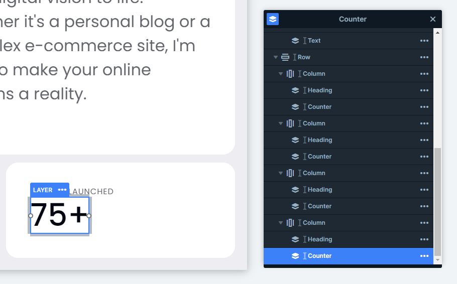
In addition, on the second slide, you can find some special layers, like the Counter layer. This is the perfect element for your website to build trust in your visitors by showing them statistics about your company. Just simply set the layer to any number of your choosing.
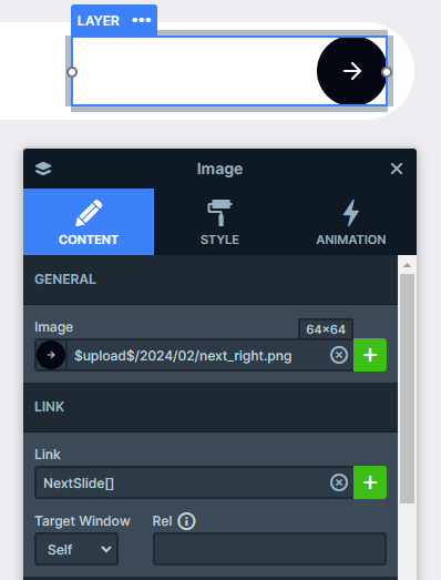
On top of that, let’s not forget about the unique Static Overlay, that helps us navigate the slider without any hassle. The secret behind this easy navigation is adding a Link Action to the Image layers.
Another setting that makes the whole look more put together is adding the margin to the top of each slider’s content, so the nav bar always stays above the content without overlapping it.
Animations
The Main Animation is set to horizontal, which adds a sophisticated look to the slider.
All layers use basic incoming animations. The layers enter the slide from different directions, smoothly introducing them. These combined movements create a subtle yet elegant visual effect.
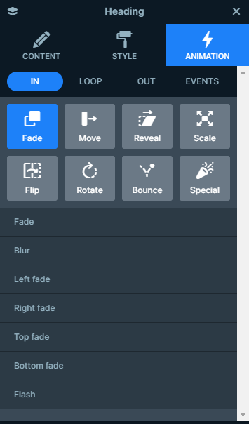
You can adjust the delay and duration of each animation on the visual timeline, which you can find at the bottom of your slide editor.
Layout
Each slide creates a captivating layout using Rows and Columns for their structure.
However, two layouts stand out from the rest. First, let’s look at the Services slide’s layout.
It uses two rows with two columns each. Apart from using the same layout inside these columns, you can notice that the columns with the white background take up a bigger portion of each row. Easily adjust it in the Row layer’s content settings. You just need to drag the column width in the below-shown intuitive panel.
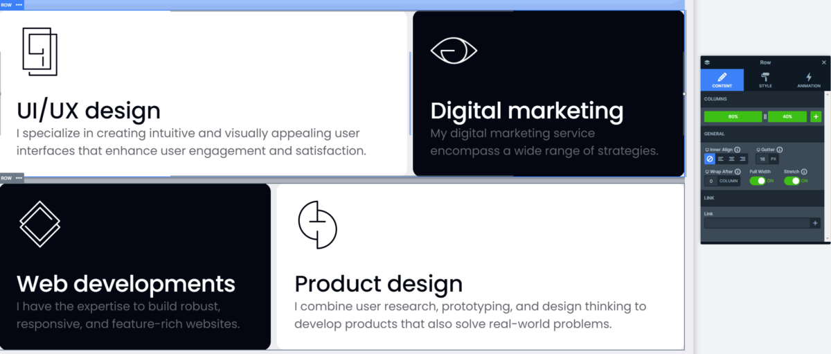
Moreover, to fine-tune the space between each column set up the Gutter on their row containers.
Next, let’s take a look at the Projects slide’s layout.
With its captivating layout, this slide creates an intriguing solution. There are four columns, that contain both images and text in them. Setting the Wrap After setting to 1 on each row container, ensure that the column containing the content wraps after the column with the image backgrounds.
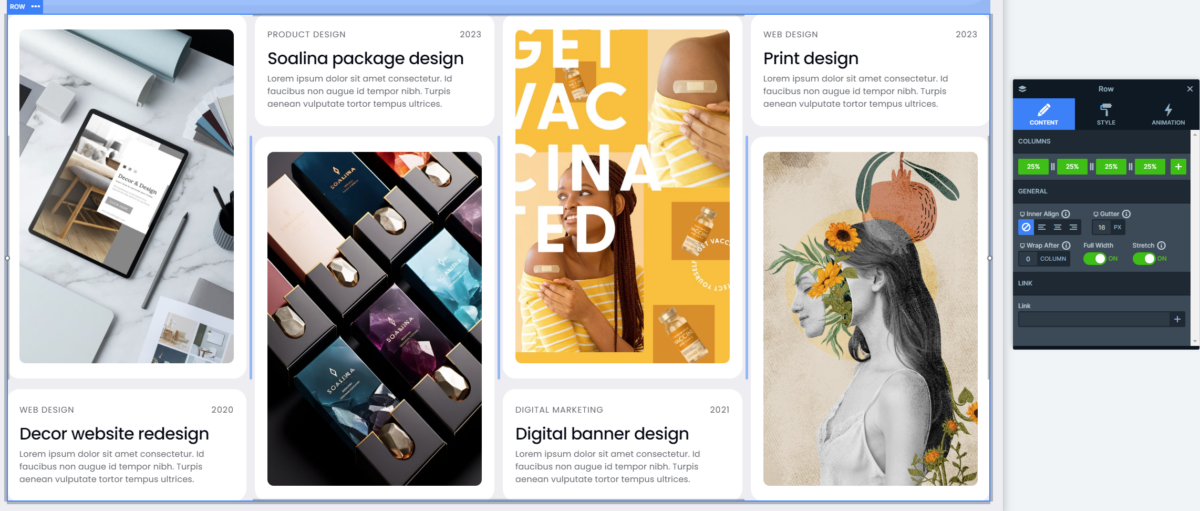
On top of that the Gutter keeps the spaces equal between each of the columns.
Responsive
Smart Slider is a fully responsive slider plugin offering useful tools to its users to optimize their designs for different screen sizes.
For example, the Font Resizer lets you adjust your layers device specifically, which makes it easier to offer your visitors a pleasant experience while they are viewing your site.
Additionally, some responsive settings activate automatically, like in this slider template’s case you can notice that a row’s columns automatically break into new lines on smaller screens, giving them enough space to shine.


