Slider Settings
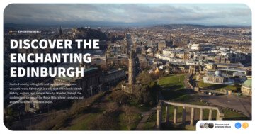
The Black Friday Slider’s Full Page layout is a perfect example of how you can easily catch your website visitors’ attention. There’s no wonder why it’s a popular design choice, as these sliders fill the full width and height of the browser. As a result, they provide a large enough space for a good first impression.

Visitors can choose between two different options to browse the slider. They can navigate it by clicking on the arrows, shown on both sides of the slider. If you choose this option you’ll notice a nice hover effect. This makes the process of switching between the slides even more user-friendly.
On the other hand, some people prefer to move between slides by simply dragging them horizontally. The good thing is that this template works well for those users too.
You can easily adjust these settings to your unique preferences under the Size and Controls settings.
Layers
The Black Friday Slider mostly uses simple, basic layers. There are Heading, Text, and Image layers.
However, there are two special ones as well on each slide, creating the sale tapes at the bottom. They use an Image Area layer. What differentiates it from the simple Image layer is that an Image Area layer can cover a given area with the selected picture and can crop parts of the image if needed.

You may have also noticed that some layers are more interactive than others, which is a result of a simple layer parallax added to them. You can adjust these settings at the Animations tab, then don’t forget to apply the Parallax value at the layer’s style tab.
Furthermore, you can notice that some Heading layers have a word inside them that’s customized differently than the rest. This outstanding effect is the result of the custom CSS they have. To achieve this look, add your special design to the Developer settings CSS section, then insert their classes on the containers in the style settings.

Animations
There are some outstanding animations on the Black Friday Slider. You can see an incoming animation on most layers, which makes their entrance more eye-catching.
However, now let’s focus on those that don’t stop moving after all the layers are introduced. Both the Image Area layers and the sale percentage layer, which deliver the main message of the slider, use a loop animation to continuously remind the user of the special offer.

There’s another outstanding layer animation, the Reveal animation. It’s a perfect way to make your content stand out. In this template’s case, it’s strategically used to create FOMO in the user, by slowly revealing the limited-time offer.
On top of that, you may have noticed the unique design element at the top and bottom of the slider. Smart Slider allows you to divide your page with fully responsive Shape dividers giving a modern edge to your website. There’s a paper-like shape at the top and bottom of the slider, which connects it with the white sections around it.
Layout
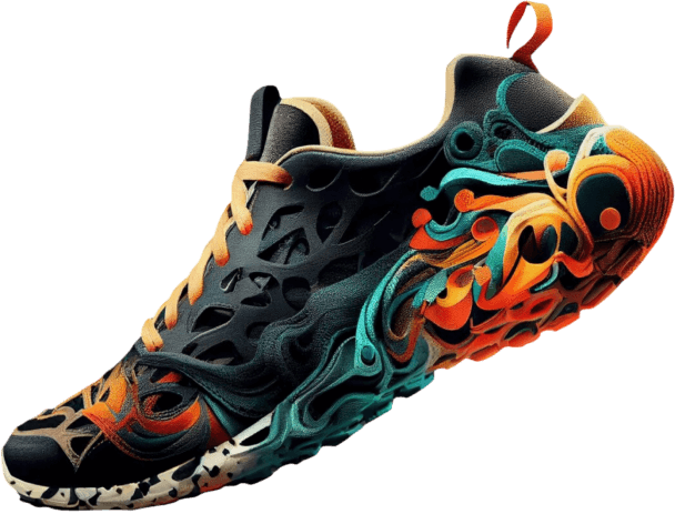
Each of this template’s slides uses the same, simple layout. There’s a row containing two columns on each side of it. While the left column contains the text, the right one showcases the unique Image layers.
By default, Smart Slider places the images below the text on mobile view in this layout. However, you have the option to change the order of the columns, so you can easily adjust the arrangement if you’d prefer to show the images first.
Moreover, there’s also an interesting layout that you can find on the slider. The sale tapes are absolute layers. They are slightly rotated to create this realistic look of crossing over each other.
What’s more, is that they are aligned to the bottom and have their own custom size, which ensures that they fill the whole slider.
Responsive
Smart Slider offers many great tools to optimize your slider for smaller screen sizes. One of the most commonly used features is the Font Resizer, which helps you to easily adjust your layers uniquely for each device’s screen.

Another great option is the Hide on feature, which you can use on any layer of your choice. In some cases, like when you are using absolute layers, it can be especially useful to hide them in mobile view.
