Slider Settings
The Orion Showcase slider is a full width slider which is a typical way to include a slider on your site. Full width sliders are favored because they fill the browser horizontally and look great on any screen size.
The type of the slider is Showcase, which means more slides can display next to each other. The Showcase slider type is rather special because it keeps the active slide in the middle of the slider to help the visitor focus.
This slider type also allows easy navigation. The visitors can click on any visible, but non-active slide to switch to it. Additionally, we added bullets to the slider to make the navigation easier.
Layers
The Orion Showcase template uses basic layers: image, heading and text. Thus, it’s perfect to display testimonials, as they usually display mostly textual content.
Animations
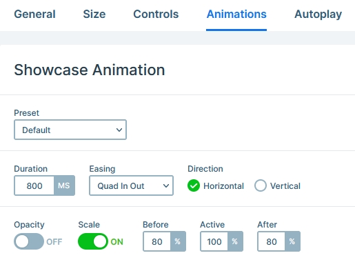
The Showcase slider type has special kind of animations. We used it to scale down the before and after slides and make the active slide stand out more.

Layout
The layout is super basic. By default when you add layers to your slide, they’re put to the middle of the slide. We kept this default behavior as it was matching the look we were after.
Responsive
Smart Slider is a responsive slider and offers many tools to optimize the mobile result. At this template our favorite tool was the Font resizer which helped us optimize the text size for mobile.
Related Documentation: Where to find the Slide Library?
Related Post: Smart Slider 3 – Slide Library


